
Point-and-click feedback is pixel-anchored commenting that lets reviewers drop pins on a screenshot or live preview to leave precise, location-specific comments. Instead of writing "the button on the homepage looks off," a reviewer clicks the actual button and says exactly what's wrong. Designers, agencies, remote teams, and clients use this method because it removes guesswork, which means fewer clarifying messages and faster sign-offs.
TL;DR:
- Pixel-anchored feedback uses both selector data and geometry to attach comments to specific locations, enabling precise issue identification.
- Pins can drift or become invalid if page markup changes significantly, requiring teams to verify their relevance before acting.
- This feedback method excels in visual design, QA, and client sign-offs but is less effective for strategy discussions or early-stage brainstorming.
- Using automated summaries and version control helps teams track changes across iterations and reduces confusion from scattered comments.
- Public deployment requires proper security measures, as some tools capture form data and have feedback endpoints that may be vulnerable to access by unauthorized users.
Table of Contents
- How pixel-anchored feedback actually works
- When point-and-click feedback works best, and when it doesn't
- A step-by-step workflow for collecting and acting on pins
- A critique framework for writing pins that get acted on
- Anchoring, drift, and security before you deploy publicly
- How Pinhub applies anchored feedback in practice
- Try Pinhub for your next design review
- Sources
- FAQ
How pixel-anchored feedback actually works
Anchored feedback systems share a few core parts. A reviewer opens a screenshot or a live page, clicks a spot, and a pin locks onto that exact location. That pin carries a threaded comment, and the underlying system stores an anchor so the comment stays attached even as the page changes.
Typical components include:
- Pins: visual markers placed at the exact point of concern.
- Anchors: a combination of selector and geometry that ties the pin to a specific element, described in detail by the in-page review overlay documentation.
- Screenshots: static captures used when a live preview isn't available.
- Threaded comments: replies attached to a single pin, keeping a discussion contained.
- Exportable summaries: condensed lists that turn scattered pins into a task sheet.
Captured context, such as the viewport size or the element selector, helps a developer reproduce an issue without asking "what browser were you using?" A design agency reviewing a client's homepage mockup, for instance, can pin a spacing issue directly on the header instead of describing its pixel position in a paragraph, which cuts the back-and-forth down to a single exchange.
When point-and-click feedback works best, and when it doesn't
Anchored feedback shines whenever the conversation is about something visible and specific. It struggles when the conversation is about direction rather than detail.
Best-fit scenarios include:
- Visual design reviews, where spacing, color, and layout need exact references.
- Staging QA, where testers flag broken elements before release.
- Client sign-off, where approval hinges on specific screens or components.
- Microcopy and layout checks, where wording or alignment needs a precise pointer.
It's a poor fit for high-level strategy discussions or early brainstorming, where there's no fixed visual to point at yet. Those conversations need open-ended notes, not pins.
There are trade-offs to weigh too. Capturing context such as selectors and viewport data helps reproduce issues, but that same data raises privacy and security questions on public pages. Pins can also drift if a page's markup changes significantly between the time feedback is left and the time someone acts on it, so teams need a plan for handling stale anchors rather than assuming every pin will hold.
A step-by-step workflow for collecting and acting on pins
A workflow turns scattered comments into a system, leveraging feedback loops to drive continuous improvements and better outcomes. Most teams follow a version of this sequence:
- Pick the review surface: choose a staging URL or a set of screenshots and scope exactly which pages or screens are in play.
- Invite reviewers: bring in guest reviewers who don't need accounts, along with internal team members.
- Capture feedback: reviewers click a spot, leave a comment, and add reproduction notes or an annotated screenshot when the issue needs more context.
- Group and triage: sort pins by page or issue type so duplicate reports don't get worked twice.
- Assign ownership: attach each pin to the person responsible and link it to a ticket if one exists.
- Resolve and record: mark the pin resolved and note which version of the design or page the fix landed in.
- Summarize: generate a condensed list of open and closed items so stakeholders can see progress without scrolling through threads.
This sequence works whether the review covers a marketing landing page or a full product redesign. The visual QA workflow guide walks through how triage and version tracking fit together in more detail, and the annotation guide for team collaboration covers the setup side for teams starting from scratch.
Pro Tip: Close the loop by turning resolved pins into a checklist rather than deleting them. It gives clients a visible record of what changed and why.
A critique framework for writing pins that get acted on
A pin is only useful if the comment attached to it is specific enough to act on. A five-part critique framework keeps reviewers consistent, based on the structured critique approach used in design skills documentation:
- First impression: what stands out, good or bad, in the first few seconds.
- Usability: whether the element does what a user expects it to do.
- Visual hierarchy: whether the eye lands where it should.
- Consistency: whether spacing, type, and color match the rest of the design.
- Accessibility: whether contrast, labeling, and focus states hold up.
- Quick wins: small fixes that improve the result without a redesign.
A useful comment template follows this shape: location, observed behavior, why it matters, suggested fix. For example: "Header nav (this pin): the active state doesn't change color, so users can't tell which page they're on. Try a 2px underline in the brand accent."
Match the depth of feedback to the design stage. Early exploratory work needs broad first-impression notes, while a near-final polish pass needs pins that call out exact pixel or contrast issues.
Anchoring, drift, and security before you deploy publicly
A resilient anchor combines a DOM selector, a short text hint, and geometry, which lets the system rebind a pin even after markup changes, a pattern described in the review overlay project's anchoring notes. When rebinding fails, the pin shows as drifted (the element moved or changed) or not found (the element no longer exists), and both states need a human to confirm whether the feedback still applies.

Accessibility matters in the widget itself. Pins should behave as ordinary interactive buttons, support keyboard navigation, and dock in a way that doesn't block page content or trap clicks meant for the page underneath.
Overlay implementations typically capture selector data, click coordinates, viewport dimensions, and an in-browser screenshot to give context for each pin, according to the review overlay documentation. One click-to-annotate WordPress plugin documents capturing form field state alongside selector and viewport data, and explicitly warns that its feedback endpoint is open by default, a reminder that public deployments need password protection or access controls that staging environments don't always require.
How Pinhub applies anchored feedback in practice
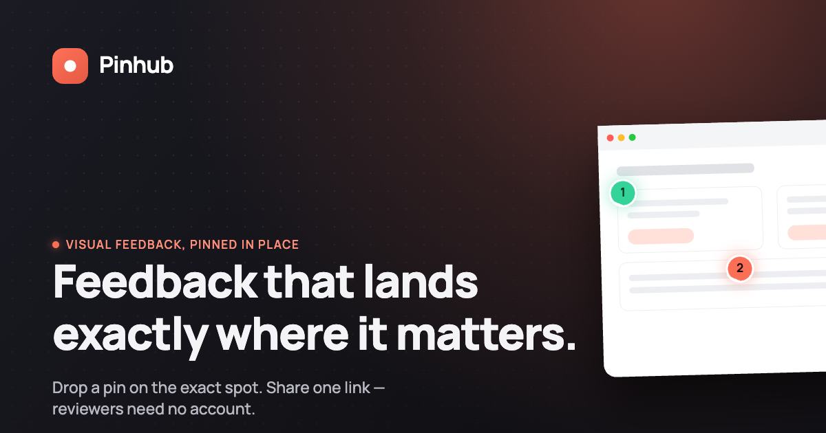
Pinhub builds its review process around the same pixel-anchoring principles covered above. Comments attach to a specific point on a screenshot or design, so a client reviewing a homepage mockup points at the exact element instead of describing its location, which cuts down the confusion that vague feedback usually creates in agency and client sign-off rounds.

Guest reviewers can leave comments without creating an account, which removes a common friction point in client approvals. A client doesn't need to remember a password to flag a typo on a banner.
Pinhub also generates automated summary lists and keeps version control across design iterations, so a team reviewing round three of a mockup can see what changed since round two without digging through old threads. Both features are built to turn scattered comment threads into a task list a designer or developer can work through directly.
— Pinhub
Try Pinhub for your next design review
If the workflow above sounds like what your team needs, Pinhub already builds it in. Pixel-anchored comments, guest reviewers who skip account creation, automated summaries, and version control across iterations are all part of the same workspace, so you're not stitching together a screenshot tool and a separate comment thread.
Product and design teams get a faster path from first draft to client sign-off. Agencies get a way to collect client feedback without asking clients to register for anything. Freelancers get a lightweight setup that doesn't require a full project management suite.
- Start with the Free plan for solo or low-volume review work.
- Move to Pro for more screenshots, Figma import, and version control. Current pricing is available on the Pinhub website.
- Pick Team for larger workspaces with more members and password-protected sharing. Current pricing is available on the Pinhub website.
Visit the Pinhub plans page to start a free workspace or compare plan details before you commit.
Sources
For implementation detail beyond this guide, see the annotation workflow guide, the website design feedback guide, and the Pinhub blog for ongoing practical posts.
- R3-Lab/web-review
FAQ
What does "pixel-anchored" feedback mean?
Pixel-anchored feedback means a comment is tied to an exact location on a screenshot or live page rather than described in words. The system uses a combination of selector data and geometry, as outlined in the review overlay documentation, to keep the comment attached to that spot.
What happens when a pin's anchor drifts?
A pin shows as drifted when the element it was attached to has moved or changed, and as not found when the element no longer exists on the page. Both states require a reviewer to check whether the original feedback still applies before acting on it.
Is it safe to run a feedback widget on a public page?
It depends on the widget and how it's configured. Some click-to-annotate tools capture form field state alongside selector and viewport data, and at least one WordPress plugin's documentation notes its feedback endpoint is open by default, so public deployments generally need password protection or access restrictions that a staging environment might not.
How is point-and-click feedback different from a written report?
A written report describes an issue in words, which leaves room for misinterpretation about where exactly the problem is. Point-and-click feedback pins the comment to the exact spot on the design, so there's no ambiguity about location.
Can clients leave feedback without creating an account?
Yes, on platforms like Pinhub, guest reviewers can click and comment without registering for an account, which removes a common barrier in client sign-off workflows.