
What makes feedback for website design actually effective?
Good feedback for website design is specific, task-oriented, and tied directly to user experience goals. Vague comments like "this doesn't feel right" or "make it pop more" give designers nothing to work with. Effective feedback names the exact element, explains the problem, and suggests a direction, even if the final solution remains open.
The Nielsen Norman Group's "task, then ask" principle captures the right timing: collect feedback after a user completes a real task, not before. Interrupting someone mid-task produces low-quality responses and frustrates the very people you need honest input from. Waiting until the task is done yields feedback grounded in actual experience.
Constructive feedback also respects the difference between personal preference and user impact. Saying "I don't like the blue" is a preference. Saying "the blue button blends into the background on mobile, making the CTA hard to find" is a design observation with real consequences. The second version gives the team something to act on.
Prioritization matters just as much as clarity. When every comment carries equal weight, teams lose focus and burn through time on low-impact changes. Effective feedback is ranked by user impact, alignment with project goals, and technical feasibility.
Best practices for writing and delivering effective design feedback:
- Reference the specific element (button, header, navigation menu) and its location on the page.
- Connect the observation to a user task or business goal, not personal taste.
- Separate critical issues from minor suggestions, and label them clearly.
- Keep feedback constructive: describe the problem, then propose a direction.
- Avoid technical jargon when sharing feedback with non-developers, and avoid design jargon when sharing with non-designers.
- Confirm that feedback is technically feasible before flagging it as a priority. Including developers early in design reviews helps catch layout inconsistencies and technical constraints before they become expensive rework.
- Use visual annotations or screenshots to anchor comments to specific areas of the design.
8 types of website feedback that actually work
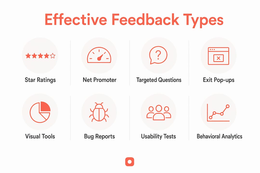
Different feedback types serve different purposes. Using only one method leaves blind spots. Here are the most effective types, and when to reach for each.
1. Star ratings and thumbs up/down prompts
Star ratings are the fastest feedback format to complete. They work best immediately after a user finishes a task, such as checking out or submitting a form. The response rate is high precisely because the ask is minimal. The tradeoff is that ratings tell you how satisfied someone is, not why. Pair them with an optional open-ended field to capture the reasoning behind low scores.
2. Net Promoter Score (NPS)
NPS asks one question: "How likely are you to recommend this site to a friend or colleague?" on a 0–10 scale. It's a reliable signal of overall satisfaction and brand loyalty, and it's widely used because it produces a single comparable metric over time. NPS works best as a periodic pulse check rather than a per-session prompt. Sending it too frequently erodes trust and response quality.
3. Targeted feedback questions
Rather than asking about the whole site, targeted questions focus on a specific page or interaction. "Did you find what you were looking for on this page?" or "Was the checkout process clear?" produce answers that map directly to design decisions. Tools like Mopinion support this approach by letting teams deploy page-level feedback forms that surface usability problems and user preferences in context.
4. Exit-intent pop-ups
Exit-intent prompts appear when a user's cursor moves toward closing the browser tab. They're most useful on high-value pages like pricing or checkout, where abandonment signals a real problem. Keep the question short: one or two fields at most. A longer form at the moment someone is leaving will get ignored. The goal is to capture the reason for leaving, not conduct a full survey.
5. Visual feedback tools and pixel-anchored comments
Visual feedback tools let reviewers pin comments directly onto a screenshot or design file, anchoring the note to the exact element being discussed. This eliminates the ambiguity of written descriptions like "the thing in the top right corner." For design teams working across time zones or with clients who aren't designers, pixel-anchored feedback dramatically reduces back-and-forth. Platforms like Usepinhub are built specifically for this: reviewers upload a screenshot or Figma design, pin comments on specific areas, and create threaded discussions tied to exact screen locations, without requiring guest reviewers to create an account.

6. Bug reports
Bug reports are a form of reactive feedback. Users submit them when something breaks or behaves unexpectedly. While they're not traditional design feedback, they reveal real-world usability failures that structured surveys often miss. A well-designed bug report form captures the page URL, the browser and device, and a description of what happened versus what was expected. Website QA tester tools can formalize this process and make bug reports easier to triage.
7. Usability testing sessions
Usability testing puts real users in front of a design and asks them to complete specific tasks while observers watch. The insights go beyond what any survey can capture because you see where users hesitate, click the wrong element, or give up entirely. Netigate and similar platforms support structured usability research by combining quantitative survey data with qualitative session analysis. Even a small number of sessions can surface the most common friction points.
8. Heatmaps and session recordings
Behavioral analytics tools like Contentsquare track where users click, scroll, and drop off. This is implicit feedback: users aren't telling you anything directly, but their behavior reveals what's working and what isn't. A heatmap showing that users consistently click on a non-clickable image tells you something a survey might never surface. Behavioral data pairs well with direct feedback methods because it shows the what while surveys explain the why.
How to collect website feedback without disrupting your users
The most common mistake in feedback collection is asking too early or too often. Nielsen Norman Group's "task, then ask" principle is the clearest rule to follow: wait until a user finishes a meaningful interaction before requesting their input. Interrupting someone mid-task produces frustrated responses and inflated negative scores.
Proactive feedback methods include surveys, in-app widgets, email follow-ups, and pop-ups triggered by specific user actions. Reactive methods include feedback buttons, social media monitoring, and support ticket analysis. Both have a place, but proactive methods give you more control over timing and question design.
No matter how many channels you use, store all feedback in a single location. Scattered feedback across email threads, spreadsheets, and design tools makes pattern recognition nearly impossible. A centralized system, whether a dedicated feedback platform or a project management tool, keeps everything accessible and comparable over time.
Survey length is a real factor in response quality. A feedback survey should be short enough to complete quickly, with a mix of rating scales, multiple-choice questions, and one optional open-ended field placed at the end. Putting an open-ended question first discourages completion.
Effective feedback collection tactics:
- Trigger feedback requests after task completion, not on page load.
- Use a persistent feedback tab on the side of the page so users can respond when they're ready.
- Send follow-up emails only after significant interactions, such as completing a purchase or finishing onboarding.
- Offer users a choice of feedback channel (in-app, email, push notification) to increase participation.
- Use microcopy to briefly explain how feedback will be used, and express appreciation for the time taken.
- Keep surveys to one minute or less, with no more than five to seven questions.
- Include an optional character-limited open-ended field to capture context without overwhelming respondents.
- Consolidate all feedback into one system before analysis begins.
What questions should you ask when gathering design feedback?
The quality of your feedback depends almost entirely on the quality of your questions. Closed-ended questions (ratings, multiple choice) produce data you can measure and compare. Open-ended questions produce context you can act on. The best surveys use both.
For website design specifically, questions should cover five areas: usability, visual design, navigation, accessibility, and content relevance. Each area maps to a different type of design decision, so covering all five gives you a complete picture.
Timing and placement matter as much as wording. A question about checkout clarity belongs on the confirmation page, not the homepage. Exit-intent prompts work for abandonment questions. Post-task surveys work for usability questions. Matching the question to the moment increases both response rate and answer quality.
Sample questions web designers and product owners can adapt:
- Usability: "Were you able to complete what you came to do today?" (Yes / No / Partially, with optional comment field)
- Visual design: "How would you rate the overall visual appearance of this page?" (1–5 scale)
- Navigation: "How easy was it to find what you were looking for?" (Very easy / Easy / Neutral / Difficult / Very difficult)
- Accessibility: "Did you encounter any difficulty reading or interacting with content on this page?" (Yes / No, with optional detail field)
- Content relevance: "Did the content on this page answer your questions?" (Yes / Mostly / No)
- Open-ended: "What, if anything, would you change about this page?"
- NPS-style: "How likely are you to return to this site?" (0–10 scale)
- Task-specific: "Was the information you needed easy to find during checkout?"
Pro Tip: Place open-ended questions at the end of your survey, not the beginning. Users who see a blank text field first often abandon the form before answering anything.
Accessibility questions deserve particular attention. If your project targets WCAG compliance, asking users directly about barriers they encountered can surface issues that automated audits miss. Pairing user-reported accessibility feedback with a technical review gives you the most complete picture. For a deeper look at common accessibility oversights in web design, it's worth reviewing what the 2026 landscape looks like before your next design review.
How to use website feedback to improve your design projects
Collecting feedback is the easy part. Turning it into better designs requires a clear process for analysis, prioritization, and implementation.
The UX Design Institute advises prioritizing feedback by four criteria: whether it benefits multiple users, whether it aligns with product strategy and business goals, whether it will have a meaningful positive impact on the user experience, and whether the team has the time and resources to act on it. Without a framework like this, teams end up debating which feedback matters instead of acting on what does.

Cross-functional collaboration is where most teams fall short. Designers, developers, and product owners often interpret the same feedback differently. A comment about "slow loading" might mean a performance problem to a developer and a visual complexity problem to a designer. Regular review sessions where all three roles discuss feedback together produce faster, more accurate decisions.
Sharing prototypes early and gathering feedback before development begins reduces the cost of changes dramatically. A layout issue caught in a Figma prototype takes minutes to fix. The same issue caught after a page is coded can take days. This is why including developers in design reviews from the start, not just at handoff, catches technical feasibility problems and inconsistent components before they compound.
Once you've collected and reviewed feedback, consolidate patterns into single action items. If multiple users report that the navigation is confusing, that becomes one action item: "Simplify primary navigation." You don't need to log every individual comment separately. The goal is to turn a volume of feedback into a manageable list of design decisions.
Tools that support visual annotations and feedback tracking make this consolidation faster. When comments are pinned to specific design elements rather than written in a separate document, patterns become visible without manual cross-referencing.
Best practices for turning feedback into design improvements:
- Establish a prioritization framework before feedback collection begins, not after.
- Hold cross-functional review sessions with designers, developers, and product owners together.
- Categorize feedback as high, medium, or low priority using consistent criteria across the team.
- Consolidate repeated observations into single action items rather than tracking every comment individually.
- Build feedback analysis into your design cycle, not as a one-time event but as a recurring step before each iteration.
- Use visual feedback tools to keep comments anchored to specific design elements, making patterns easier to spot.
- Monitor feedback closely after launching a new feature or redesign to catch user experience issues early.
- Document feedback that doesn't make the current sprint so it isn't lost for future iterations.
For a structured approach to evaluating website design and acting on what you find, a clear evaluation framework makes the difference between feedback that sits in a spreadsheet and feedback that ships as an improvement.
Common pitfalls in giving and receiving website design feedback
Even experienced teams fall into patterns that make feedback less useful or actively counterproductive. Knowing what to avoid is as practical as knowing what to do.
Giving feedback on personal preference instead of user impact. The most common pitfall. "I don't like this font" is not design feedback. "This font renders poorly at small sizes on mobile, which affects readability for a large portion of our audience" is. Feedback grounded in user behavior and project goals holds up in review; preference-based feedback creates conflict.
Waiting too long to involve developers. Design reviews that happen without developer input often produce beautiful mockups that are expensive or impossible to build as designed. Font inconsistencies, button style conflicts, and layout patterns that don't adapt to real content all get caught faster when a developer is in the room from the start.
Treating all feedback as equally urgent. Without a prioritization system, teams either try to act on everything (and burn out) or act on whatever was mentioned most recently (and lose strategic focus). Both outcomes slow projects down. A simple high/medium/low framework applied consistently prevents this.
Giving feedback without context. "Fix the header" tells a designer nothing useful. "The header on the pricing page overlaps the hero image on screens narrower than 768px" gives them exactly what they need. Specific, located, contextual feedback gets resolved faster and with fewer follow-up questions.
Feedback overload from too many channels. When feedback arrives through email, Slack, comment threads, spreadsheets, and sticky notes simultaneously, nothing gets properly tracked. Teams miss patterns, duplicate effort, and lose important observations. Centralizing feedback into one system before analysis begins is the fix, not a nice-to-have.
Receiving feedback defensively. Designers who treat critique as an attack on their work shut down the feedback loop. The most productive design teams treat feedback as data, not judgment. When a reviewer says a CTA is hard to find, that's information about user behavior, not a verdict on the designer's skill.
Skipping accessibility in design reviews. Accessibility issues caught during the design phase are far cheaper to fix than those caught after launch. Reviewing designs against WCAG accessibility standards as part of every design review, not as an afterthought, prevents compliance problems and improves the experience for all users.
Collecting feedback without a plan to act on it. Asking users for input and then doing nothing with it damages trust. Users who see no changes after providing feedback stop responding to future requests. Closing the loop, even with a brief acknowledgment of what changed and why, keeps participation rates healthy over time.
Collect and manage design feedback with Usepinhub
Vague feedback slows every design project down. Usepinhub solves this by letting your team and clients pin comments directly onto screenshots and Figma designs, anchoring every note to the exact pixel being discussed. Guest reviewers can participate without creating an account, so getting input from clients or stakeholders takes seconds, not a setup process.
Version control keeps your feedback organized across iterations, and AI-powered summaries turn long comment threads into clear action lists. Password-protected share links keep sensitive designs secure during reviews.
Start collecting precise design feedback with Usepinhub and spend less time clarifying what reviewers meant and more time shipping better designs.
Key Takeaways
Effective feedback for website design is specific, prioritized, and tied to user tasks and project goals, not personal preference.
| Point | Details |
|---|---|
| Time feedback correctly | Ask after task completion, following the Nielsen Norman Group's "task, then ask" principle, to get higher-quality responses. |
| Use multiple feedback types | Combine star ratings, NPS, targeted questions, visual tools, and behavioral analytics for a complete picture. |
| Prioritize before acting | Evaluate feedback by user impact, business alignment, and resource availability before committing to changes. |
| Involve developers early | Including developers in design reviews catches technical feasibility issues and layout inconsistencies before coding begins. |
| Centralize all feedback | Store feedback from every channel in one system to make pattern recognition and prioritization manageable. |
FAQ
How do you write good feedback for a website design?
Good design feedback names the specific element, describes the problem in terms of user impact, and suggests a direction for improvement. Avoid preference-based comments and focus on observations tied to usability, accessibility, or project goals.
What are examples of good feedback comments for web design?
Effective comments are specific and located, such as "The CTA button on the pricing page is hard to see on mobile because it matches the background color" or "The navigation menu has too many top-level items, which makes it difficult for users to find the right section quickly."
How do you give good design feedback?
Reference the exact element and its location, connect your observation to a user task or business goal, and separate critical issues from minor suggestions. Nielsen Norman Group recommends keeping feedback requests short and task-focused to maintain quality.
How do you review a website design effectively?
A thorough website design review covers visual hierarchy, CTA effectiveness, navigation clarity, responsive behavior, accessibility compliance, and content relevance. Including both designers and developers in the review catches visual and technical issues before they reach the development phase.
When should you collect feedback during a design project?
Collect feedback at multiple stages: after initial prototypes to validate assumptions, after usability testing sessions to identify friction, and after launch to monitor real-world performance. Gathering input early, especially through prototype testing, reduces the cost of design changes significantly.