
A visual QA process is a structured method for checking that what actually renders on screen matches the intended design, catching layout shifts, broken states, and typography drift that functional tests never touch. Here's the compact version you can apply today: define a baseline, automate regression checks on core pages, run those checks in CI, triage failures with design context, then gate the release on sign-off. The strongest setups pair automated visual regression with a short human review loop and a PR gate, so nothing ships without someone actually looking at the screen.
- Define your baseline pages and components first
- Automate regression testing for high-traffic flows
- Run checks in CI on every pull request
- Triage failures with a designer, not just a QA engineer
- Gate the release until visual issues are resolved or accepted
Pro Tip: Start with five pages, not fifty. A visual QA process that covers your checkout flow and homepage well beats one that half covers your entire site.
Key Takeaways
A visual QA process works when automated regression, a defined checklist, and human review gate every release together, not separately.
| Point | Details |
|---|---|
| Start with baselines | Define scope on high-traffic pages and components before automating anything. |
| Cover five checklist categories | Test visual accuracy, responsive behavior, interactive states, edge cases, and accessibility. |
| Test the full state matrix | Check default, hover, focus, active, disabled, loading, error, and empty states. |
| Use real devices, not just emulation | Emulation misses rendering quirks that only show up on real browsers and hardware. |
| Pair automation with pinned feedback | Usepinhub adds pixel-anchored comments and guest review access to speed sign-off. |
Table of Contents
- Why Does Visual QA Matter for Your Team?
- What Is the Step-by-Step Visual QA Process?
- Which Visual Testing Method Should You Use?
- What Should Your Visual QA Checklist Include?
- How Do You Integrate Visual QA Into CI and Pull Requests?
- What Are the Most Common Visual QA Pitfalls?
- How Does Pinhub Fit Into Your Visual QA Workflow?
- Sources
- FAQ
Why Does Visual QA Matter for Your Team?
Skipping visual QA doesn't just create ugly bugs. It creates trust problems. A misaligned call-to-action button or a font that renders three sizes too small on mobile can quietly tank conversions before anyone notices the pattern in analytics.
Visual testing catches what functional tests are blind to: font rendering, misalignment, color discrepancies, and broken states across devices, according to Tricentis. A functional test confirms the checkout button submits the form. It says nothing about whether that button is visible, styled correctly, or positioned where a user expects to find it.
- Keeps brand consistency across releases and contributors
- Cuts triage time because issues get flagged before release, not after a support ticket
- Protects conversion-critical flows from silent layout regressions
- Surfaces issues in states and edge cases that manual clicking rarely reaches
The pattern shows up constantly: a single CSS change meant for one component quietly breaks spacing on a checkout page three deploys later, and nobody catches it until a customer does.
What Is the Step-by-Step Visual QA Process?
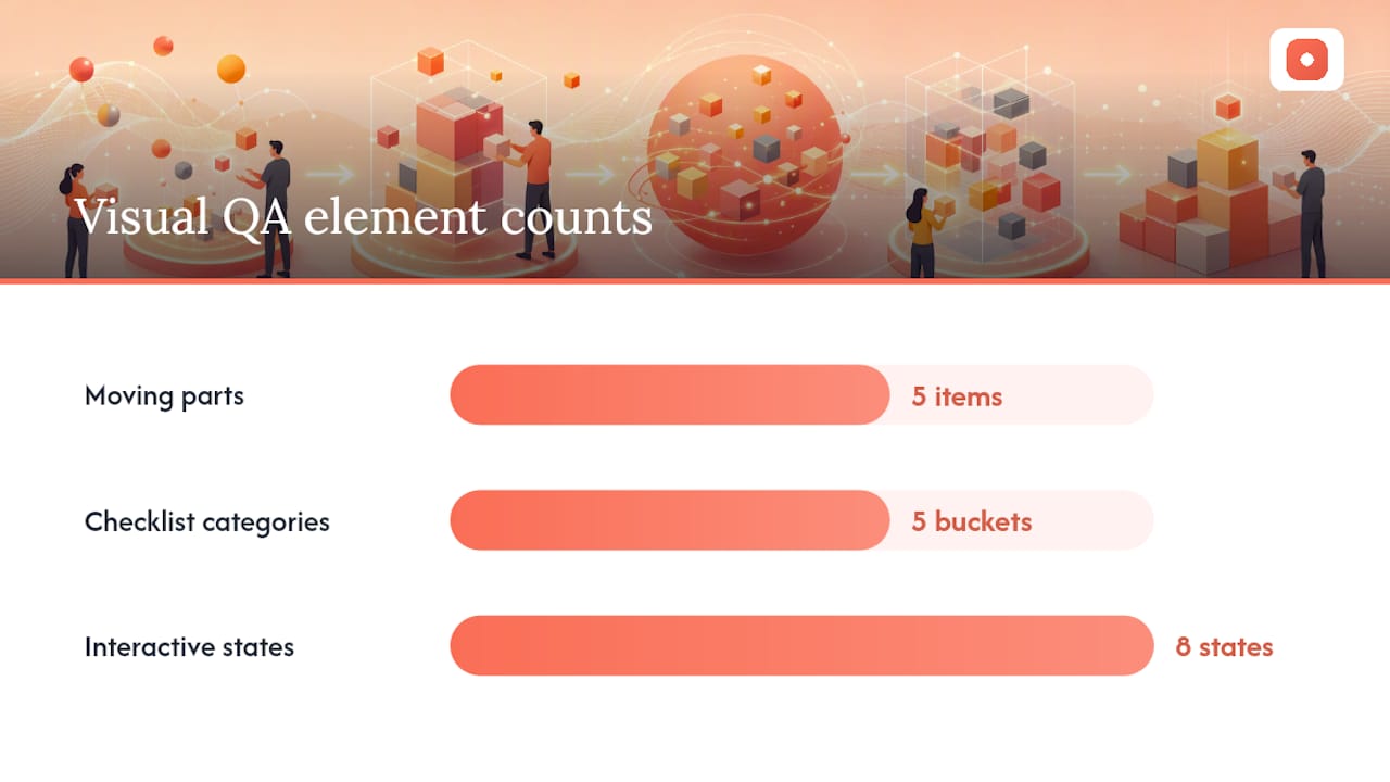
A workable visual QA process has five moving parts: scope, checklist, states, triage, and gating. Skip any one of them and the whole system gets unreliable fast.
- Define scope and baselines. Decide which pages and components actually need visual tests. Every homepage and checkout flow deserves a baseline; a rarely visited settings page probably doesn't. Set a policy for when baselines get updated (intentional redesign, yes; accidental drift, no).
- Build your checklist categories. Structure acceptance criteria around five buckets: visual accuracy, responsive behavior, interactive states, content and edge cases, and accessibility. This five-category structure mirrors the design QA process outlined by Stellae, and it prevents small discrepancies from piling up unnoticed.
- Test the state matrix. Every interactive element needs checks across default, hover, focus, active, disabled, loading, error, and empty states. A button that looks perfect at rest but breaks on focus is still a broken button.
- Triage by severity. Not every pixel mismatch deserves a blocked release. Separate true bugs (broken layout, unreadable text, missing content) from design change requests (a spacing preference, a color the designer wants to reconsider). Severity should weigh user impact and how visible the flow is, not just how obvious the diff looks in a screenshot.
- Run checks at the right cadence. Local runs catch issues before a commit. PR-level smoke tests catch regressions before merge. Nightly full-suite runs catch anything that slipped through. Pre-release gates are your last line of defense.
Baseline governance deserves its own mention here. Without a clear policy for when and why a baseline gets updated, teams drown in false positives and start ignoring the tool altogether, a pattern Amplitude's research on visual testing flags as one of the most common reasons visual QA programs quietly die. Our own website QA checklist walks through the pre-release gate checks that pair well with this workflow.
Pro Tip: Assign baseline update approval to one person or a small group. If anyone can approve a new baseline, your regression suite stops meaning anything.
Which Visual Testing Method Should You Use?
Four methods dominate visual QA work, and picking the wrong one for your scale wastes time either way.
Manual overlay inspection puts a design mockup directly over the live build so a reviewer can spot pixel-level drift by eye. It works well for small projects and one-off design reviews, and pixel-anchored feedback tools speed this up considerably by letting reviewers pinpoint exact differences directly on a screenshot instead of describing them in a comment thread.
Pixel-diff regression automates the overlay idea, comparing screenshots against a stored baseline pixel by pixel. It scales well but throws false positives on anything with dynamic content, like a timestamp or a rotating banner.
Rules-based validation checks design intent (spacing tokens, color values, alignment rules) rather than raw pixels, which scales better across large, localized sites and design systems where hundreds of pages share components.
AI and context-aware comparison understands what actually changed versus what's cosmetic noise, cutting false positives compared to rigid pixel-diff approaches according to Tricentis.
Pick based on scale, false-positive tolerance, CI/CD integration needs, and how much real-device coverage you actually require.
What Should Your Visual QA Checklist Include?
A component-level checklist should cover colors, spacing, typography, icons, images, borders, shadows, and design tokens. Missing any one of these lets small drift accumulate into a visibly inconsistent product within a few sprints. Our design review checklist breaks each of these categories down further.
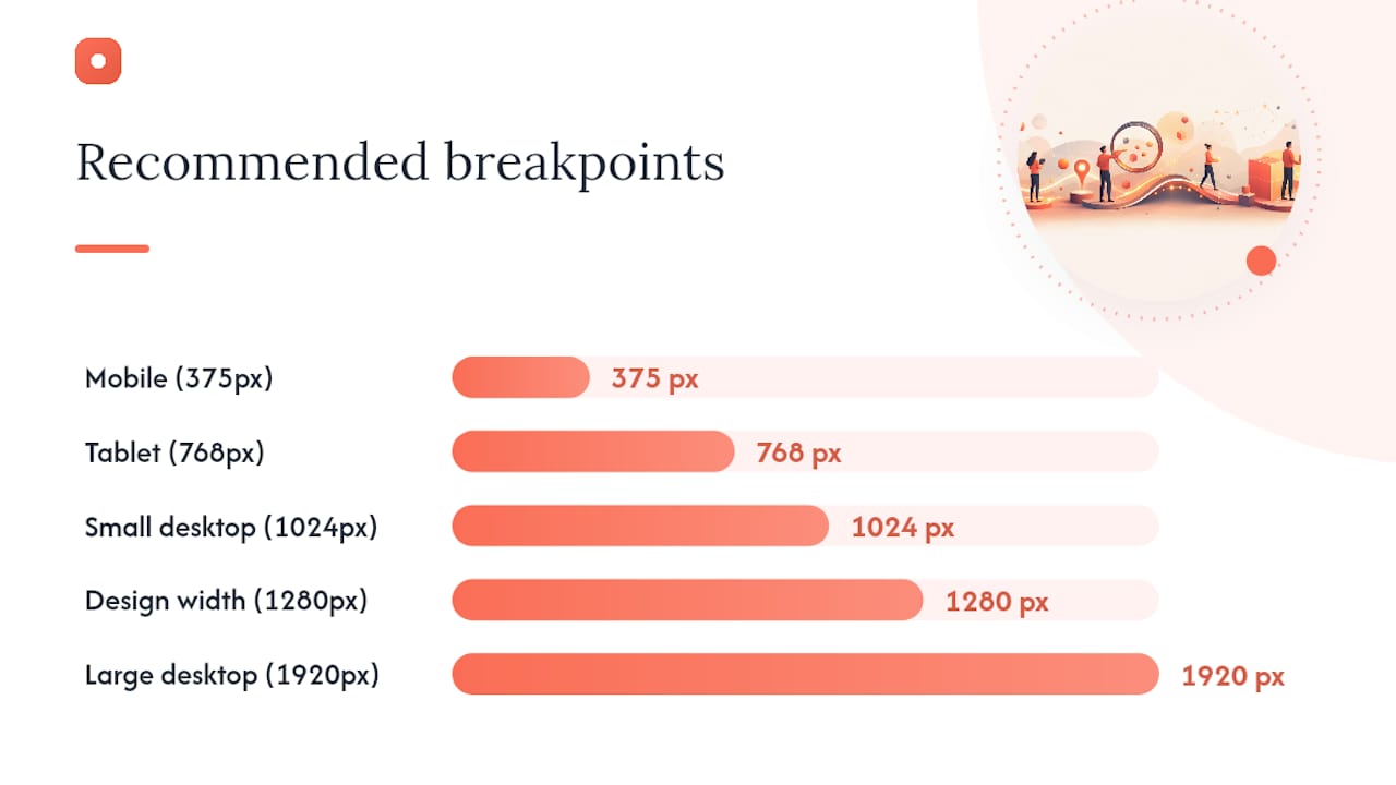
Recommended breakpoints:
- Mobile (375px): the tightest layout constraint, catches text overflow first
- Tablet (768px): often the most neglected breakpoint in practice
- Small desktop (1024px): where navigation menus frequently break
- Design width (1280px or whatever your design files specify): should match pixel-perfect
- Large desktop (1920px): catches excessive whitespace and stretched images
Real devices still matter here. Emulation misses rendering quirks specific to actual browsers and hardware, which is why Stellae's design QA guidance recommends testing on real devices or browser clouds rather than emulation alone.
State matrix example (test each on mobile and desktop): default, hover, focus, active, disabled, loading, error, empty.
A minimal automated visual regression check follows three steps: navigate to the page, capture a screenshot, and assert it against the stored baseline. Frameworks like Playwright support this pattern directly, per Stellae's process documentation.
Pro Tip: Screenshot the empty state deliberately. It's the state developers forget to build and the one QA engineers forget to test.
How Do You Integrate Visual QA Into CI and Pull Requests?
Visual QA only sticks when it lives inside the workflow developers already use, not in a separate tool nobody opens.
- Require a screenshot check on every PR touching UI code, reserve full regression suites for nightly or pre-release runs
- Use pinned, guest-accessible screenshot feedback so reviewers without accounts can flag issues directly on the image
- Route triage through a clear chain: QA flags the failure, the designer confirms intent, the developer fixes it
- Run pre-commit checks locally, smoke tests on PR, and the full suite nightly
Pairing automated checks with a short human review loop measurably speeds sign-off, since a structured review process resolves ambiguous cases faster than automation alone ever could. Our web requirements guide covers how to write acceptance criteria that make this handoff smoother.
What Are the Most Common Visual QA Pitfalls?
Most visual QA programs fail quietly, not dramatically. They just stop catching real problems while everyone assumes they still work.
- Over-relying on pixel diffs and drowning in false positives from dynamic content
- Testing only at desktop resolution and missing mobile-specific breakage
- Running QA too late, after development instead of alongside it
- Skipping state and edge-case testing in favor of the happy path
- Ignoring accessibility contrast and dark mode entirely
The fix for most of these is context-aware comparison instead of rigid pixel matching, disciplined baseline governance, and real-device testing rather than emulation alone. Prioritize visual bugs by asking four questions: does it break function, does it block a core user flow, does it damage brand consistency, and does it touch a conversion path. A misaligned footer link rarely outranks a broken checkout button, no matter how obvious the diff looks in a screenshot.
Pro Tip: Treat a "small" visual bug on your pricing page as high severity by default. Visual trust and conversion are more tightly linked there than anywhere else on your site.
How Does Pinhub Fit Into Your Visual QA Workflow?
Pixel-anchored comments solve the ambiguity that slows most manual visual review: instead of describing "the button in the top section," reviewers pin the comment directly to the exact pixel. Usepinhub adds guest reviewer access without account creation, version history for tracking design changes over time, password-protected links for client-facing rounds, and AI-assisted summaries that double as an acceptance checklist.
- Organize screenshots by workspace and project so triage stays connected to the right release
- Use AI summaries to close out a review round before it reaches the PR gate
Pro Tip: Turn resolved comment threads into your sign-off checklist. If every thread is closed, the design is ready to ship.
A Practitioner's View on Automation and Human Review
Automated visual checks catch the obvious regressions, but human review still resolves the judgment calls no diff tool can make. If you're rolling this out for the first time, start with a small, curated PR check on your highest-traffic pages before expanding suite-wide.
Get Pinpointed Visual Feedback Without the Back-and-Forth
Screenshot threads and vague comments like "this looks off" slow down every review round this guide has walked through. Usepinhub replaces that with pixel-anchored comments, so a reviewer marks the exact spot on the exact screenshot and everyone sees precisely what needs fixing.
That precision shows up directly in your triage speed and your review chain. Guest reviewers join without creating an account, so a client or stakeholder can weigh in on a design round within minutes. Version history keeps every iteration traceable, which matters the moment someone asks "what did this look like before the last fix." If your team is ready to cut review cycles down, start with Usepinhub and connect it to your next design review round.
Sources
- What is visual testing and why it matters
- Design QA Process
- What Is Visual Testing? Best Practices And Benefits
FAQ
What Is a Visual QA Process?
A visual QA process checks that an application's rendered appearance matches its intended design, catching layout, typography, color, and state issues that functional tests miss.
What Are the Steps in a QA Process?
The core steps are defining scope and baselines, building a checklist across visual accuracy and responsive behavior, testing interactive states, triaging by severity, and gating releases on sign-off.
What Are the Five Categories in a Design QA Checklist?
A structured design QA checklist covers visual accuracy, responsive behavior, interactive states, content and edge cases, and accessibility, according to Stellae's design QA process.
Should Visual QA Run in CI or Only Before Release?
Both: run smoke-level screenshot checks on every pull request, then run the full regression suite nightly or before release as a final gate.
How Does Pinhub Help With Visual QA Reviews?
Usepinhub lets reviewers pin comments to exact points on a screenshot, invite guest reviewers without an account, and track version history, which speeds up sign-off during design and PR review rounds.