
TL;DR:
- Effective website reviews require a mobile-first approach combined with integrated audits of UX, technical performance, SEO, content, and accessibility. Using pixel-anchored comments, baseline screenshots, and clear ownership, teams can identify and fix issues efficiently before publication. Comparing staging to production environments helps catch environment-specific problems that could disrupt user experience or tracking.
Review a website by running a mobile-first check of your critical user paths, then auditing UX/design, technical performance/SEO, and content and accessibility as a single integrated system. Document every finding as a pixel-anchored screenshot comment with a clear owner and severity level.
TL;DR: Three pillars cover everything: UX/design, technical performance/SEO, and content and accessibility. Start on mobile, capture evidence with pinned screenshots, and assign a named owner to every issue before the review closes.
Quick-pass micro-checklist:
- Complete the primary conversion path on a real phone
- Check navigation, tap targets, and font readability on mobile
- Verify all forms, buttons, and key links work
- Confirm title tags and meta descriptions are present and unique
- Scan for obvious contrast or accessibility failures
- Compare staging to production before any publish
Table of Contents
- What does a fast pre-publish website review checklist look like?
- How do you review a website step by step?
- Why does staging vs. production comparison matter so much?
- Which mobile issues do teams most often miss?
- Who does what in a collaborative website review?
- What tool features make website reviews faster and more exact?
- A ready-to-use issue template and review checklist
- How often should you run reviews versus full audits?
- Key Takeaways
- What actually speeds up reviews in real projects
- Usepinhub makes exact, location-specific reviews straightforward
- Useful sources for deeper reading
- FAQ
What does a fast pre-publish website review checklist look like?
A pre-publish sweep should take 10–20 minutes and catch the issues most likely to break conversions. Run it on every release, not just major launches.
- Money path first. Complete the checkout, sign-up, or contact flow on a real mobile device. If it fails here, nothing else matters.
- Mobile navigation. Open the hamburger menu, tap through two levels, and confirm no element is obscured by a sticky header or chat widget.
- Broken links and buttons. Click every CTA and nav link on the changed pages. A single dead link on a pricing page can cost a sale.
- SEO fields. Confirm the page title is under 60 characters, the meta description is present, and the Open Graph image loads when the URL is shared.
- Accessibility quick scan. Check color contrast on body text and confirm tap targets are large enough to hit without zooming.
- Staging vs. production snapshot. Load both environments side by side and flag any visual or functional difference as high priority.
Pro Tip: Before the review starts, take a baseline screenshot of each changed page in Usepinhub. If a regression appears after the fix, you have a timestamped reference to compare against without relying on memory.
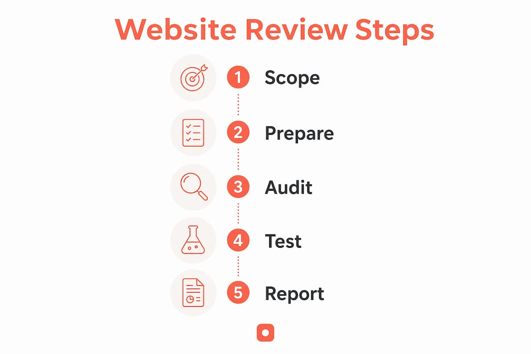
How do you review a website step by step?
A structured website review follows a repeatable sequence. Skipping steps or running them out of order is where most teams lose time to rework.
- Define scope. Name the business goal, the critical user journeys, and who signs off. A review without a defined owner rarely closes.
- Capture baseline evidence. Take pixel-anchored screenshots of every page in scope on both staging and production. Pin a note to each screenshot naming the environment, device, and browser.
- Run the mobile-first money path. Complete the primary conversion flow on a real phone over cellular. Record any friction point as a pinned comment with the exact screen location.
- Check desktop layout and cross-browser behavior. Verify that components, headers, and footers render consistently. Flag any layout shift or broken component.
- Test all links, forms, and interactive elements. Broken forms are among the highest-impact issues a review can catch, yet they are easy to miss when teams only review visually.
- Audit SEO fields and performance feel. Check title tags, meta descriptions, and page load speed. Tools like HubSpot's Website Grader give a quick automated score, but always add a manual UX pass on top.
- Run accessibility heuristics. Combine automated scanning with manual checks: keyboard navigation, zoom behavior, and screen reader landmarks. Automated tools alone miss roughly half of real accessibility issues.
- Document every issue as a ticket-ready item. Each finding needs: a screenshot with a pixel-anchored pin, the URL, device and OS, reproduction steps, expected behavior, severity, and a named owner.
- Prioritize by business impact. An audit that only finds issues becomes backlog noise unless findings are tied to business outcomes and sequenced by impact.
- Verify fixes and close threads. Re-check each item against the baseline screenshot, mark the comment thread resolved, and confirm the fix on production before sign-off.
| Review step | Primary owner | Output |
|---|---|---|
| Scope definition | Product owner / client | Goals doc, journey map |
| Baseline capture | Designer / QA | Pinned screenshots |
| Mobile money path | QA / reviewer | Pinned issue list |
| SEO and performance | Developer | Ticket with severity |
| Accessibility audit | QA + developer | Ticket with WCAG reference |
| Fix verification | QA | Resolved thread, version note |
Pro Tip: Treat accessibility, usability, and performance as one system. Fixing a contrast issue often improves readability for all users, and a performance fix can resolve a layout shift that was also blocking a CTA.
Why does staging vs. production comparison matter so much?
Staging environments can mask third-party tag misconfigurations, server-side differences, and environment-specific scripts that only break in production. Comparing staging to production is not optional.
- Templates and global components. Verify that the header, footer, and shared components render identically in both environments.
- Form endpoints. A form that submits successfully on staging may point to a test endpoint that silently drops leads in production.
- Analytics and marketing tags. Confirm that tracking scripts fire correctly in production and are not duplicated or missing.
- A/B tests and content variations. Check that experiment logic does not bleed between environments or show the wrong variant to production visitors.
- Environment-specific scripts. Any script that behaves differently based on the domain can cause regressions that are invisible until after deploy.
Pro Tip: Snapshot both environments in Usepinhub before deploying. Run the money path on both and pin any difference as a high-priority issue. This takes under five minutes and prevents the most common post-deploy surprises.
Which mobile issues do teams most often miss?
Mobile accounts for a significant portion of worldwide web traffic, yet most teams build and review on a desktop. The issues below are the ones that slip through most often.
- Sticky header overlap. A large sticky nav bar can cover the top of content or obscure a CTA on scroll. Test by scrolling slowly through a long page.
- Tap target size. Buttons should be large enough to hit reliably on touch screens. Check every CTA, form field, and nav link.
- Font size on body text. Text must be large enough to read without zooming, which breaks layout on many sites.
- CTA placement below the fold. On mobile, a CTA that sits comfortably above the fold on desktop can drop entirely out of view. Verify the primary CTA is visible without scrolling on a 375px-wide screen.
- Chat widget overlap. Live chat or cookie banners frequently cover the primary CTA on mobile. Record this as a pixel-anchored issue with the exact screen coordinates.
- Cellular completion. Run the full conversion flow on cellular, not just Wi-Fi. Slower connections expose lazy-loading failures and timeout errors that Wi-Fi masks.
Who does what in a collaborative website review?
Clear ownership is what separates a review that closes from one that stalls. Every issue needs a filer, a fixer, a verifier, and a sign-off.

| Role | Responsibility | Expected deliverable |
|---|---|---|
| Reviewer / client | Files issues with pixel-anchored screenshots | Pinned comment with device, URL, and reproduction steps |
| Designer | Resolves UX and visual issues | Updated design file or component |
| Developer / engineer | Implements fixes and confirms technical changes | Code change with staging verification |
| QA | Re-checks fixes against baseline | Resolved thread with version note |
| Release owner | Final sign-off before production deploy | Approved checklist, all threads closed |
For the feedback capture step, every issue should include: device and OS, browser version, the URL (staging or production), a pixel-anchored screenshot, and clear reproduction steps. This metadata eliminates the back-and-forth that slows most reviews. For organizing feedback between designers and clients, a shared workspace with threaded comments keeps everything in one place.
- Assign each issue to a named owner at the time of filing, not after triage.
- Set severity at filing: critical (blocks conversion), high (degrades UX), medium (cosmetic or minor), low (nice-to-have).
- Use a version baseline so QA can compare the fix to the original state without relying on memory.
- Close comment threads only after the fix is verified on production, not on staging.
Pro Tip: Require a minimal reproduction template for every issue. Even a two-line description of "steps to reproduce / expected result" cuts the average back-and-forth by removing the most common clarification questions.
What tool features make website reviews faster and more exact?
The right tool features map directly to each step in the review workflow. When evaluating options for website QA and review, prioritize these capabilities:
- Pixel-anchored comments. Pins tied to a specific screen location remove ambiguity entirely. "The button in the top-right corner" becomes a dot on the exact pixel.
- Guest reviewer access. Clients and stakeholders should be able to comment without creating an account. Friction at this step delays feedback cycles.
- Version history. Baseline screenshots with timestamps let QA compare before and after without manual side-by-side work.
- Automated summaries. AI-generated issue lists turn a long comment thread into a scannable checklist, which speeds triage.
- Browser extension for screenshot capture. Capturing a live page directly from the browser, without leaving the review tool, removes a step from every issue filed.
- Password-protected share links. Clients reviewing pre-launch work need secure access without a full account setup.
Usepinhub provides all of these features in a single workspace. Reviewers pin comments directly onto screenshots, clients join via a guest link with no account required, and the AI summary converts the full thread into a resolved checklist. The browser extension captures live pages in one click. For teams that also work in Figma, Usepinhub's Figma integration keeps design and production reviews in the same workflow.
A ready-to-use issue template and review checklist
Copy this template for every issue filed during a review:
- Title: Short description of the problem (e.g., "CTA hidden by chat widget on mobile")
- Screenshot: Pixel-anchored pin on the affected area
- URL: Full URL, noting staging or production
- Device / context: Device model, OS version, browser
- Reproduction steps: Numbered steps to recreate the issue
- Expected behavior: What should happen
- Severity: Critical / High / Medium / Low
- Suggested fix: Optional, but speeds triage
- Owner: Named person responsible for the fix
Two-column review checklist for a 10–30 minute sweep:
| Mobile checks | Desktop + technical checks |
|---|---|
| Money path completes on cellular | All nav links and CTAs work |
| Navigation opens and closes cleanly | Title tags present and under 60 characters |
| Font size readable without zoom | Meta descriptions present and unique |
| Tap targets large enough to hit | No broken links on changed pages |
| CTA visible above the fold | Forms submit to correct endpoint |
| No element obscured by sticky header or widget | OG image loads on social share |
| Page loads quickly on cellular connections | Staging matches production visually |
To convert checklist items into sprint tickets, attach the baseline screenshot, set severity, and assign an owner before the sprint planning session. This turns the checklist into a pre-launch QA workflow with no extra translation step.
How often should you run reviews versus full audits?
Cadence depends on release frequency and page importance, but the general framework holds across most teams.
- Every release: Run the pre-publish checklist (15–30 minutes, one reviewer). Focus on changed pages and the money path.
- Weekly lightweight sweep: For high-traffic or revenue-critical pages, a 30–90 minute check with a reviewer and QA catches regressions between major releases.
- Every 3–6 months: A comprehensive audit covering accessibility, performance, SEO, and design takes several days and needs a cross-functional team. Prioritize money-path pages and highest-traffic pages first.
Start audits with the pages that generate the most revenue or leads. A full accessibility and performance audit on a low-traffic blog post is a lower return than a focused review of the checkout or sign-up flow.
Key Takeaways
A reliable website review combines mobile-first checks, three integrated audit pillars, and pixel-anchored documentation so every issue reaches the right person with enough context to fix it.
| Point | Details |
|---|---|
| Mobile-first priority | Start every review on a real phone; mobile accounts for roughly 54% of worldwide web traffic. |
| Three integrated pillars | Audit UX/design, technical performance/SEO, and content and accessibility as one system, not separate projects. |
| Staging vs. production | Always compare both environments before deploying; environment-specific scripts and tag misconfigurations only appear in production. |
| Ticket-ready documentation | Every issue needs a pixel-anchored screenshot, device context, reproduction steps, severity, and a named owner. |
| Usepinhub for exact feedback | Usepinhub's pin comments, guest reviewer links, version history, and AI summaries cover the full capture-to-close workflow. |
What actually speeds up reviews in real projects
The teams that close reviews fastest share one habit: they make vague feedback structurally impossible. When every comment must include a pinned screenshot, a device, and a reproduction step, reviewers self-correct before they file. That single governance change cuts the average clarification round from two or three exchanges to zero.
Baseline screenshots have a similar outsized effect. Without them, QA has to rely on memory or re-create the original state manually. With a timestamped baseline in Usepinhub, the verification step takes minutes instead of an hour.
Guest reviewer access matters more than most teams expect. When a client can click a link and pin a comment without creating an account, feedback arrives the same day instead of waiting for an onboarding call. That compression in the feedback loop compounds across every iteration.
The deeper point is about integration. Teams that run UX, performance, and accessibility as separate workstreams often fix the same root cause three times. A layout shift that breaks a CTA on mobile is simultaneously a Core Web Vitals issue, a UX problem, and an accessibility concern. Catching it once in a single integrated review and assigning it to the right owner is faster than running three siloed audits and reconciling the overlap later.
Usepinhub makes exact, location-specific reviews straightforward
Vague feedback costs teams hours of back-and-forth. Usepinhub replaces "the button looks off" with a pin on the exact pixel, a threaded comment, and a named owner, all in one shared workspace.
Clients join via a guest link with no account setup required. The browser extension captures live pages in one click. Version history keeps a timestamped baseline for every review cycle, so QA can verify fixes without manual side-by-side comparisons. AI summaries convert long comment threads into resolved checklists, which cuts triage time on larger audits. For teams running frequent releases, that adds up quickly.
Start a free review on Usepinhub and run your next pre-publish checklist with pixel-anchored comments from your first session.
Useful sources for deeper reading
Pick three or four of these for your team's review playbook rather than reading all of them at once.
- Usepinhub blog: How to Review Websites — Practical templates and a workflow guide written for design and development teams.
- HubSpot: Website Audit Ultimate Guide — Covers audit cadence, tool recommendations, and a free tracker for ongoing monitoring.
- Webability.io: Web Site Evaluation Playbook — Strong on the integrated three-pillar approach and turning findings into prioritized tickets.
- Sitepager: Website Review Process — Focused on pre-publish checks and staging vs. production comparisons.
- Concordia University Library: How to Evaluate Websites — Useful for content credibility checks and source evaluation criteria.
- Foureyes: Website Evaluation Checklist — Covers mobile-first checks and Core Web Vitals in a practical checklist format.
FAQ
How do you review a website quickly before publishing?
Run the pre-publish checklist: complete the money path on mobile, check navigation and tap targets, verify key links and forms, and confirm title tags and meta descriptions are present. The full sweep takes 15–30 minutes for a single reviewer.
What are the three pillars of a website review?
Experts recommend auditing UX/design, technical performance/SEO, and content and accessibility as a single integrated system rather than separate projects, so fixes address root causes instead of symptoms.
How often should a full website audit be done?
Run a pre-publish check on every release, a lightweight sweep weekly for active pages, and a comprehensive audit covering accessibility, performance, SEO, and design every 3–6 months.
How does Usepinhub help teams give exact feedback on a website?
Usepinhub lets reviewers pin comments directly onto screenshot locations, share review links with clients who need no account, and use AI summaries to convert comment threads into resolved checklists, covering the full review workflow from capture to sign-off.
Why does staging vs. production comparison matter?
Environment-specific scripts, misconfigured tags, and server-side differences frequently cause regressions that only appear in production. Comparing both environments before every deploy catches these issues before real users encounter them.