
TL;DR:
- A website review assesses usability, content, visual design, functionality, and accessibility to identify specific improvement areas. Conducting regular, organized reviews with precise, actionable feedback and using tools like Usepinhub enhances efficiency and clarity in addressing issues. Prioritizing user impact and separating technical from aesthetic evaluations ensures ongoing site performance and experience quality.
A website review is a structured evaluation of how well a site performs across usability, content quality, visual design, technical functionality, and accessibility. Done right, it gives design and product teams the precise, grounded feedback they need to make improvements that actually matter. The process follows four core steps: set clear evaluation goals, choose your evaluation methods, gather both qualitative and quantitative data, then deliver feedback that is specific and tied to real issues.
Key elements of an effective website review:
- Define the scope and goals before you start
- Evaluate all five core domains, not just design or speed
- Combine automated tools with hands-on human assessment
- Document findings with enough context for others to act on them
- Prioritize issues by their impact on users, not by how easy they are to fix
Table of Contents
- How to review websites across five core domains
- Best practices for keeping website reviews continuous
- How Usepinhub gives you pixel-level visual feedback
- Expert checklists and QA methods that catch what you miss
- What a complete website review process looks like
- Why iterative reviews outperform one-time audits
- Expert checklists and the 5-second test in practice
- Tools and software for conducting website reviews
- Common pitfalls to avoid during website reviews
- How to prioritize issues based on impact and severity
- What an effective website review report looks like
- Usepinhub makes precise website feedback faster
- Key Takeaways
- FAQ
How to review websites across five core domains
Industry research identifies five domains that every thorough website evaluation should cover. Each one surfaces a different category of problems.
1. Usability. Can users navigate the site and complete tasks without confusion? Check information architecture, menu clarity, and error recovery. The 5-second test is a quick heuristic here: if a new visitor cannot identify what the site does, who it serves, and what to do next within five seconds, the page has a clarity problem.
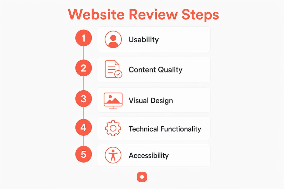
2. Content quality. Accuracy, relevance, and readability all belong here. Look for outdated information, missing context, and copy that assumes too much prior knowledge from the reader.
3. Visual design. Assess brand consistency, layout hierarchy, typography, and color contrast. A page can look polished and still fail if the visual hierarchy does not guide the eye toward the right action.

4. Technical functionality. Core Web Vitals metrics, specifically Largest Contentful Paint (LCP), Interaction to Next Paint (INP), and Cumulative Layout Shift (CLS), give you measurable benchmarks for speed, responsiveness, and visual stability. Also check for broken links, browser compatibility, and device rendering.
5. Accessibility. Review against WCAG standards: text contrast ratios, keyboard navigation, alt text on images, and label clarity on form fields. For a deeper look at what teams commonly miss, the accessibility oversights guide covers the most frequent gaps heading into 2026.
Pro Tip: Separate your technical review from your aesthetic review. Mixing bug reports with design opinions in the same pass creates confusion about what needs fixing versus what needs a conversation. Treat them as two distinct sessions.
Best practices for keeping website reviews continuous
One-time audits miss the point. UXMatters research shows that continuous review processes catch emerging UX issues and keep pace with user expectations far better than periodic deep dives.
Audit frequency: A comprehensive website review should be conducted regularly to maintain competitive and functional web experiences.
Practical habits that make continuous review work:
- Schedule lightweight reviews monthly and full audits every six months
- Use version control to track what changed between review cycles
- Combine automated scanning tools with qualitative walkthroughs on every cycle
- Assign severity levels to findings immediately so nothing sits unresolved
- Document decisions, not just problems, so future reviewers understand the context
Prioritizing by impact keeps the process from stalling. A broken checkout flow outranks a misaligned footer margin every time. Focus resources on issues that directly affect user goals and conversion paths first.
How Usepinhub gives you pixel-level visual feedback
Vague feedback wastes everyone's time. Comments like "the header feels off" or "this section looks cluttered" force designers to guess what the reviewer actually means. Precise, screenshot-anchored feedback reduces that miscommunication and speeds up iteration cycles.
Usepinhub is built specifically for this. Teams upload screenshots or Figma designs, then pin comments directly onto the exact pixel area they are referencing. Each pin opens a threaded discussion anchored to that screen location, so context never gets lost. Guest reviewers can participate without creating accounts, which removes friction for clients and stakeholders who are not part of the core team.
| Feature | Benefit |
|---|---|
| Pinned comments on screenshots | Feedback is anchored to a specific location, no ambiguity |
| Threaded discussions per pin | Conversations stay organized by issue, not by date |
| Guest access without accounts | Clients and stakeholders can review without onboarding |
| Version control | Teams track changes across design iterations |
| AI feedback summaries | Key issues surface quickly without reading every thread |
| Password-protected share links | Sensitive designs stay secure during external review |
| Browser extension for screenshots | Capture live pages directly for immediate annotation |
Additional benefits for distributed teams:
- Reduces back-and-forth emails about design specifics
- Keeps all feedback in one place, tied to the relevant design version
- Supports website annotation workflows that cross-functional teams can follow without a learning curve
Pro Tip: Use Usepinhub's AI summary feature after each review round to generate a consolidated list of open issues. Share that list in your next standup instead of walking through every pin individually.
Expert checklists and QA methods that catch what you miss
A structured QA checklist closes the gap between what reviewers notice and what actually affects users. Cover these categories on every review pass:
- Usability: Task completion paths, navigation labels, error messages, and empty states
- Content: Spelling, grammar, outdated dates, broken internal links, and missing metadata
- SEO: Page titles, H1 structure, canonical tags, and image alt attributes
- Performance: Page load time on mobile data, script bloat, and image compression
- Accessibility: Contrast ratios, focus indicators, form labels, and screen reader compatibility
- Security: HTTPS status, certificate validity, and exposed sensitive data.
Mobile-first testing on real devices is non-negotiable. UI issues appear differently on an actual phone than on a resized desktop browser, particularly around tap target size, sticky headers, and form field behavior.
Heatmaps and session recordings add a layer of behavioral data that checklists cannot capture. They reveal where users hesitate, where they drop off, and where confusing layout shifts or unclear calls to action create what reviewers call "conversion leaks." Pair that behavioral data with your checklist findings and you get a much clearer picture of what to fix first.
Review reports should group findings by domain, assign a severity level to each issue, and include a screenshot or annotation as evidence. A finding without context is just an opinion.
What a complete website review process looks like
The full process runs in five stages. First, define your goals: are you auditing for a redesign, a launch, or a quarterly health check? The answer shapes which domains you weight most heavily. Second, select your methods. Evaluation methods should be tailored to the specific website and the goals of the review, since no single approach covers every attribute. Third, gather data using both automated tools and direct observation. Fourth, analyze findings and group them by domain and severity. Fifth, produce a report with prioritized recommendations tied to specific evidence.
A useful website QA checklist covers more than 35 checks across these stages and gives teams a repeatable starting point for every review cycle.
Why iterative reviews outperform one-time audits
A single audit gives you a snapshot. An iterative review process gives you a trend line. When you review on a regular cadence, you can see whether a fix actually worked, whether a new feature introduced a regression, and whether user behavior is shifting in ways that require a design response.
The practical difference shows up in how teams handle findings. One-time audits often produce long reports that sit unread. Iterative reviews produce shorter, focused findings that feed directly into the next sprint or design cycle.
Expert checklists and the 5-second test in practice
The 5-second test works because it mirrors real user behavior. Visitors do not read pages, they scan them. If the headline, subhead, and primary call to action do not communicate the site's purpose within five seconds, most visitors will leave before they engage with anything else.
Run the test by showing a screenshot of the page to someone unfamiliar with the site. After five seconds, ask: what does this site do, who is it for, and what should you do next? Gaps in their answers point directly to clarity problems in the visual hierarchy or copy.
Expert checklists formalize this kind of structured observation. They prevent reviewers from defaulting to personal taste and keep feedback grounded in user-centered criteria.
Tools and software for conducting website reviews
The right tool depends on what you are measuring. For website design evaluation, you need something that captures visual context alongside the feedback. For technical audits, you need performance data and crawl reports.
Common categories of tools design teams use:
- Performance and SEO: Google Search Console, Google PageSpeed Insights, and Core Web Vitals reports
- Accessibility: WAVE and browser-based contrast checkers
- Behavioral data: Heatmap and session recording platforms
- Visual feedback and annotation: Usepinhub for screenshot-based, pixel-anchored team reviews
- QA testing: Dedicated QA tester tools that cover both usability and backend stability
Combining automated tools with qualitative human evaluation is the approach that surfaces the most complete picture. Automated tools catch measurable issues fast. Human reviewers catch the things that feel wrong but do not trigger an error code.
Common pitfalls to avoid during website reviews
The most frequent mistakes are not technical. They are process failures.
Reviewing only on desktop is the biggest one. Mobile accounts for the majority of browsing globally, and Google indexes the mobile version of pages first. If your review does not include real device testing, you are missing the primary user experience.
Mixing aesthetic opinions with technical findings in the same report creates confusion about what requires a developer versus a designer. Keep them separate. Ignoring accessibility basics is another common gap. WCAG compliance is not just a legal consideration; it directly affects usability for a broad range of users.
Finally, producing a report without severity levels leaves teams without a clear starting point. Every finding needs a priority so the team knows what to address in the next cycle versus what can wait.
How to prioritize issues based on impact and severity
Severity levels give your review report structure. A common framework uses three tiers: critical issues that block user goals or break core functionality, significant issues that create friction or confusion without fully blocking users, and minor issues that affect polish or edge cases.
Within each tier, prioritize by the number of users affected and the frequency of the affected interaction. A broken mobile checkout flow is critical regardless of how small the visual fix looks. A misaligned icon on a rarely visited page is minor even if it is easy to fix.
Connecting each finding to a specific user goal keeps prioritization grounded. Ask: does this issue prevent or slow down a user from completing the main task on this page? If yes, it moves up the list.
What an effective website review report looks like
A good report is short, specific, and tied to evidence. Each finding includes the domain it belongs to, the severity level, a description of the issue, a screenshot or annotation showing exactly where it occurs, and a recommended action.
Group findings by domain rather than by page. This makes it easier for the right team member, developer, designer, or content editor, to pick up their section and act on it without reading the whole document.
Avoid vague language in recommendations. "Improve the CTA" is not a recommendation. "Change the primary CTA button label from 'Submit' to 'Get Your Free Quote' and increase its contrast ratio to meet WCAG AA" is one. Specificity is what turns a review report into a workable task list.
Usepinhub makes precise website feedback faster
Scattered feedback across email threads and comment docs slows design teams down. Usepinhub gives you a single place to collect, organize, and resolve visual feedback, with every comment pinned to the exact pixel it references.
Upload a screenshot, drop a pin, and start a threaded discussion anchored to that spot. Your team sees exactly what you mean without a follow-up explanation. Guest reviewers join without creating accounts, so clients and stakeholders can contribute feedback the same day you share a link. Version control keeps every iteration organized, and AI summaries surface the key issues after each round so nothing gets buried.
If your team is spending more time clarifying feedback than acting on it, try Usepinhub free and run your next review with every comment tied to a specific location on the design.
Key Takeaways
A thorough website review covers five core domains, runs on a regular cadence, and delivers findings specific enough to act on without a follow-up conversation.
| Point | Details |
|---|---|
| Five evaluation domains | Cover usability, content, visual design, technical functionality, and accessibility on every review. |
| Review every six months | A comprehensive audit at least every six months keeps web experiences competitive and functional. |
| Separate technical from aesthetic | Run technical and design reviews as distinct sessions to keep findings clear and actionable. |
| Prioritize by user impact | Rank issues by how directly they block or slow user goals, not by how easy they are to fix. |
| Usepinhub for visual feedback | Pin comments directly on screenshots to eliminate vague feedback and speed up design iterations. |
FAQ
What does a website review cover?
A website review evaluates usability, content quality, visual design, technical functionality, and accessibility. Research supports covering all five domains since each surfaces a different category of issues.
How often should you review a website?
A comprehensive website review should be conducted at least every six months to keep the site competitive and functional. Lighter checks on specific areas can run more frequently.
What is the 5-second test in website evaluation?
The 5-second test checks whether a new visitor can identify what a site does, who it serves, and what to do next within five seconds. It is a fast way to surface clarity problems in headlines and visual hierarchy.
How do you write a useful website review report?
Group findings by domain, assign a severity level to each issue, and include a screenshot or annotation as evidence. Vague observations without context do not give teams enough to act on.
How does Usepinhub help with website reviews?
Usepinhub lets teams pin comments directly onto screenshots, keeping feedback anchored to a specific location on the design. Guest reviewers can participate without accounts, and version control tracks changes across iterations.