
TL;DR:
- Website design evaluation measures how well a site meets user needs through design, usability, and performance criteria. It helps identify issues that cause high bounce rates and low conversions, providing a framework to prioritize fixes. Combining automated AI tools with expert review ensures comprehensive and accurate assessments.
Website design evaluation is the process of measuring how well a site meets user needs and business goals through specific design, usability, and performance criteria. Web designers and digital marketers who skip this process make decisions based on preference rather than evidence. The result is predictable: high bounce rates, low conversions, and frustrated visitors. A structured website design review changes that. It gives you a repeatable framework to identify what works, what fails, and what to fix first.
What are the key criteria for evaluating website design?
A website design review covers five core categories: visual design, usability, content quality, technical performance, and conversion readiness. Each category contains specific checkpoints that reveal whether a site is built to serve users or just to look good.
Visual design
Visual hierarchy, color contrast, typography, and brand consistency are the four pillars of strong visual design. Hierarchy guides the eye from the most important element to the least important. Color contrast affects both readability and accessibility under WCAG 2.1 standards, which require a minimum contrast ratio of 4.5:1 for normal text. Typography choices affect how long visitors stay on a page. Brand consistency builds recognition and trust across every screen.

Usability and navigation
Usability measures how easily a visitor can find what they need. Key checkpoints include clear navigation labels, logical page structure, mobile responsiveness, and touch-friendly tap targets. A site that works perfectly on desktop but breaks on a phone fails a large portion of its audience. Google's mobile-first indexing means mobile usability also directly affects search rankings.
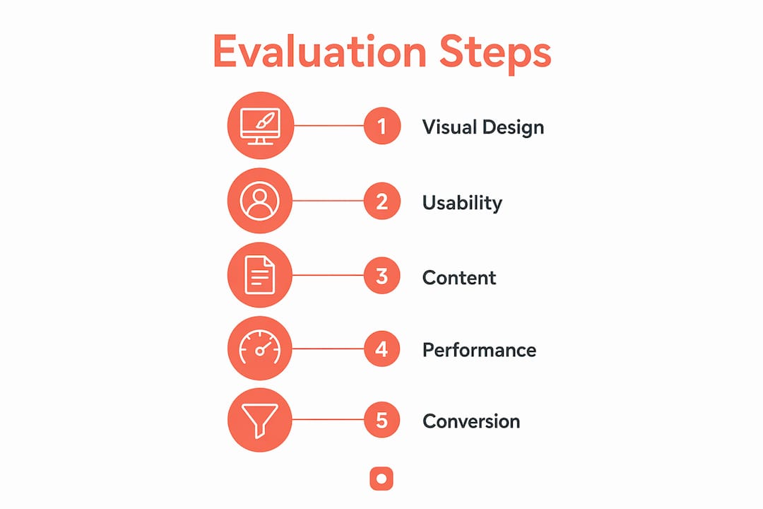
Content quality and technical performance
Content must be readable, accurate, and organized around what the visitor needs to know. Technical performance covers load speed, SEO fundamentals, and accessibility compliance. Combining quantitative and qualitative analysis avoids the bias that comes from measuring only one dimension. Load speed, validation errors, and accessibility scores give you numbers. Usability and content clarity give you context.
Conversion-focused elements
Conversion readiness is where design meets business outcomes. Clear calls to action, trust signals like testimonials and security badges, and functional forms are the checkpoints here. Effective evaluations audit momentum from the landing page to the desired action, not just the visual finish. Bounce rates are the clearest signal that this momentum is broken.
| Category | Key Checkpoints |
|---|---|
| Visual design | Hierarchy, color contrast, typography, brand consistency |
| Usability | Navigation clarity, mobile responsiveness, tap targets |
| Content quality | Readability, accuracy, user-focused structure |
| Technical performance | Load speed, SEO basics, WCAG accessibility compliance |
| Conversion readiness | CTAs, trust signals, form functionality |
How do tools and frameworks help you assess web design quality?
The most effective approach to assessing web design quality combines automated tools with manual expert review. Neither method alone gives you the full picture.
AI-powered audit tools
AI UI/UX audits evaluate websites across 7 to 12 dimensions, with visual design weighted up to 25% for first impressions. That weighting reflects how quickly visitors form judgments about a site. Common dimensions include mobile experience (15–20%), usability (15–20%), and accessibility (10–20%). AI first impression tools grade above-the-fold content on a 0–100 scale, with scores below 40 indicating significant trust gaps or confusion. These scores give you a fast, objective baseline before you invest time in deeper analysis.
One critical limitation: multi-model AI consensus using tools like GPT-4, Gemini, and Claude increases reliability. Single-model reliance risks hallucinations and false positives. For high-stakes evaluations, run your site through at least two AI models and compare findings before drawing conclusions.
Manual expert audits
Manual expert audits cost about $375 on average and deliver prioritized video walkthroughs within 7 business days. That cost buys something automated tools cannot provide: human judgment. Expert audits reveal invisible friction points like emotional path illogic and brand voice disconnects that code-based scanners miss entirely. A scanner can flag a slow load time. Only a human reviewer can tell you that your headline contradicts your brand promise.
AI personas and ICP agents
AI personas provide fast, low-cost message validation by replicating target buyer goals and frustrations. They act as a cheaper, faster validation layer before you commit to expensive user testing. You can use them to check whether your messaging resonates with a specific buyer profile before a single real user sees the page. This approach is especially useful for evaluating design from a buyer's perspective when real user testing is not yet in the budget.
Conversion frameworks
The AARRR framework (Acquisition, Activation, Retention, Referral, Revenue) maps design decisions to business outcomes at each stage of the funnel. Applying it during a review forces you to ask whether each page element serves a specific stage. A homepage hero section, for example, belongs to Acquisition and Activation. If it fails to communicate value clearly, it fails both stages simultaneously.
Pro Tip: Run your site through two AI audit tools before scheduling a manual expert review. Use the AI scores to identify the highest-priority areas, then direct the human reviewer to focus there. This approach cuts review time and sharpens the findings.
How to conduct a step-by-step website design evaluation
A structured process produces consistent, comparable results across evaluations. Follow these eight steps in order.
-
Define goals and audience. Identify who the site serves, what action you want them to take, and what business outcome that action supports. Without this foundation, every finding is subjective.
-
Gather tools and data sources. Collect Google Analytics data, Google Search Console reports, and outputs from at least one AI audit tool. Baseline data makes your findings defensible.
-
Analyze first impressions and messaging clarity. Load the homepage and note what you understand within five seconds. If the value proposition is not clear immediately, visitors will not wait for it to become clear.
-
Evaluate visual hierarchy and navigation flow. Trace the path your eye follows from the top of the page. Check whether that path leads toward the primary call to action or gets lost in competing elements.
-
Test mobile responsiveness and performance. Use Google PageSpeed Insights to measure load times on mobile and desktop. Check that all navigation elements, forms, and CTAs work correctly on a phone screen.
-
Assess content readability and trust factors. Read the copy at a normal pace. Check for jargon, passive voice, and missing trust signals like client logos, testimonials, or security certifications.
-
Review conversion pathways and CTAs. Follow every conversion path from entry point to completion. Note where the path breaks, where friction appears, and whether the CTA language matches visitor intent.
-
Document findings and plan improvements. Organize findings by severity: critical issues that block conversion, significant issues that reduce trust, and minor issues that affect polish. Address critical issues first.
This sequence works because it mirrors the visitor's experience. You start where they start, move where they move, and measure what they measure.
Common pitfalls that undermine website usability assessment
The most common mistake in a website usability assessment is treating aesthetics as the primary measure of quality. A professionally finished design with poor conversion flow still fails. Sites that prioritize aesthetic polish over user guidance produce high bounce rates even when every visual element is technically correct.
Watch for these specific traps:
- Ignoring mobile and accessibility issues. WCAG compliance and mobile performance are not optional. They affect both search rankings and the experience of a significant portion of your audience.
- Relying on a single AI tool. One model's output reflects that model's training biases. Cross-reference findings across multiple tools before acting on them.
- Skipping buyer perspective. Evaluating design from your own point of view misses how your actual audience reads the page. AI personas and user acceptance testing tools fill this gap efficiently.
- Neglecting real performance data. Subjective impressions without load speed data, bounce rate data, or heatmap data are incomplete. Numbers anchor your qualitative observations.
"Design evaluation that focuses only on how a site looks misses the point entirely. The real question is whether the design creates momentum toward the action you want visitors to take. Aesthetics support that goal. They do not replace it."
Pro Tip: After completing your evaluation, share your findings as annotated screenshots with your team. Pixel-level comments on specific design elements eliminate the vague feedback that slows down revision cycles.
Key Takeaways
Effective website design evaluation requires combining visual, usability, technical, and conversion criteria with both automated tools and human expertise.
| Point | Details |
|---|---|
| Use five core categories | Assess visual design, usability, content, technical performance, and conversion readiness together. |
| Combine AI and human review | AI audits provide fast baselines; expert audits reveal friction that automated tools miss. |
| Apply multi-model AI validation | Use at least two AI tools to reduce false positives before acting on findings. |
| Follow the visitor's path | Structure your evaluation to mirror how a real visitor moves through the site. |
| Prioritize by severity | Fix critical conversion blockers first, then address trust issues, then polish. |
What I've learned from evaluating hundreds of websites
The most consistent pattern I see is this: teams spend weeks on visual refinement and skip the conversion flow entirely. They launch a site that looks polished and performs poorly. The visual design passes every aesthetic check. The bounce rate tells a different story.
The second pattern is over-reliance on a single evaluation method. A team runs one AI audit, sees a score of 72, and calls the site acceptable. They miss the emotional path illogic that a human reviewer would catch in the first five minutes. No single tool, AI or otherwise, gives you the complete picture.
What actually works is treating evaluation as a continuous process, not a one-time event. Design decisions compound over time. A navigation change made in january affects conversion data you will not see until march. Running quarterly evaluations lets you catch those effects before they become entrenched problems. It also builds a record of what changed, when it changed, and what happened as a result.
The teams that get the most from design evaluation are the ones who connect every finding to a business metric. Not "the CTA button is too small" but "the CTA button is too small, and that correlates with a 34% drop-off at the checkout step." That framing gets fixes prioritized and implemented. Vague observations get filed and forgotten.
— Pinhub
Pinhub makes website design feedback faster and clearer
Getting precise, organized feedback on a website design is one of the hardest parts of the evaluation process. Vague comments in email threads slow everything down.
Usepinhub solves this by letting you upload screenshots and pin comments directly onto specific design elements. Every piece of feedback is anchored to an exact pixel location, so there is no confusion about what is being discussed. Guest reviewers can participate without creating an account, which means clients and stakeholders can give feedback immediately. Usepinhub also generates automated summary lists and supports version control, so your team always knows what changed and what still needs attention. Start your first evaluation at Usepinhub with five free evaluations included.
FAQ
What does it mean to evaluate website design?
Website design evaluation is the process of measuring how well a site serves user needs and business goals across visual design, usability, technical performance, and conversion criteria. It combines objective data with qualitative analysis to identify specific improvements.
How do I analyze website design without a big budget?
Start with free tools like Google PageSpeed Insights for performance and a single AI audit tool for visual and usability scoring. Prioritize findings by severity and address conversion blockers before investing in a full manual expert review.
What is WCAG and why does it matter for design evaluation?
WCAG (Web Content Accessibility Guidelines) is the international standard for web accessibility, requiring a minimum color contrast ratio of 4.5:1 for normal text. Failing WCAG compliance excludes users with disabilities and can affect search rankings.
How often should you conduct a website design review?
Quarterly reviews catch the compounding effects of design changes before they become entrenched problems. Run a full evaluation after any major redesign, content overhaul, or significant drop in conversion metrics.
What is the biggest mistake in website usability assessment?
Prioritizing aesthetic polish over conversion flow is the most common and costly mistake. A visually finished site with poor user guidance produces high bounce rates regardless of how good it looks.