
TL;DR:
- Effective website feedback involves gathering user input to improve usability, design, and functionality. It combines quantitative metrics with qualitative insights to identify issues early and prioritize impactful changes. Usepinhub offers a precise, visual feedback tool that streamlines design reviews and enhances feedback clarity.
Feedback on website design is the process of gathering input from users and stakeholders about a site's usability, visual clarity, and functionality, then using that input to make better design decisions. Done well, it reduces costly redesigns, validates assumptions before development begins, and gives your team a clear picture of what users actually experience. The goal is not just to collect opinions but to surface patterns that point to real improvements in user experience, conversion rates, and brand perception.
Here is what effective website design feedback typically helps you accomplish:
- Identify usability problems before they reach development
- Validate design assumptions with real user input
- Prioritize changes based on user needs and business goals
- Reduce development rework by catching issues early
- Improve accessibility, navigation clarity, and overall satisfaction
Tools like Net Promoter Score (NPS) surveys, visual annotation platforms, and behavior analytics each play a role in this process. Usepinhub, for example, takes a pixel-anchored approach, letting teams pin comments directly on screenshots to eliminate the vague, hard-to-act-on feedback that slows most review cycles down.
What does feedback on website design actually look like?
Website design feedback comes in more forms than most teams realize. Understanding the range helps you choose the right method for each stage of your project.
Quantitative feedback gives you measurable signals:
- Star ratings and NPS scores (the 0–10 scale that segments users into Promoters, Passives, and Detractors)
- Thumbs up/down responses, which yield higher completion rates than longer surveys
- Customer Effort Score (CES), which measures how easy a task was to complete
- Heatmaps, which show where users click, scroll, and focus attention
Qualitative feedback tells you the "why" behind the numbers:
- Open-ended text comments left via on-site widgets or post-task surveys
- Visual annotations pinned to specific design elements
- Bug reports with screenshots and reproduction steps
- Session recordings that reveal hesitation, confusion, or drop-off points
Exit-intent popup surveys are a particularly useful channel. Triggered when a user's cursor moves toward the browser bar, they capture honest sentiment from visitors who are about to leave without converting. Embedded feedback widgets, on the other hand, stay visible throughout the session, letting users flag issues on their own terms.
The most useful feedback usually combines both types. A thumbs-down rating tells you something is wrong; the optional open-ended follow-up tells you what. Pairing a simple quantitative metric with a single open-ended question is the format Nielsen Norman Group recommends for feedback surveys, and it works because it respects users' time while still capturing motivation.
How do you collect website feedback effectively?
The single most common mistake teams make is asking for feedback at the wrong moment. Interrupting a user mid-task produces low-quality responses and frustrates the people you are trying to learn from. The fix is straightforward: wait until after users complete a task before asking for input. This "task-then-ask" rule is the foundation of every effective feedback collection strategy.
Beyond timing, here are the practices that consistently produce better results:
- Keep surveys short. A feedback survey should take around 1 minute to complete. Longer forms see higher abandonment and lower-quality responses.
- Mix question types. Start with a rating scale for quick quantitative data, then offer an optional open-ended field for context.
- Use the right channel. Users prefer feedback requests in the channel where they interact with your product. If they are on your website, ask there, not via a follow-up email three days later.
- Offer multiple feedback options. Some users prefer a quick rating; others want to write a paragraph. Giving both options increases willingness and honesty in responses.
- Avoid survey fatigue. Space out feedback requests and focus each survey on a single design question rather than trying to cover everything at once.
- Incentivize thoughtfully. Explaining how feedback will be used and expressing appreciation raises participation rates. Loyalty points or a small discount can help, but transparency matters more.
For internal stakeholders, the process looks different. Designers and developers reviewing the same set of high-fidelity mockups need a shared space to leave comments tied to specific elements, not a shared inbox full of email threads. Tools built for annotating websites collaboratively solve this by keeping every comment anchored to the exact pixel it refers to.
Pro Tip: Use AI-assisted feedback tools to filter and group open-ended responses before your team reviews them. This cuts analysis time significantly and surfaces the patterns that matter most, so your team spends time deciding what to fix, not reading through raw responses.
Why does website feedback matter for design improvement?
Feedback fills the gap between what your analytics show and what your users actually experience. A bounce rate tells you people are leaving; it does not tell you why. A heatmap shows where attention goes; it does not explain what users expected to find there. Continuous feedback widgets provide a sentiment pulse that helps you track how users feel over time, but they work best when they steer formal usability research rather than replace it.
The practical benefits of building feedback into your design process include:
- Fewer late-stage surprises. Problems caught during the design phase are far cheaper to fix than problems discovered after development. Developer input early in the design phase reduces scope creep and avoids time-consuming rework.
- Better prioritization. When you know which issues frustrate the most users, you can rank design changes by impact rather than guessing.
- Improved accessibility. Feedback from users with different needs surfaces barriers that automated checks miss.
- Higher user satisfaction. Iterating on real input rather than internal assumptions produces designs that actually work for the people using them.
- Reduced development errors. Catching missing states, unclear navigation, and inconsistent components during review prevents bugs from reaching production.
The teams that get the most value from feedback treat it as an ongoing loop, not a one-time audit. Collecting input after launch, analyzing it regularly, and feeding findings back into the next design iteration is what separates sites that improve steadily from those that stagnate.
What are the top website feedback tools available in the USA in 2026?
The market for website feedback tools has grown considerably, and the right choice depends on your team's size, workflow, and the type of feedback you need most. The tools below cover the full range, from enterprise survey platforms to lightweight visual annotation widgets.
| Tool | Type | Key Features | Pricing | Best For |
|---|---|---|---|---|
| Mopinion | Continuous feedback platform | Real-time feedback, analytics dashboards, survey logic | Tiered plans | Enterprises and UX teams needing comprehensive insights |
| Netigate | Survey platform | Customizable surveys, strong analytics, employee feedback | Tiered plans | Businesses focused on structured survey-based feedback |
| Hotjar | Behavior analytics | Heatmaps, session recordings, feedback polls | Free + paid tiers | Marketers and product teams tracking user behavior visually |
| SurveyMonkey | Survey platform | Flexible survey builder, large distribution options | Free + paid tiers | Organizations needing easy-to-deploy surveys at scale |
| GetFeedback | CRM-integrated feedback | CRM integration, detailed reporting, in-context surveys | Paid plans | Sales and support teams needing direct feedback integration |
| Qualtrics | Enterprise experience management | Advanced analytics, workflow automation, scalable surveys | Enterprise pricing | Large organizations requiring advanced feedback workflows |
| HubSpot Customer Feedback Tools | Marketing-integrated feedback | CRM integration, NPS and CSAT surveys, automation | Free + paid tiers | Marketing teams using feedback for campaign optimization |
| Qualaroo | On-site micro-survey tool | Behavior-triggered surveys, AI analysis, targeting | Tiered plans | Product teams seeking contextual feedback on user flows |
| Usersnap | Visual bug tracking | Screenshot annotations, bug reporting, integrations | Tiered plans | Development and QA teams streamlining issue reporting |
| UserVoice | Product feedback management | Idea collection, voting, prioritization pipelines | Paid plans | Product managers driving feature requests |
| MarkUp.io | Visual annotation | Pixel-specific comments, collaboration, live site markup | Free + paid tiers | Design and marketing teams needing visual feedback workflows |
| Filestage | Online proofing | Multi-file review, approval workflows, version tracking | Tiered plans | Creative teams managing feedback across design projects |
| ruttl | Visual feedback platform | Real-time annotations, task assignment, website markup | Free + paid tiers | Remote teams collaborating on design iterations |
| Pastel | Live site annotation | Client commenting on live sites, simple interface | Tiered plans | Freelancers and agencies collecting client feedback |
| ReviewStudio | Creative review software | Multi-file review, discussion threads, approval cycles | Tiered plans | Agencies handling multi-round review feedback |
| Ziflow | Online proofing | Automated version control, comparison tools, approvals | Tiered plans | Marketing and creative teams managing complex review cycles |
| Marker.io | Bug reporting and feedback | Visual feedback capture, project management integrations | Tiered plans | Developers and testers linking feedback to issue tracking |
| nootiz | Visual feedback widget | Embedded widget, pinpointed annotations, client input | Tiered plans | Digital teams collecting client and user input visually |
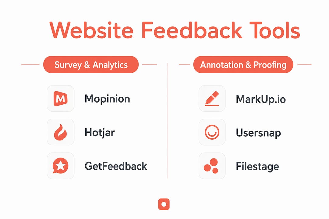
Survey and analytics platforms
Mopinion sits at the enterprise end of the survey-and-analytics category. It combines real-time feedback collection with customizable dashboards and survey logic, making it well suited for UX teams that need to track sentiment across multiple digital channels simultaneously. Netigate takes a similar structured approach, with particular strength in employee feedback alongside customer surveys.
Hotjar is the go-to for teams that want to see behavior, not just hear about it. Heatmaps and session recordings give you visual evidence of where users struggle, and the feedback polls layer direct sentiment on top of that behavioral data. SurveyMonkey and Qualtrics serve different ends of the same spectrum: SurveyMonkey for teams that need quick, flexible surveys without a steep learning curve, and Qualtrics for enterprises that need sophisticated analytics, branching logic, and workflow automation at scale.
GetFeedback and HubSpot Customer Feedback Tools both shine when feedback needs to flow directly into a CRM. GetFeedback connects tightly with Salesforce, while HubSpot's tools work naturally within its own marketing and sales ecosystem. Qualaroo takes a different angle entirely, using behavior-triggered micro-surveys to ask the right question at exactly the right moment in a user's session.
Visual annotation and proofing tools
This category is where the feedback gets most specific. Rather than asking users how they feel about a page, visual annotation tools let reviewers point to exactly what they mean.

MarkUp.io lets teams leave pixel-specific comments on live websites or static designs, which cuts down on the back-and-forth that vague written feedback creates. ruttl offers similar live-site annotation with real-time collaboration and task assignment, making it a practical choice for distributed teams. Pastel keeps things simple: clients click on any element of a live site and leave a comment, with no technical setup required. That simplicity makes it a strong fit for freelancers and small agencies.
Usersnap focuses on the development side of feedback, combining screenshot-based annotations with bug reporting and integrations into tools like Jira and Trello. Marker.io covers similar ground, with an emphasis on automatically creating issues in project management apps from captured feedback. nootiz embeds a lightweight widget directly on the site, letting clients and users drop pinned comments without leaving the page.
Filestage, ReviewStudio, and Ziflow are built for creative teams managing multi-round review cycles across many file types. Filestage centralizes approvals and version tracking. ReviewStudio handles multi-file review with threaded discussions. Ziflow automates version comparison and consolidates approvals, which is particularly useful when multiple stakeholders need to sign off before a design moves forward.
How do professionals review and evaluate website design feedback?
Collecting feedback is only half the work. Knowing how to evaluate it, and then decide what to act on, is where most teams struggle.
What a thorough design review covers
Professional website design reviews examine more than aesthetics. A complete review addresses visual hierarchy, copy clarity, navigation logic, and user flow, but it also covers technical feasibility, responsive behavior, and accessibility compliance. The reason to include all of these is practical: most problems are far easier to address during the design phase than once designs are committed to code.
Key areas a thorough review should cover:
- Visual consistency: Are styles, spacing, and components consistent across pages?
- User experience: Are navigation patterns intuitive? Are interactive elements clearly defined?
- Responsive design: Does the layout hold up across screen sizes and devices?
- Accessibility: Does the design meet WCAG standards? Are color contrast, focus states, and alt text addressed?
- Technical feasibility: Can every element be built as designed within the platform's constraints?
- Content scalability: Will the design hold up when real content replaces placeholder text?
Visual design comments often overlook critical technical concerns like responsive behavior and workflow logic. That is why involving a developer in the design review, not just at handoff, consistently produces better outcomes. A developer reviewing designs through a technical lens catches missing states, unclear click areas, and accessibility gaps that a purely visual review misses.
Heuristic evaluation and prioritization
Heuristic evaluation applies a set of established usability principles to assess a design without requiring user testing. Nielsen Norman Group's ten heuristics, covering areas like error prevention, recognition over recall, and consistency, give reviewers a structured framework for identifying problems that users would likely encounter.
Once feedback is collected, prioritization becomes the critical decision. Not every piece of input deserves equal weight. A useful approach is to sort feedback into three buckets: fix now (issues that block users or break core functionality), fix soon (friction points that reduce satisfaction but do not prevent task completion), and consider later (nice-to-have improvements with lower impact). This keeps the team focused on changes that move the needle rather than chasing every suggestion.
Pro Tip: AI-enabled feedback tools now detect obvious usability issues like color contrast failures and layout inconsistencies automatically. Use them as a first pass to clear the straightforward issues, then reserve expert review time for the nuanced design decisions that require human judgment.
For teams evaluating their own design process, a website design review checklist covering both visual and technical dimensions gives reviewers a consistent starting point across every project.
Analyzing feedback patterns over time
Nielsen Norman Group recommends reading through feedback on a weekly or monthly basis and grouping similar responses to find patterns. A single complaint about confusing navigation might be noise. The same complaint appearing across twenty sessions is a signal worth acting on. Automated accessibility testing tools can complement this manual analysis by flagging compliance issues that might otherwise take hours to catch manually.
The teams that improve fastest are the ones that close the loop: they collect feedback, analyze it for patterns, prioritize the highest-impact changes, implement them, and then collect feedback again to verify the fix worked.
Usepinhub gives your team a cleaner way to review designs
The tools compared above cover a wide range of feedback needs, from enterprise survey platforms to live-site annotation widgets. If your team's main challenge is vague, hard-to-act-on feedback during design reviews, Usepinhub offers a focused alternative worth considering.

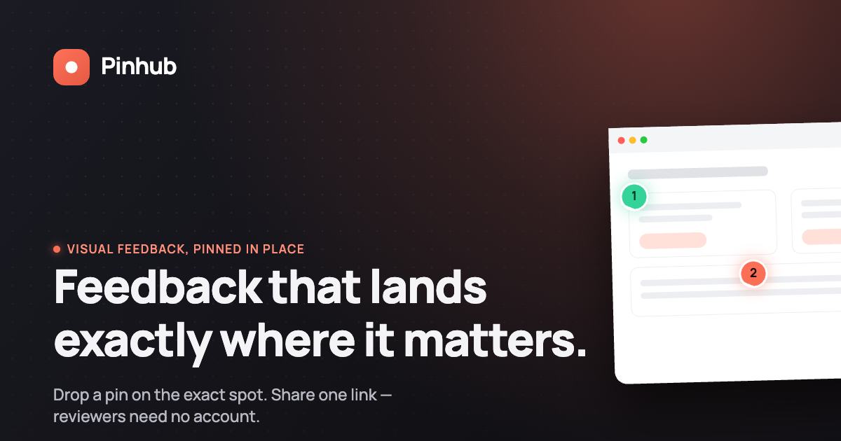
Usepinhub lets you upload screenshots or Figma designs and pin comments directly onto specific areas of the image. Every comment is anchored to the exact pixel it refers to, so reviewers and designers are always talking about the same thing. Guest reviewers can participate without creating an account, which removes the friction that slows down client review cycles. Version control keeps the history of changes organized, and AI-powered summaries turn a thread of pinned comments into a clear, prioritized list of what needs attention.
For product design teams, marketing agencies, and remote collaborators who spend too much time decoding vague written feedback, Usepinhub is built around the specific problem of making design feedback precise and fast to act on. It fits naturally alongside the broader tools in this list, handling the visual review layer while your survey or analytics platform handles the quantitative side.
FAQ
What are some examples of feedback on website design?
Common examples include NPS scores, thumbs up/down ratings, open-ended text comments, heatmaps showing where users click, visual annotations pinned to specific design elements, bug reports with screenshots, and exit-intent survey responses. Each type captures a different dimension of the user experience.
How do you review a website design effectively?
A thorough review covers visual hierarchy, copy clarity, navigation, responsive behavior, accessibility compliance, and technical feasibility. Involving a developer alongside a designer catches issues that a purely visual review misses, and using a structured checklist keeps the process consistent across projects.
What questions should you ask in a website feedback survey?
Focus on one issue per survey and pair a rating question with a single optional open-ended follow-up. Useful questions include "Did you find what you were looking for today?" and "What, if anything, made this task difficult?" Avoid leading questions that push users toward a predetermined answer.
What are the 7 C's of website design?
The C's framework covers Context, Content, Community, Customization, Communication, Connection, and Commerce. It is a model for evaluating the completeness of a website's design and user experience across multiple dimensions, though definitions vary slightly by source.
How does Usepinhub differ from traditional feedback survey tools?
Usepinhub focuses on visual, pixel-anchored feedback rather than survey responses. Reviewers pin comments directly onto screenshots or Figma designs, which makes feedback specific and easy to act on. It complements survey tools by handling the visual review layer that text-based surveys cannot capture.
Key Takeaways
Collecting and acting on website design feedback is the most direct path to a site that works better for the people using it.
| Point | Details |
|---|---|
| Task-then-ask timing | Ask for feedback after users complete a task, not mid-task, to get higher-quality, more honest responses. |
| Short surveys win | A feedback survey should take around 1 minute to complete; longer forms reduce response quality. |
| Combine feedback types | Pair a quantitative rating with an optional open-ended follow-up to capture both the signal and the reason behind it. |
| Review beyond aesthetics | Effective design reviews cover visual consistency, accessibility, responsive behavior, and technical feasibility, not just how a page looks. |
| Usepinhub for visual reviews | Usepinhub's pixel-anchored comment system makes design feedback specific and fast to act on, particularly for teams reviewing screenshots and Figma files. |