
TL;DR:
- A structured mobile-first review scores design, usability, performance, SEO, and conversion to generate prioritized developer tickets. Using pixel-anchored feedback and measurable Web Vitals, teams can identify issues critical to user experience and ranking. Usepinhub streamlines this process with visual annotations, guest access, version control, and AI summaries, making reviews faster and clearer.
Run a structured, mobile-first review that scores design, usability, performance, SEO, and conversion potential, then produce a prioritized, developer-ready fix list. Weighted scoring combined with mobile testing and pixel-anchored feedback converts subjective impressions into tickets a developer can act on without a single clarifying question.
Start here — three actions you can take today:
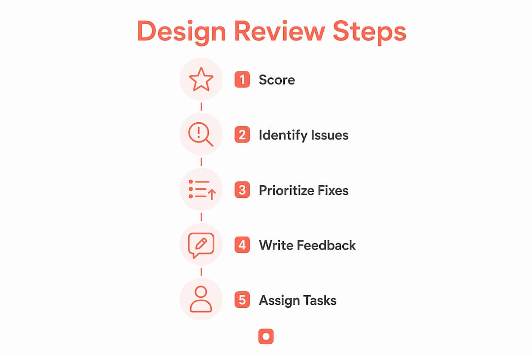
- Score the page across five categories using a weighted framework (design, usability, performance, SEO, conversion)
- Walk the primary user journey on a real phone and note every friction point
- Capture annotated screenshots with acceptance criteria attached to each comment
This approach works because it removes opinion from the equation. When every reviewer uses the same scoring template and every comment references a specific pixel location, the team stops debating and starts shipping fixes.
A weighted scoring system turns a fuzzy "something feels off" into a ranked list of what to fix first. Use five categories, each scored 0–10, then multiply by a weight that reflects business priority.
| Category | Weight | Score (0–10) | Weighted Score |
|---|---|---|---|
| Design & Brand | — | 7 | — |
| Usability | — | 5 | — |
| Conversion & Trust | — | 4 | — |
A score in this range flags Conversion & Trust and Usability as the weakest areas — those get the first sprint. Map scores to action categories: a high score range means pass, a middle range means needs work, a low score means fail and block launch.
Pro Tip: Fix architectural issues (layout, navigation structure, information hierarchy) before touching typography or color. Adjusting aesthetics on a broken layout creates rework, not progress.
For a deeper look at category-based evaluation, the website design evaluation guide on the Pinhub blog walks through scoring examples with real page types.
Table of Contents
- What does a mobile-first testing checklist look like?
- How do you measure Core Web Vitals during a design review?
- How do you write feedback developers can implement immediately?
- Who should be involved, and how long does a review take?
- How do you prioritize fixes and build a short roadmap?
- How does Usepinhub support a faster, clearer review process?
- Key Takeaways
- Why clarity beats polish in every design review
- Pinhub makes your next design review faster and clearer
- Useful sources and further reading
- FAQ
What does a mobile-first testing checklist look like?
Google indexes the mobile version first, so a desktop-only review misses the experience most visitors actually have. Run this sequence on a real phone, not a browser emulator.
- 5-second clarity test. Load the homepage cold. Can you tell what the business does and what to do next within a few seconds? If not, the headline or hero section needs work before anything else.
- Primary journey walk. Navigate homepage → primary CTA → confirmation. Note any tap targets that feel too small, any sticky header that covers content, and off-canvas menus that require multiple taps to close.
- Form and checkout test. Fill out the contact or checkout form on mobile. Check that labels remain visible when the keyboard opens, fields don't jump behind the keyboard, and autocomplete functions properly.
- Breakpoint screenshots. Capture full-page screenshots at common device widths such as smartphone and tablet sizes. Annotate layout breaks, text overflow, and image cropping.
- Edge-case tests. Throttle to "Slow 3G" in Chrome DevTools. Test with a low-battery device (reduced motion enabled). Check for gesture conflicts on carousels and sticky overlays.
Pro Tip: Check that navigation is discoverable, fonts are readable without pinching, and tap targets are large enough — these three items catch the majority of mobile friction in a single pass.
How do you measure Core Web Vitals during a design review?
Core Web Vitals directly affect abandonment and conversion. LCP, INP, and CLS each measure a different dimension of perceived performance, and each has a clear pass/fail threshold.
| Metric | What it measures | Good | Needs Work | Poor |
|---|---|---|---|---|
| LCP (Largest Contentful Paint) | Load speed of the main visible element | ≤ 2.5s | 2.5–4.0s | > 4.0s |
| INP (Interaction to Next Paint) | Responsiveness to user input | — | — | — |
| CLS (Cumulative Layout Shift) | Visual stability during load | — | — | > 0.25 |
Measurement tools and how to use them:
- PageSpeed Insights — paste the URL, get field data (real users) and lab data side by side. Screenshot the report and attach it to your review ticket.
- Chrome DevTools Lighthouse — run from the Performance tab for a local lab score; useful for testing staging environments not yet indexed.
- WebPageTest — provides filmstrip views and waterfall charts that pinpoint exactly which resource delays LCP.
First-line fixes to include in tickets: compress and convert hero images to efficient formats, add font-display swapping to prevent invisible text during font load, and defer noncritical JavaScript that blocks the main thread.
How do you write feedback developers can implement immediately?
The clearest predictor of a smooth review cycle is whether a developer can read a comment and act on it without asking a follow-up question. Use this structure for every piece of feedback:
Callout # → Severity → Area → Exact observation → Expected behavior → Reference

Before (vague): After (developer-ready): Avoid subjective phrases like "looks better," "feels modern," or "more professional." Frame every comment as: "This element prevents [user goal] because [objective observation]." That framing makes the fix self-evident.
Pro Tip: Pixel-anchored comments tied to a specific screenshot version create an automatic audit trail. When a developer resolves the thread, the accepted state is recorded — no separate change log needed. Usepinhub's version control for design feedback works exactly this way.
Who should be involved, and how long does a review take?
Involving developers early prevents the most expensive category of rework: designs that look right but can't be built as specified. Bring them in at the first structured review, not after sign-off.
Core roles and their contribution:
- Product/Design lead — owns the scoring template and facilitates the session
- Developer — flags technical feasibility, performance constraints, and responsive rules
- QA — runs the mobile checklist and edge-case tests
- PM/Stakeholder — sets business priority weights and approves the roadmap
Typical timelines:
- Single-page review (homepage or landing page): typically takes a few hours including annotation and ticket creation
- Multi-page audit (multiple pages): usually requires several days with a structured handoff meeting
- Pre-launch sweep (full site): may span several days, including accessibility checks and performance baselines
Cost factors include scope (number of pages and breakpoints), accessibility depth (WCAG AA vs. AAA), and whether the team uses a shared annotation tool or relies on email threads. Teams using a web design project management workflow typically cut review time by keeping all feedback in one place from the start.
How do you prioritize fixes and build a short roadmap?
An impact × effort matrix keeps the team focused on changes that move metrics, not just changes that are easy to make.
- Critical (blockers): High impact, any effort. Fix before launch. Examples: broken mobile navigation, CLS above 0.25, missing form labels (WCAG failure).
- Important (high business impact): High impact, moderate effort. Schedule in the next sprint. Examples: LCP above 4.0s on the homepage, CTA below the fold on mobile.
- Minor (polish): Low impact, low effort. Batch into a maintenance sprint. Examples: inconsistent button radius, missing alt text on decorative images.
Limit critical flags to a manageable number per review. When everything is critical, nothing is. For each prioritized fix, record the pre-fix metric (e.g., LCP = 4.2s), the acceptance criterion (LCP ≤ 2.5s), and the verification tool (PageSpeed Insights re-run after deploy). That pre/post structure turns your roadmap into a measurable improvement record, not just a to-do list.
How does Usepinhub support a faster, clearer review process?
Usepinhub maps directly to the capture → annotate → prioritize → resolve workflow described above.
| Review step | Usepinhub feature | What it removes |
|---|---|---|
| Capture | Browser extension screenshot | Manual screenshot + upload friction |
| Annotate | Pixel-anchored pin comments | Vague "top right area" descriptions |
| Collaborate | Guest reviewer access (no account needed) | Onboarding delays for clients or stakeholders |
| Prioritize | Threaded discussions + comment resolution checklist | Scattered email threads |
| Audit | Version history + accepted-change log | Separate change documentation |
| Summarize | AI-generated feedback summaries | Manual meeting notes |
Common team scenarios:
- Agency handoff: Upload the client's current site screenshots, invite the client as a guest reviewer, and collect pinned comments before the kickoff call. No account setup required on the client side.
- Cross-functional review: Design, dev, and QA pin comments on the same screenshot version. Threads resolve as checklist items, so the PM sees completion status without a status meeting.
- Pre-launch QA sweep: Use the pre-launch QA checklist alongside Pinhub's version control to confirm every ticket from the review has been resolved before go-live.
Usepinhub offers a free plan for solo or low-volume use, with Pro and Team plans that add unlimited screenshots, Figma integration, password-protected share links, and AI summaries, and you can complement it with Eagle Eye — AI Detector for Google Docs to automate document quality checks.
Key Takeaways
A structured, mobile-first website design review produces developer-ready tickets when it combines weighted scoring, Core Web Vitals measurement, and pixel-anchored feedback in a single repeatable workflow.
| Point | Details |
|---|---|
| Score before you critique | Use a weighted scoring system across design, usability, performance, SEO, and conversion to rank fixes objectively. |
| Mobile testing is non-optional | Google indexes the mobile version first; test on a real phone at common smartphone and tablet widths. |
| Core Web Vitals thresholds | Target LCP ≤ 2.5s, INP —, and CLS —; measure with PageSpeed Insights and Lighthouse. |
| Developer-ready feedback | Structure every comment as callout → severity → area → observation → expected behavior → reference. |
| Usepinhub for the full workflow | Pixel-anchored pins, guest access, version control, and AI summaries keep the entire review in one place. |
Why clarity beats polish in every design review
The most expensive mistake teams make is treating a design review as a taste exercise. Polished visuals on a page that fails the 5-second clarity test, loads in 5 seconds on mobile, or buries the primary CTA below the fold will not convert. The scoring framework in this guide exists precisely to prevent that: it forces the team to measure what matters before debating what looks good.
Mobile-first testing is not a checkbox. With Google's mobile-first indexing now the default, a design that only works on a 1440px desktop is effectively invisible to the majority of users. Core Web Vitals compound this: a poor LCP score doesn't just frustrate users, it directly affects search ranking and therefore the traffic the design ever gets to convert.
The shift that changes review culture is involving developers at the first session, not the last. Technical feasibility questions answered during review cost minutes. The same questions answered after sign-off cost sprints. Run the scoring template on a single page this week as a pilot. The output — a short ranked list with acceptance criteria — is more useful than any amount of general feedback, and it gives the whole team a shared language for every review that follows.
Pinhub makes your next design review faster and clearer
Design reviews stall when feedback lives in email threads, Slack messages, and verbal notes from a call. Usepinhub replaces that scattered process with pixel-anchored comments pinned directly to screenshots, so every piece of feedback has a precise location, a thread, and a resolution state.
Guest reviewers join without creating an account, which means clients and stakeholders can contribute on the same day you share a link. Version control keeps a full history of accepted changes, and AI-generated summaries turn a long comment thread into a concise handoff document for developers.
Whether you're running a single-page review or a full pre-launch sweep, Usepinhub's free plan gets your team started today. Pro and Team plans add unlimited screenshots, Figma integration, and password-protected links for client work. Start your first review and see how much faster a structured, visual feedback process moves.
Useful sources and further reading
- Core Web Vitals overview — web.dev: definitions, thresholds, and measurement guidance for LCP, INP, and CLS
- Mobile-first indexing documentation — Google Developers: why Google indexes the mobile version and what it means for design reviews
- PageSpeed Insights — Google: free field and lab performance data; attach report URLs to review tickets
- Lighthouse in Chrome DevTools — Google: run audits on staging environments before public launch
- WebPageTest — filmstrip and waterfall views for diagnosing LCP and render-blocking resources
- WCAG 2.1 Quick Reference — W3C: accessibility success criteria for contrast, keyboard navigation, tap targets, and form labeling
- Web page evaluation checklist — FourEyes: a practical scoring checklist covering speed, mobile usability, content clarity, and conversion paths
- How to review a website design — DrawOnWebsite: seven-area review sequence and annotation workflow
Save PageSpeed Insights and WebPageTest report URLs as attachments in your review tickets. They serve as the pre-fix baseline and make post-deploy verification a one-click comparison.
FAQ
What is the first step to review website design?
Run the 5-second clarity test: load the page cold and check whether a visitor can identify what the business does and what to do next within 3–5 seconds. If that fails, fix the headline and hero section before evaluating anything else.
How long does a full website design evaluation take?
A single-page review takes 2–4 hours including annotation and ticket creation. A multi-page audit of 5–10 pages typically runs 1–2 days, and a full pre-launch sweep takes 3–5 days depending on scope and accessibility depth.
Which tools measure Core Web Vitals for a design review?
PageSpeed Insights provides real-user field data and lab scores in one report. Chrome DevTools Lighthouse is useful for staging environments, and WebPageTest adds filmstrip views that pinpoint exactly which resource delays LCP.
How do you write feedback a developer can act on without follow-up questions?
Structure each comment as: callout number, severity, area, exact observation, expected behavior, and a reference (mockup frame, CSS value, or WCAG rule). Avoid subjective language and frame every comment around a specific user goal the current state prevents.
How does Usepinhub help teams review website design more efficiently?
Usepinhub lets teams pin comments directly onto screenshots at the exact pixel location, invite guest reviewers without account setup, track version history, and generate AI summaries of comment threads — keeping the entire review in one place from capture to resolution.