
TL;DR:
- A repeatable website review evaluates technical SEO, performance, usability, content, and conversion with a scoring system. Starting with a five-second clarity test quickly identifies brand and visual hierarchy issues before deeper analysis. Using tools like Search Console, Lighthouse, and Usepinhub creates a structured, ongoing process to fix critical issues efficiently.
A repeatable website review checks five core categories: Technical SEO, Performance, Usability, Content Quality, and Conversion. Start with a 5-second clarity test, gather baseline data from Google Search Console and Lighthouse, then work through each category with a pass/warn/fail score. That sequence is how design and marketing teams turn a vague "something feels off" into a prioritized fix list.
The five-second test is your fastest signal. If a new visitor cannot answer three questions within five seconds, what is offered, who it is for, and what to do next, the site has a clarity problem that no amount of performance tuning will fix. Run it before you open a single tool.
For objective baseline data, open PageSpeed Insights and paste your homepage URL. You will get Core Web Vitals scores immediately: target LCP under 2.5 seconds and CLS under 0.1. Then check Google Search Console's Coverage report for indexability errors. Those two steps alone surface the most common blockers teams miss.
Pro Tip: Before your first review session, capture a full-page screenshot and upload it to Usepinhub. Pin a comment on every element that fails the 5-second test. That anchored record becomes the baseline your team returns to after each fix cycle.
Table of Contents
- How do you run a quick website review in 15 minutes?
- What does a full step-by-step website audit look like?
- Which tools should you use, and what should each one measure?
- How do you decide what to fix first, and when is a redesign the right call?
- How do you build a repeatable review cadence?
- How does Usepinhub support the website review workflow?
- What do heatmaps and session recordings tell you that metrics cannot?
- How do you check brand consistency during a review?
- What legal compliance checks belong in every website review?
- Key Takeaways
- The review process most teams get wrong
- Get started with Usepinhub for your next website review
- Useful sources for running your own website review
- FAQ
How do you run a quick website review in 15 minutes?
A fast pass does not need to be shallow. These checks expose the highest-friction problems before you commit to a full audit.
- Run the 5-second test. Show the homepage to someone unfamiliar with the site for exactly five seconds, then ask: what does this site offer, who is it for, and what should you do next? Three wrong answers means the visual hierarchy needs work before anything else.
- Check the SSL certificate. Look for the padlock in the browser bar. No HTTPS is an immediate fail and a trust signal that hurts both users and search rankings.
- Run a quick Lighthouse audit. Open Chrome DevTools, go to the Lighthouse tab, and run a mobile audit on the homepage. Note the Performance, Accessibility, and SEO scores.
- Confirm a visible CTA above the fold. On both desktop and mobile, the primary call to action should be visible without scrolling.
- Check the mobile viewport. Resize the browser or use Chrome's device toolbar. Horizontal scroll, tiny tap targets, or text that requires zooming are immediate usability failures.
- Spot-check one key landing page. Paste it into PageSpeed Insights and note any Core Web Vitals flags.
Pro Tip: Frame fast feedback as a pinned screenshot, not a Slack message. When you capture the mobile viewport issue and pin a comment directly on the broken element, the engineer fixing it has context. A message that says "mobile looks off" does not.
What does a full step-by-step website audit look like?
A methodical review moves through five categories in order, because technical issues block everything else. Fix crawlability before you touch content; fix performance before you optimize conversion.
The five audit categories and scoring rubric
Use a three-level score for every check: Pass (meets the threshold), Warn (borderline, monitor), Fail (fix before next release).
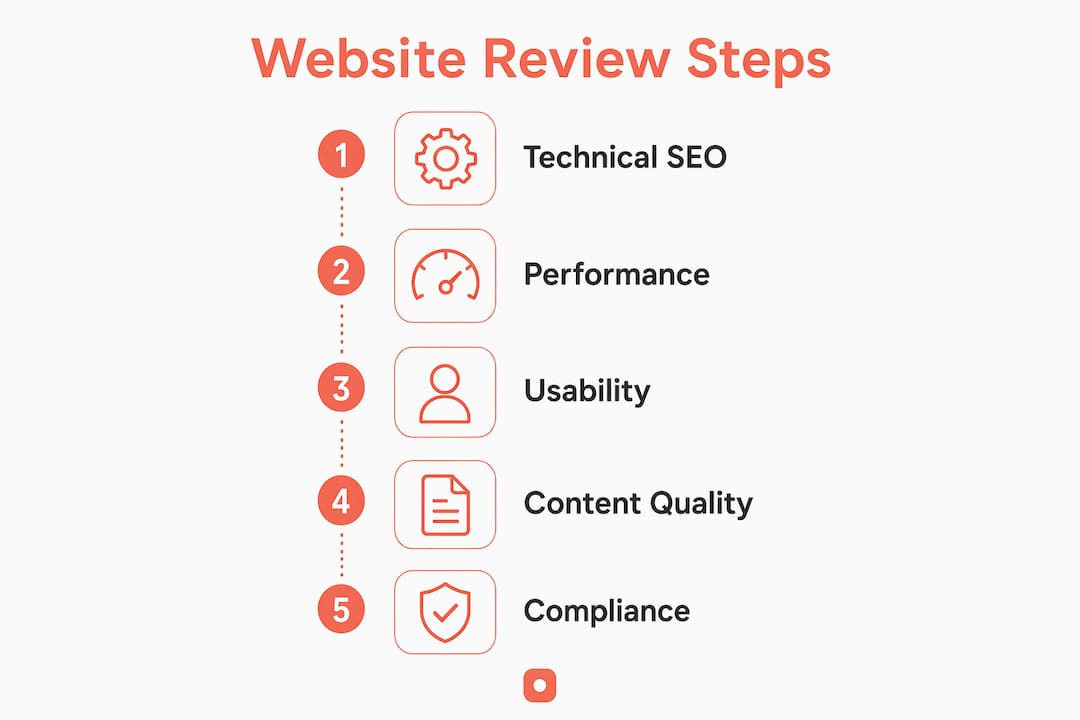
| Category | What to check | Pass threshold | Fail signal |
|---|---|---|---|
| Technical SEO | Crawlability, indexability, sitemap, robots.txt | All key pages indexed, no unintended noindex | Coverage errors in Search Console |
| Performance | LCP, CLS, INP | LCP < 2.5s, CLS < 0.1, INP < 200ms | Any Core Web Vital in the red zone |
| Usability | Navigation, mobile responsiveness, accessibility | WCAG AA, no horizontal scroll, tap targets ≥ 48px | Keyboard trap, missing alt text, color contrast fail |
| Content Quality | Accuracy, E-E-A-T signals, freshness | No outdated claims, author credentials visible | Thin pages, duplicate meta descriptions |
| Conversion | CTA clarity, funnel flow | Primary CTA visible above fold on mobile | No CTA, broken form, unclear next step |
For every issue your team finds, record it in a structured row: page URL, category, severity (user-facing friction), metric or tool used, estimated time to fix, owner (design / engineering / content), and a suggested priority score. That structure is what turns a review into a trackable action plan.
Pro Tip: Use your website QA checklist alongside this rubric. The two documents together cover both pre-launch and post-launch review scenarios without overlap.
Which tools should you use, and what should each one measure?
Match the audit question to the right tool. Guessing at performance without Lighthouse data, or flagging accessibility issues without a checker, produces findings you cannot defend to engineering.

| Tool | What to measure | Red flag threshold |
|---|---|---|
| Google Search Console | Indexability, coverage errors, Core Web Vitals field data | Any page with "Excluded" or "Error" status |
| Lighthouse / PageSpeed Insights | LCP, CLS, INP, Accessibility score, SEO score | Performance score below 50 on mobile |
| Analytics (GA4 or equivalent) | Bounce rate by page, conversion funnel drop-off | High exit rate on a conversion page |
| Heatmap / session recording tool | Click patterns, scroll depth, rage clicks | Users not reaching the CTA |
| Accessibility checker (axe, WAVE) | WCAG violations, missing labels, contrast ratios | Any critical violation |
Core Web Vitals thresholds to keep in mind: LCP under 2.5 seconds, CLS under 0.1, and INP under 200ms are the targets that separate a passing performance score from one that actively costs you rankings. Capture these numbers from both lab data (Lighthouse) and field data (Search Console) because they often differ.
- Automated tools give you objective baselines, but they cannot replicate a real user's confusion. Pair every tool finding with a human observation.
- For QA tool recommendations that map to Core Web Vitals benchmarking, check the Usepinhub blog.
How do you decide what to fix first, and when is a redesign the right call?
Impact-to-effort prioritization keeps teams from spending a sprint on a low-traffic page while a broken checkout flow goes unaddressed. Map every issue to two axes: business impact (conversion loss, ranking drop, legal risk) and engineering effort (hours, not story points).
Fix in this order: crawlability and indexing errors first, then Core Web Vitals failures, then conversion blockers, then content gaps, then visual polish. A stable technical foundation prevents wasted design cycles.
When a site fails many items across a 33–50 point checklist, a full redesign is often faster and more cost-effective than incremental fixes. High technical debt means each patch creates new dependencies, and the cumulative fix timeline can exceed a redesign timeline within two quarters.
The redesign decision checklist:
- More than 20 checklist items failing across multiple categories
- Technical debt that makes each fix dependent on another unfixed issue
- Brand or messaging that no longer reflects the business
- Conversion rate that has not improved after two full audit cycles
- Timeline or budget that makes incremental fixes more expensive than a rebuild
For timeline context: a focused incremental fix cycle (5–10 issues) typically takes two to four weeks. A full redesign for a mid-size site runs three to six months. When the fix backlog exceeds 20 items and spans all five categories, the redesign path is worth presenting to leadership with the audit data as evidence.
Pro Tip: When escalating to leadership, export your issue table with priority scores and estimated fix hours. A spreadsheet showing 23 failing checks and 180 hours of engineering time makes the redesign case without requiring a presentation.
How do you build a repeatable review cadence?
A one-off review misses drift. New deployments introduce regressions; content ages; search algorithms shift. Treating audits as ongoing practice is what keeps a site competitive after launch.
- Monthly lightweight check (30–60 minutes): Marketing or design runs a Search Console coverage scan, checks Core Web Vitals field data, and flags any new 404s or CTA regressions.
- Quarterly full audit (half-day): A cross-functional team works through all five categories with the full scoring rubric, 33–50 checks, and produces an updated issue table.
- Event-driven review: Run a targeted audit after every major release, redesign, or content migration. Focus on the categories most likely affected by the change.
Role matrix: Marketing and design own the monthly check and content quality reviews. Engineering owns technical SEO and performance fixes. Product or marketing leadership approves priority changes and redesign decisions.
Deliverables for each full audit: annotated screenshots with pinned comments, a completed issue table with severity and owner, priority scores, and ETAs for each fix. Store these in your team's project board so the next reviewer can compare against the previous cycle.
How does Usepinhub support the website review workflow?
Visual feedback tools close the gap between what automated tools flag and what a human reviewer actually sees. Usepinhub is built for exactly this workflow.
The practical sequence: capture a screenshot of the page under review using the Usepinhub browser extension, upload it to your workspace, then pin comments directly onto the elements that fail your scoring rubric. A broken CTA gets a pin. A color contrast failure gets a pin. Each pin carries a threaded discussion anchored to that pixel location, so the engineer or designer who picks it up has full context.
Guest reviewers can join without creating accounts, which matters when you are pulling in a client, a stakeholder, or a subject-matter expert for a one-time review. Version control lets you compare the current screenshot against the previous cycle's capture, so regressions are visible at a glance. AI-generated summary lists turn a session full of pinned comments into a structured issue table ready to paste into your audit report.
Vague feedback ("the header looks wrong") is one of the most common causes of rework in design review cycles. Anchoring every comment to a specific pixel location removes the ambiguity and gives owners the context they need to fix the right thing on the first pass.
Pro Tip: After each review session, use Usepinhub's AI summary to generate your issue table automatically. Export it directly into your audit report and assign owners before the session ends.
What do heatmaps and session recordings tell you that metrics cannot?
Quantitative metrics show you where users drop off. Heatmaps and session recordings show you why. A page with a high exit rate in GA4 tells you there is a problem; a session recording of a user repeatedly clicking a non-clickable element tells you exactly what the problem is.
Behavior tools reveal friction that no automated audit will surface. Scroll depth maps show whether users reach the CTA at all. Click maps reveal whether users are trying to interact with elements that are not interactive. Rage-click recordings point to broken functionality or misleading visual affordances.
Pair behavior data with your audit findings. If your Lighthouse score is strong but conversion is low, session recordings are the next step. If heatmaps show users ignoring the primary CTA, the issue is likely placement or visual hierarchy, not copy.
How do you check brand consistency during a review?
Brand consistency is not just about logo placement. It covers every touchpoint: typography, color palette, tone of voice, button styles, and the way the site describes what the business does.
A design consistency audit checks whether every page feels like it belongs to the same site. Common failures include pages built at different times that use different heading styles, CTAs with inconsistent labels ("Get Started" on one page, "Sign Up Free" on another), and body copy that shifts between formal and casual registers without reason.
During your review, screenshot three to five pages from different sections of the site and compare them side by side. Check typography scale, button styles, spacing, and messaging. Any page that feels visually or tonally out of place is a brand consistency fail.
What legal compliance checks belong in every website review?
Legal compliance is not optional, and it is not just a developer's concern. Marketing teams are often the ones who add tracking scripts, update cookie banners, or publish new landing pages, which makes them responsible for keeping compliance current.
Every review should confirm: a privacy policy is present and up to date, a cookie consent banner appears before non-essential cookies are set, terms of use are accessible from the footer, and any data collection forms include the required disclosures. For sites that serve users in California, CCPA compliance adds additional requirements around data sale opt-outs.
HTTPS is also a legal and trust baseline. An expired SSL certificate or mixed-content warning is both a security risk and a signal to users that the site is not maintained. Check certificate expiry dates during every quarterly audit.
This article provides general guidance, not legal advice. Confirm your site's specific compliance requirements with a qualified legal professional.
Key Takeaways
A structured website review that combines the 5-second clarity test, a pass/warn/fail scoring rubric, and objective tool data gives design and marketing teams a repeatable process for finding and fixing the issues that actually affect users and rankings.
| Point | Details |
|---|---|
| Start with the 5-second test | If visitors cannot identify the offer, audience, and next action in five seconds, fix clarity before anything else. |
| Fix technical issues first | Crawlability and indexability errors block every other improvement; resolve them before content or conversion work. |
| Use Core Web Vitals as your performance benchmark | Target LCP under 2.5s and CLS under 0.1; capture both lab and field data for an accurate picture. |
| Run audits on a cadence | Monthly lightweight checks plus quarterly full audits catch regressions before they compound. |
| Use Usepinhub for anchored feedback | Pin comments on failing elements in screenshots so every issue has context, an owner, and a clear fix path. |
The review process most teams get wrong
Most teams treat a website review as a one-time project triggered by a redesign or a traffic drop. That framing guarantees they miss the slow drift: the CTA that stopped converting after a copy change, the page that lost its index status after a CMS update, the mobile layout that broke when a new widget was added.
The other common failure is vague feedback. "The homepage feels cluttered" is not a fix instruction. It does not tell a designer which element to move, which copy to cut, or which visual hierarchy rule is being violated. Teams that rely on Slack threads and email chains for review feedback spend more time clarifying than fixing.
What actually works is a combination of structure and specificity. A scoring rubric gives every reviewer the same criteria. Pinned screenshot comments give every issue a location. An issue table with owners and ETAs gives every fix a path to completion. Those three things together are what separate a review that produces results from one that produces a document no one reads.
The art-and-science balance matters too. A site can pass every Lighthouse check and still convert poorly because the brand voice is inconsistent or the visual hierarchy buries the offer. Technical health and design clarity are both required.
Get started with Usepinhub for your next website review
Your next review does not need a long setup. Usepinhub gives design and marketing teams a faster path from audit findings to fixed issues, without the back-and-forth that slows most review cycles.
Sign up for a free Usepinhub account, install the browser extension, and capture your first page screenshot in under two minutes. Pin your first issue directly onto the element that fails your 5-second test. Invite a guest reviewer with a single link, no account required. When the session is done, use the AI summary to generate your issue table and assign owners before anyone leaves the call.
Usepinhub's free plan covers solo and low-volume reviews. Pro and Team plans add unlimited screenshots, Figma integration, version control, password-protected shares, and AI summaries for larger teams. Compare plans and start your first review today.
Useful sources for running your own website review
- Google Search Console: Check indexability, coverage errors, and Core Web Vitals field data. Start here before any other tool.
- PageSpeed Insights: Run LCP, CLS, and INP checks on any URL. Use for both homepage and key landing pages.
- Website Audit Checklist (Digital Unicon): A 200+ point reference covering technical SEO, performance, security, accessibility, and analytics.
- Free Website Audit Checklist (Revamp): 50-check interactive checklist with Core Web Vitals thresholds and prioritized recommendations.
- Website Audit Checklist (Privexon): 33-check framework covering accessibility, security, and cadence guidance.
- Usepinhub blog: Guides on feedback workflows, design review best practices, and QA checklists for teams.
Store your screenshots and issue tables in your team's project board after every audit cycle. The next reviewer will thank you.
FAQ
How long does a full website review take?
A quick 15-minute pass covers the highest-friction issues; a full audit across all five categories typically takes half a day for a mid-size site.
What is the first thing to check when reviewing a website?
Run the 5-second clarity test first. If visitors cannot identify what the site offers, who it is for, and what to do next within five seconds, that is the highest-priority fix regardless of technical scores.
How often should a team run a website review?
Monthly lightweight checks for performance and Search Console data, plus a quarterly full audit covering all five categories, is the recommended cadence for most sites.
When does a site need a redesign instead of incremental fixes?
When a site fails more than 20 checklist items across multiple categories, a redesign is often faster and more cost-effective than patching each issue individually.
How does Usepinhub fit into a website review workflow?
Usepinhub lets teams capture page screenshots, pin comments on specific failing elements, invite guest reviewers without accounts, and export AI-generated issue tables, replacing vague feedback with a structured, trackable audit record.