
The right way to handle client design feedback is simple: invite specifics, map every comment to the project's actual goals, convert it into a task, and confirm next steps before the call ends. That sequence works whether the note is "make it pop" or a detailed line item. This guide covers both the reactive tactics for messy feedback and the preventive workflows that stop it from getting messy in the first place.
TL;DR:
- Clients should be guided to provide specific, goal-oriented feedback by using checklists, timeboxing, and visual prompts to prevent vague or conflicting notes.
- Transforming ambiguous comments into clear tasks involves asking targeted questions and offering two concrete options for faster decision-making.
- Using tools with pixel-anchored comments, version control, and single feedback channels reduces confusion and keeps reviews efficient and traceable.
- Establishing a repeatable process with milestone checks and summarized feedback helps compare input across rounds and identifies patterns over time.
- Employing a feedback system like Pinhub automates these tactics with features such as guest review access, AI summaries, and organized comment tracking.
Table of Contents
- How Do You Respond to Vague or Unhelpful Client Feedback?
- How Can You Help Clients Give Better Design Feedback?
- Building a Repeatable Design Feedback Process
- Client Design Feedback Examples and How to Rewrite Them
- What Tools Actually Reduce Feedback Confusion?
- A Platform-Led Way to Run This Workflow
- A Small Studio, One Vague Note, and a Faster Fix
- Try a Faster Way to Collect Client Design Feedback
- Sources
- FAQ
How Do You Respond to Vague or Unhelpful Client Feedback?
"Make it pop" is not feedback. It's a feeling looking for a translator, and that translator is you. Before you touch the design file, separate the emotion from the actual request. A client who says a homepage "feels off" is usually reacting to something specific, a color, a font size, a missing headline, but they haven't found the words yet. Your job is to extract the part you can act on.
Start with targeted questions instead of guessing. Three tend to do the heavy lifting:
- What outcome are you hoping this change creates?
- Do you have an example of something you like or dislike?
- If we can only fix one thing this round, what's the priority?
These questions work because they force the client to point at something concrete, and tactics like these consistently turn unhelpful notes into workable direction. Once you have a direction, don't hand back a single revised version and hope it lands. Offer two options.
- Show variant A and variant B side by side, each addressing the stated concern differently.
- Let the client react to something real instead of imagining a fix in the abstract.
- Log which option they choose and why, so the reasoning doesn't get lost between meetings.
Giving clients a binary choice produces faster decisions than open-ended "change this" requests, mostly because comparing two things is easier than inventing a third from scratch.
Sometimes the feedback isn't vague, it's just wrong for the project. A client asking for five fonts on one page conflicts with basic hierarchy. Here, your job shifts from clarifying to defending, but defend with evidence, not opinion. Point back to the brief, the user goal, or a metric you agreed to earlier. If there's no such anchor, that's a sign you skipped a step upstream.
Pro Tip: Keep a running note of every design decision tied to a stated goal ("increased primary CTA clicks," "faster load on mobile"). When feedback conflicts with a goal, you're not arguing taste against taste, you're pointing at the agreed target.
Whatever you decide, write it down. Log the decision and the next step in your project tracker, then send a one-line confirmation to the client so nobody re-litigates it three weeks later.
How Can You Help Clients Give Better Design Feedback?
Most unhelpful feedback isn't the client's fault. Nobody taught them how to give it. A short prompt sent before the review does more to fix this than any amount of patience during the call.
Send a five-item checklist ahead of time:
- What's the goal of this specific screen or page?
- Who is the audience looking at it?
- What constraints exist (brand rules, technical limits, deadline)?
- What's the single highest priority for this round?
- Do you have an example, competitor or otherwise, that illustrates what you mean?
Design studios that require this kind of checklist report fewer conflicting requests and cleaner handoffs once work moves to development. The checklist works because it forces prioritization before the meeting starts, not during it.
Timeboxing matters just as much. A review with no time limit and no defined scope drifts into scope creep almost every time. Tell the client up front: "This review covers the homepage layout and the header only, we'll look at footer copy next week." That single sentence prevents half the tangents that eat review time.
Visual prompts beat verbal ones. An annotated screenshot with numbered callouts, or a quick A/B mockup, gives clients something to point at instead of describing from memory. Facilitating feedback well often comes down to setting clear reviewer roles and being explicit about what can and cannot change before comments start flowing.
Pro Tip: Require one feedback channel per project, whether that's a shared doc, a comment thread, or a review tool. When notes arrive split across email, Slack, and a shared drive, something always gets missed, and it's usually the important thing.
Building a Repeatable Design Feedback Process
A one-off review is a conversation. A repeatable design project evaluation process is a system, and systems are what let you compare feedback across rounds instead of reacting to each one in isolation.
Start by defining milestone checkpoints where feedback happens, typically wireframe, visual direction, and pre-launch. At each one, ask the same one or two questions every time: "Does this meet the goal we set at kickoff?" and "What's the single biggest concern right now?" Repetition sounds boring, but it's the entire point. Asking identical questions at the same points in every project reduces bias and makes feedback comparable across clients and projects, which is how you eventually spot patterns instead of just fires.
Once feedback comes in, the loop has three steps:
- Assign each piece of feedback as a task with an owner and a deadline.
- Track changes with version control so nobody works from an outdated file.
- Send a short "here's what we changed" summary after each round.
That last step matters more than it sounds like it should. A brief recap of what changed and why cuts down on clients re-raising points you already addressed, and it builds trust that their input actually did something.
One structural choice makes this easier to sustain: assign an operations lead, not the designer, to manage the intake and tracking of feedback. Designers are close to the work, which makes them prone to either defensiveness or fatigue after enough rounds. A dedicated process owner keeps the questions consistent and the tone neutral, and frees the design team to focus on execution rather than triage.
Client Design Feedback Examples and How to Rewrite Them
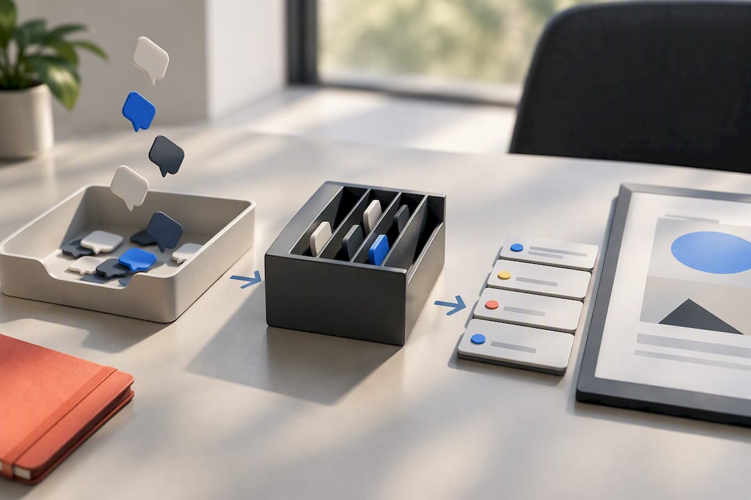
Here's what turning vague notes into actionable tasks actually looks like in practice.
| Client feedback (as given) | Rewritten actionable task |
|---|---|
| "Make it pop more" | Increase contrast on primary CTA button; test against current version for click rate |
| "I don't love the colors" | Get two specific color palette examples from client; present two revised mockups by Thursday |
| "This feels cluttered" | Reduce homepage sections; owner: lead designer; priority: high |
| "Can we make the logo bigger?" | Increase logo size in header only; confirm it doesn't crowd nav; owner: designer |
| "It doesn't feel like us" | Schedule 15-minute call to review brand guidelines against current draft |
A quick micro-template turns any comment into a ticket: Feedback: [quote the client's words] → Ask: [what outcome do they want] → Task: [who does what, by when] → Priority: [high, medium, low].
For pushback that gets personal or heated, a short script depersonalizes the exchange fast: "I hear the concern about [X]. Our goal for this screen was [Y], so let's look at whether this change supports that or works against it." It redirects the conversation to the shared goal instead of a disagreement about taste.
Before your next review, send this one-line prompt: "Before we meet, jot down the goal, the audience, one constraint, and your top priority for this round." It's the same checklist logic that makes milestone reviews faster.
What Tools Actually Reduce Feedback Confusion?
Not every tool feature matters equally here. A few capabilities do most of the work in cutting down back-and-forth, and they're worth prioritizing over anything flashy.
- Pixel-anchored annotation, so a comment sits exactly on the element it refers to, not floating in a general comment thread.
- Guest reviewer access that doesn't require an account, since clients abandon feedback the moment a login wall shows up.
- Version control, so nobody comments on a file that's already three revisions old.
- Automated feedback summaries that compile scattered comments into a single actionable list.
- Link and password protection for sharing work outside the immediate team.
The simplest workflow chains three steps: annotated screenshot, task ticket, versioned deliverable. Each comment becomes a line item, each line item gets an owner, and the next upload replaces the outdated one instead of sitting alongside it.
Not every review needs a full tool, though. A quick screen-recorded walkthrough is often enough when a client is reacting to motion, timing, or a flow that's hard to describe in text. Video and annotated visual prompts consistently outperform written descriptions when the issue is something the client can see but can't quite name. Save the dedicated review workflow for anything with multiple stakeholders, multiple rounds, or a paper trail you'll need later.
Pro Tip: If a client's feedback references a screen you haven't shared yet, that's usually a sign the review request got sent to the wrong version. Version control isn't a nice-to-have, it's what stops that mistake.
A Platform-Led Way to Run This Workflow
Everything above depends on feedback landing in one traceable place. Pixel-anchored comments do a lot of that work by themselves. When a client circles the exact button instead of typing "the top part," ambiguity mostly disappears, and rounds move faster because nobody's guessing what "top part" meant.
Two features carry the rest of the load:
- Guest reviewer access lets clients comment without creating an account, which removes the biggest reason feedback goes missing.
- AI-generated summary lists compile scattered comments into one prioritized view, closer to a synthesized report than a raw comment thread.
For studios running multiple projects, assigning an operations lead to collect and synthesize this input (rather than leaving it to individual designers) matches how operational ownership of feedback tends to reduce bias and surface patterns across clients.
A Small Studio, One Vague Note, and a Faster Fix
A small team once got the note "this doesn't feel premium enough" on a pricing page, three days before launch. Instead of guessing, the designer asked for one comparable example the client admired. The client sent a competitor's page with tighter spacing and a serif headline. That single reference turned a vague mood into two concrete changes, shipped same day. Pinhub's own review workflows are built around that exact habit: ask before you revise.
— Pinhub
Try a Faster Way to Collect Client Design Feedback
You've read the tactics. Pinhub is built to make them automatic instead of manual. Pixel-anchored comments mean feedback lands exactly where the client meant it, not in a vague comment box. Guest reviewers respond without creating an account, so clients actually participate instead of ignoring another login prompt. Version control keeps everyone on the current file, AI-generated summary lists turn a scattered thread into a prioritized list, and password-protected share links keep external reviews contained to the right people.
The Free plan works for solo designers or low-volume projects with no listed cost, and the Pro plan runs $19 per month (or $180 per year) for unlimited screenshots and Figma import. Teams that need more seats and shared workspaces can start on Team at $39 per month, billed at $384 annually. Visit the landing page to try the free plan or pull templates for your next review.
Sources
- Client feedback systems (professional services research)
- How to collect meaningful client feedback and use it to improve
- How to handle bad or unhelpful design feedback
- Helping clients give feedback
- How to encourage constructive design feedback (video)
FAQ
Can You Give Examples of Client Design Feedback?
Common examples include "make it pop," "I don't love the colors," and "this feels cluttered," each of which hides a specific, fixable concern once you ask a clarifying question. The rewritten task table earlier in this guide shows how to turn five of the most frequent vague comments into assignable work items.
How Do You Appreciate Good Design Feedback?
Good feedback names a specific element, ties it to a goal, and offers an example or reference point instead of a general impression. When a client provides that level of detail, acknowledge it directly and use it as the model for what you ask for in future reviews.
How Do You Handle Difficult Client Feedback?
Separate the emotional tone from the actual request, then ask what outcome the client wants and whether they have an example of it. If the request conflicts with an agreed goal or constraint, point back to that goal rather than arguing preference against preference.
How Do You Give Good Creative Feedback?
Effective creative feedback names what should change, why it should change, and how you'll know it worked, ideally tied to a goal set before the review started. Offering two options for a client (or a client offering two directions for feedback) tends to produce faster, clearer decisions than open-ended commentary.
Does Pinhub Help With Managing Client Design Feedback?
Pinhub centralizes feedback with pixel-anchored comments, guest reviewer access without account creation, and version control, so notes stay attached to the exact screen element they reference. Current pricing, including the Free plan and paid Pro and Team tiers, is listed on the Pinhub site.