
A repeatable branding feedback process centralizes every comment in one place, uses observation→impact→objective language instead of opinions, names a single owner to consolidate input, and logs every decision with a rationale. Start today by moving all open feedback into one shared thread or board before your next review.
TL;DR:
- A structured, centralized feedback process with one owner and clear logging prevents scattered comments and ensures updates are tracked and justified.
- Feedback should be stage-specific, focusing on concept direction early, cross-format clarity mid-stage, and final craftsmanship and accessibility at the end.
- Using observation-impact-objective phrasing makes feedback actionable and helps designers understand problems without being told exactly how to fix them.
- Tools that anchor comments directly to precise design points and allow guest reviewers significantly reduce ambiguity and streamline review cycles.
- Implementing pre-defined roles and scheduled review points ensures authority and prevents delays caused by indecision or uncoordinated input.
Table of Contents
- What Is a Branding Feedback Process, and Why Does It Break Down?
- Quick Checklist: 8 Rules for Actionable Branding Feedback
- How Should Feedback Change at Each Project Stage?
- How Do You Write Feedback a Designer Can Act On?
- How Do You Consolidate Scattered Feedback Into a Plan?
- Who Decides, and How Often Should Reviews Happen?
- Which Tools Reduce Ambiguity in Branding Reviews?
- How Pinhub's Own Workflow Reflects This Process
- What Mistakes Derail Most Branding Reviews?
- Editorial Perspective: What Most Teams Get Backward
- Get Structured Feedback Without the Scattered Threads
- Sources
- FAQ
What Is a Branding Feedback Process, and Why Does It Break Down?
A branding feedback process is the structured method a team uses to collect, evaluate, and act on reactions to logo work, color systems, messaging, and other identity elements before they go live. Most teams don't have a formal one. They have a Slack channel, a few email chains, and a founder who says "make it pop" three days before launch.
That informal setup is the root cause of almost every stalled rebrand. Feedback arrives from six people in five formats, nobody owns reconciling it, and the designer ends up guessing which comment actually matters. Objective-led critique reduces subjective taste conflicts because it forces every comment back to a shared question: does this meet the brief, or doesn't it? Once a team adopts that filter, brand design feedback stops being a popularity contest and starts being a diagnostic tool.
The rest of this guide breaks that process into the parts you can copy directly into your next review cycle: a checklist, a stage-by-stage review structure, language templates, governance roles, and the tools that make consolidation less painful.
Quick Checklist: 8 Rules for Actionable Branding Feedback
Before your next review meeting, run through this list. Most branding strategy feedback problems trace back to skipping one of these steps, not to a lack of design talent on either side of the table.
- Keep every comment in one place. Scattered feedback across email, Slack, and verbal notes is the single biggest cause of missed revisions. Assign one consolidator to own the master list.
- Open with what's working. Starting with positives isn't about softening the blow. It tells the designer which elements to protect through the next round.
- Use observation, then impact. State what you see, then what it does to the viewer or the brand goal, before you jump to a fix.
- Define the scope up front. Tell reviewers whether this round covers concept direction, color and type, or final production polish. Mixed-scope reviews create mixed-quality feedback.
- Point at specifics, not vibes. A pinned comment on the exact pixel or line of copy beats "the logo feels off" every time.
- Log every decision. Write down what changed, why, who approved it, and when. This single habit prevents relitigating settled arguments two weeks later.
- Rank by impact and effort. Not every comment deserves equal weight. A typo fix and a full palette swap don't belong on the same priority tier.
- Name the approver before the meeting starts. If nobody knows who has final say, the review will run long and settle nothing.
Pro Tip: Before you send feedback, read it back as if you were the designer receiving it with no context. If it doesn't tell them what's wrong and why it matters, it's not ready to send.
Closing the loop matters as much as opening it. After a revision round, show reviewers exactly what changed and why certain suggestions weren't adopted. Skipping this step is why the same feedback resurfaces round after round. Once people see their input was heard, even when it wasn't used, they stop repeating it and start trusting the process.
How Should Feedback Change at Each Project Stage?
Branding strategy feedback fails most often when reviewers apply final-round scrutiny to a first-round concept, or wave through a nearly finished asset because they're tired of looking at logos. The fix is matching the type of feedback to the stage of work.
-
Early concept stage: test the idea, not the execution. The only question that matters here is whether the direction solves the brief. Ask: does this concept speak to the audience we defined? Does it differentiate from the three competitors we listed in the brief? Reviewers should resist commenting on exact shades of blue or kerning at this point. Those comments are premature and they derail conversations that should be about strategy. Bring the original brief, a one-page audience summary, and any competitor references to this meeting, and timebox it to 45 minutes. If the room can't agree the idea answers the brief, no amount of polish will fix that later.
-
Mid-stage: test clarity and cross-format behavior. By now the concept is set, and the job shifts to stress-testing it. Does the message read clearly at a glance? Do the brand cues (color, wordmark, key visual devices) survive when dropped into a business card, an app icon, a trade show banner, and a dark-mode website? This is also the point to bring in outside eyes. Structured user feedback before launch is considered important by many designers, and mid-stage is the cheapest moment to run it, before production costs are sunk into a direction nobody outside the room has seen. Avoid craft-level nitpicks here too. Save exact spacing and color calibration for the final round. Bring mockups across at least three real-world formats and a short list of the specific questions you want outside viewers to answer.
-
Final approval: check craft, accessibility, and production readiness. This is the only stage where line-level scrutiny belongs. Check contrast ratios for accessibility, confirm legal copy and trademark symbols are correct, verify file formats match what production actually needs, and check that every locked brand element matches the approved system. Bring the final brief, the approved mid-stage direction, and a production checklist so nobody reopens strategic debates that were settled two rounds ago. Timebox this review too. Final approval meetings that run long usually mean someone is trying to relitigate the concept stage, and that conversation needs to happen separately, not inside a production sign-off.
Treating these three stages identically is how a six-week rebrand turns into a four-month one. Match the review to the stage, and each round does one job well instead of three jobs badly.
How Do You Write Feedback a Designer Can Act On?
The gap between feedback that works and feedback that wastes a revision round almost always comes down to phrasing. "Change the logo to blue" is a command. It tells the designer what to do but nothing about the problem it solves, which means if blue doesn't work, they have nothing left to try.
The fix is a three-part structure: observation, then impact, then objective. Say what you see, explain what it does to the viewer or the goal, and name the objective it should hit instead. Framing feedback this way hands the designer the problem to solve rather than a prescribed solution, which is exactly why designers with room to problem-solve tend to produce stronger second drafts than ones handed a fix-it order.
A lighter version of the same idea uses the I like / I wish / I wonder frame, which works well for quick async comments where a full three-part statement feels heavy:
- "I like how the icon set stays consistent across all five product pages."
- "I wish the body copy had more contrast against the background on mobile."
- "I wonder if the tagline reads too formal for the social audience we're targeting."
A few before-and-after examples show the difference in practice:
- Logo: Before: "This logo is boring." After: "The mark reads flat next to competitor logos that use more dimension (observation). It might get lost in a crowded app store grid (impact). We need something with more visual weight at small sizes (objective)."
- Color: Before: "I don't like this green." After: "This green sits close to a competitor's brand color (observation). Customers scrolling quickly could confuse the two (impact). We need a shade with more separation from theirs (objective)."
- Layout: Before: "Too cluttered." After: "There are five competing focal points on this page (observation). Users won't know where to look first (impact). We need one clear visual hierarchy (objective)."
- Copy: Before: "Make it punchier." After: "This headline reads like every other line in the paragraph (observation). It won't stop someone mid-scroll (impact). We need language that creates urgency in the first five words (objective)."
"Change to X" feedback is destructive because it substitutes one person's taste for a diagnosis of the actual problem. The designer either does what you said, whether or not it fixes anything, or ignores it and burns political capital. Describing the problem instead means any solution that solves it earns approval, not just the one you happened to picture. For more ready-to-use phrasing, Usepinhub's design feedback templates and 30 ready-to-use feedback examples cover this pattern across more asset types.
How Do You Consolidate Scattered Feedback Into a Plan?
Collecting brand insights is only useful once someone turns forty comments from six people into a single, prioritized list. Without that step, you have raw opinion, not a plan.
Pick one source of truth. Whether it's a shared board, a centralized document, or a dedicated review tool, the rule is the same: every comment lives in exactly one place, and everyone knows where that place is. Mixed channels are the fastest way to lose a comment entirely, and losing comments is what makes stakeholders feel unheard, which is what makes them repeat themselves louder in the next meeting. Usepinhub's guide to managing stakeholder feedback covers how to set this up for teams with more than a handful of reviewers.
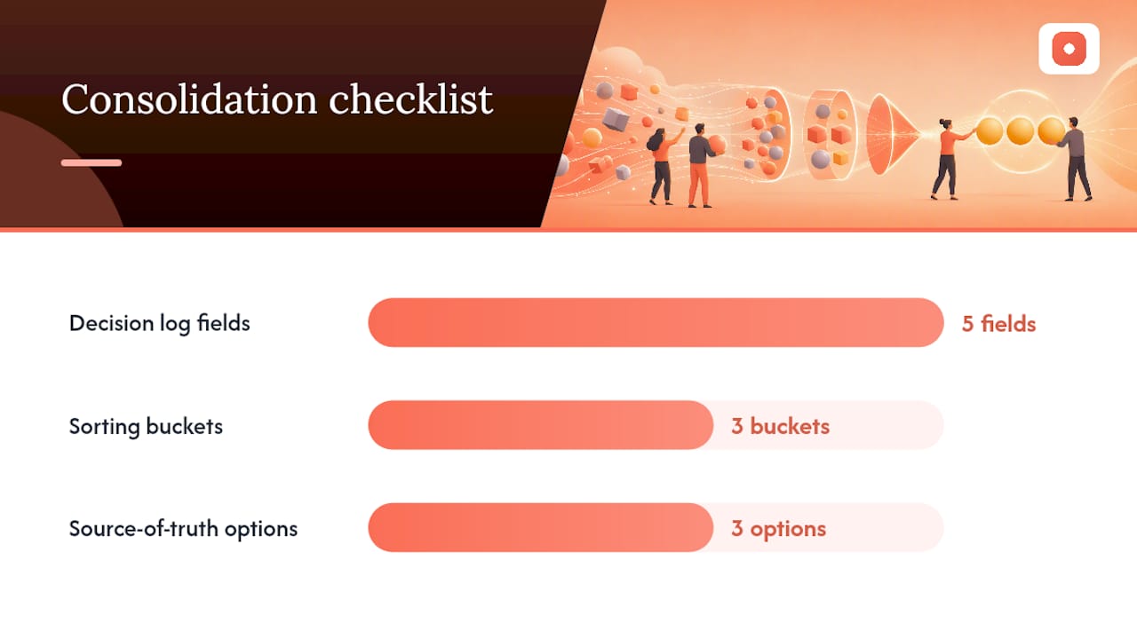
Build a decision log with five fields. Every logged decision needs the decision itself, the rationale behind it, who approved it, the timestamp, and a link to the specific asset version it applies to. This sounds like overhead until the third time someone asks "wait, didn't we already decide this?" and you can answer in ten seconds instead of reopening a debate.
Once feedback is consolidated, sort it before you act on any of it:
- Impact versus effort. A quick copy fix that resolves confusion beats a full logo redraw that addresses a minor stylistic preference. Rank by what moves the needle relative to what it costs to fix.
- Frequency tally. If eight of ten reviewers flagged the same issue independently, that's a stronger signal than one person's strong opinion, though frequency alone shouldn't be the only test. Mixing quantitative frequency with qualitative themes gives a more reliable read than either alone.
- DACI for disputes. When two stakeholders disagree and neither will budge, don't let the loudest voice win by attrition. Defer to whoever holds the Approver role and require them to state which project objective the decision serves.
- "Do now, clarify, challenge" buckets. Sorting notes into these three categories turns an overwhelming pile of comments into a manageable task list, separating quick fixes from items that need more context from ones worth pushing back on.
Version control closes the loop. Every round should document what changed since the last version and why, tied back to the specific decision log entries that drove it. Reviewers who can see their comment led to a documented change, even a partial one, trust the next round more than reviewers who have to guess what happened to their note.
Who Decides, and How Often Should Reviews Happen?
Branding process evaluation falls apart most often not from bad ideas but from unclear authority. Somebody has to be able to say "we're done" and have that stick, or every review becomes round two of the last one.
The DACI framework solves this by assigning four roles before work starts: Driver (runs the process and keeps it moving), Approver (has final sign-off, ideally one person, not a committee), Contributor (gives input but doesn't decide), and Informed (kept in the loop, no vote). On a mid-size rebrand, that might look like: the brand manager as Driver, the CMO as Approver, the design lead and a customer-facing sales rep as Contributors, and the wider marketing team as Informed. Predefining these roles prevents projects from stalling when opinions split, because everyone already knows whose call it is.
Alongside DACI, most organizations benefit from a dedicated brand owner or steward, someone responsible for the health of the identity system long after the launch project wraps. This person maintains the templates, fields ad hoc questions from other teams, and flags drift before it becomes a pattern.
Cadence matters as much as roles:
- Run small, frequent check-ins during active design work. Weekly is common for fast-moving projects.
- Set hard gating points at each major stage: concept approval, mid-stage sign-off, final release.
- Schedule a formal brand audit every six months even after launch. Scheduled reviews on this cadence, paired with governance and locked templates, prevent the slow drift that happens when ten different people apply "close enough" versions of the logo over a year.
When disagreements surface mid-project, don't let them run on personality or seniority. Go back to the stated objective and ask which option actually serves it, with evidence where you have it.
Pro Tip: Write the DACI assignments into the kickoff document, not just into a meeting agenda. Roles that only exist in someone's memory get renegotiated the moment there's friction.
Which Tools Reduce Ambiguity in Branding Reviews?
Vague brand identity review comments almost always trace back to a tooling gap, not a communication failure. When feedback lives in a format that can't point at a specific pixel, reviewers default to vague language because vague is all the tool supports.
Pixel-anchored comments and annotated screenshots fix this directly. A comment attached to an exact point on an image forces specificity in a way a general comment thread never will. Instead of "the header feels off," a reviewer pins a comment directly on the header and writes what they observe there. The designer never has to guess which header, which element, or which version.

Guest reviewer access removes a common bottleneck. Client stakeholders and outside collaborators often stall reviews simply because setting up an account feels like friction they don't have time for. Letting them comment without creating one gets input from busy executives and external partners who would otherwise never open the file.
Light user testing validates brand hypotheses before you bet on them. You don't need a formal lab study to catch a problem. A five-person self-guided test asking "what does this logo make you think this company does?" or a handful of short interviews about a new tagline can surface a misread before it goes to print. Testing at multiple points across the design process catches usability and perception gaps while they're still cheap to fix.
Prototypes and cross-format checks catch surprises before launch. A logo that looks perfect on a 27-inch monitor can fall apart at favicon size or on a dark-mode app screen. Testing the identity across every real context it will actually appear in, business cards, social avatars, packaging mockups, catches these gaps while a revision still costs an afternoon instead of a reprint.
A short list of what to look for in any tool you adopt:
- Comments anchored to an exact location on the asset, not a general thread.
- A way for outside reviewers to participate without account setup.
- Automatic version history so nobody has to ask "wait, which file is current?"
- A summary or resolution view that shows what's open versus settled at a glance.
How Pinhub's Own Workflow Reflects This Process
Usepinhub was built around the same principle this guide argues for: vague feedback wastes revision rounds, and specificity is what fixes it. The platform's pixel-anchored comments exist because "the logo feels off" and a comment pinned directly to the exact spot on a logo produce two very different second drafts.
Mapping the product to the workflow stages covered above shows why the features exist in the first place. Collecting feedback benefits from guest reviewer access, since client stakeholders and outside partners can comment without creating an account, which removes the single biggest reason busy reviewers skip a round entirely. Consolidating benefits from automated summary lists that pull scattered pinned comments into one view, closer to the single source of truth this guide recommends over scattered email threads. Prioritizing and resolving benefit from version control and resolvable comment threads, which let a team track exactly what changed between rounds and close out settled items instead of letting them resurface in the next meeting.
Picture a five-person team running a rebrand across three review rounds. Feedback that used to arrive across email, Slack, and a shared drive folder instead lands as pinned comments on the exact screens they concern, get consolidated automatically, and get marked resolved as the design team addresses them.
None of this replaces the discipline covered earlier, objective-led critique, staged reviews, DACI roles. It just removes the friction that keeps teams from following that discipline consistently.
What Mistakes Derail Most Branding Reviews?
A handful of errors account for most of the pain in branding improvement suggestions gone wrong. Each one has a direct fix.
- Vague comments with no fix. "This doesn't feel right" gives the designer nothing to act on. Replace it with observation→impact→objective, every time, no exceptions.
- Too many uncoordinated reviewers. Ten people commenting independently in ten different places creates chaos, not thoroughness. Assign one consolidator who owns turning raw comments into a single prioritized list.
- Reviewing too late. Waiting until the final round to raise a concept-level objection wastes every hour spent polishing a direction that was never going to work. Staged reviews with required artifacts at each gate catch this early.
- Ignoring evidence in favor of opinion. A strong personal reaction from one stakeholder shouldn't outweigh a quick test with five real users. Build light testing into the process instead of relying purely on internal reactions.
Each of these mistakes compounds the others. Late reviews tend to attract vague panic-driven comments, and vague comments tend to multiply when there's no consolidator sorting them. Fix the process, and most of these problems stop appearing on their own.
Editorial Perspective: What Most Teams Get Backward
Most guidance on branding feedback treats the problem as a communication issue: teach people to phrase comments better, and reviews will run smoother. That's true as far as it goes, but it misses the bigger failure point. Feedback breaks down because of where it lives, not just how it's worded.
A perfectly phrased observation→impact→objective comment still gets lost if it's buried in a Slack thread that scrolled past two hours ago. Teams spend enormous energy training reviewers to write better comments while doing nothing to fix the fact that those comments scatter across four tools the moment the meeting ends. The location problem is bigger than the language problem, and it's the one almost nobody talks about.
The other misconception is treating governance as something you add once a project has already gone off the rails. DACI roles and decision logs work best when they exist before the first concept lands in an inbox, not after the third stakeholder has already relitigated a settled decision. Waiting for chaos to justify structure means you pay the cost of chaos first.
The honest take: process discipline and better tooling aren't separate fixes. A team that writes flawless observation→impact→objective feedback into six different inboxes is barely better off than a team that writes vague feedback into one. Fix the language and the location together, or you're only solving half the problem.
— Pinhub
Get Structured Feedback Without the Scattered Threads
Everything in this guide, observation→impact→objective phrasing, a single consolidator, decision logs, staged reviews, works better when the feedback itself lives in one anchored place instead of across email, Slack, and screenshots pasted into a doc. That's the specific gap Usepinhub closes: comments pin directly to the exact spot on a design, so nobody has to guess which header, which shade, or which line of copy a reviewer meant.
Guest reviewers can weigh in without setting up an account, which solves the biggest reason client stakeholders skip a review round. Automated summary lists turn a scattered pile of pinned comments into the consolidated, prioritized view this guide recommends, and version control keeps every round's changes documented without a separate spreadsheet. Whether you're running a solo design practice or coordinating a distributed brand team, the workspace scales from a free plan to team tiers with Figma integration and unlimited screenshots. Try Usepinhub on your next review round and pin your first comment directly on the design you're discussing today.
Sources
A few resources are worth bookmarking before your next review cycle. Usepinhub's design feedback templates give you a starting structure for observation→impact→objective comments, and the 30 ready-to-use feedback phrases work well as a quick reference during live review calls.
On governance specifically, the DACI model breakdown is worth reading in full if you're setting up roles for the first time. And for teams wondering how to spot brand drift before it becomes a rebrand, a brand perception audit offers a framework for treating feedback as data rather than validation.
- How to review creative work and give effective design feedback for better brand consistency
- Getting user feedback at every stage of the design process
- Brand identity design: A guide for brand leaders & marketing teams
FAQ
What is the 3-7-27 rule in branding?
The 3-second rule refers to how quickly consumers form impressions of a brand, emphasizing that early-stage brand reviews should prioritize instant clarity over intricate detail.
What are the 5 C's of branding?
Definitions vary across sources, but a common version covers Clarity, Consistency, Character, Connection, and Credibility, the qualities a review process should test for at each stage rather than relying on personal taste alone.
What are the 7 pillars of branding?
Frameworks differ by source, but branding pillars typically include purpose, positioning, visual identity, voice, experience, culture, and consistency. A structured branding feedback process exists precisely to test whether design work reinforces these pillars instead of drifting from them.
What are the 5 stages of brand recognition?
Brand recognition typically develops through awareness, recognition, preference, loyalty, and advocacy. Feedback captured during design reviews should keep the earliest stages, awareness and recognition, especially in mind, since visitors form judgments about a brand within seconds of encountering it.
How often should a brand undergo a formal feedback review?
Beyond active project reviews, most organizations run a formal brand audit every six months to catch drift before it becomes visible to customers.
What tool helps centralize scattered branding feedback?
A platform that anchors comments to exact points on a design, like Usepinhub, keeps feedback from splintering across email and chat, which is the single most common cause of missed revisions in a branding review.