
Good design feedback names what you see, explains why it matters to the user or business goal, and points toward the next step. It's specific, diagnostic, and never just a taste call. Use this template: Context (what you're looking at and why) → Observation (what you notice) → Impact (who it affects and how) → Next step (a question or clear action).
Here's the pattern in action. Bad: "The header feels off." Better: "On the pricing page (context), the header competes with the CTA for visual weight (observation), which likely pulls attention away from the button we need people to click (impact). Can we reduce the header size or shift its color?" (next step).
Pro Tip: Tie every comment to a goal, a user quote, or a metric whenever you can. Feedback anchored to something measurable, rather than an opinion, gets resolved faster and argued about less.
Key Takeaways
Effective design feedback names the specific element, states its impact on the user or goal, and always ends with a next step rather than a command.
| Point | Details |
|---|---|
| Use the four-part method | Structure every comment as Context → Observation → Impact → Next step to remove ambiguity. |
| Rewrite vague comments | Translate reactions like "make it pop" into named elements with a measurable outcome. |
| Mark priority clearly | Label every note as blocking or nice-to-have so designers can triage fast. |
| Match format to issue type | Use live calls for strategy and flow, async comments for pixel-level notes. |
| Pin comments to reduce ambiguity | Usepinhub lets reviewers pin feedback directly to a screenshot or Figma frame and resolve it as a checklist. |
Table of Contents
- What Makes Design Feedback Examples Actually Useful?
- Core Principles: A Repeatable Method For Feedback
- Bad Design Feedback Examples and How to Rewrite Them
- Templates for Peers, Clients, and Stakeholders
- Which Feedback Format Should You Use?
- What Questions Should a Design Critique Focus On?
- How Should Designers Receive Feedback Well?
- Which Tools Handle Feedback Best?
- What Does a Real Design Critique Sound Like?
- How Pinhub Turns Vague Comments Into Resolved Fixes
- What I Wish More Reviewers Did
- Run Faster Reviews With Pixel-Anchored Feedback
- Sources
- FAQ
What Makes Design Feedback Examples Actually Useful?
The best design critique examples share three traits: they're specific enough to act on, they connect to a goal rather than a preference, and they end with a direction instead of just a complaint. Feedback that skips any of those three tends to stall projects, not move them forward.
Structured feedback formats reduce ambiguity and speed revisions when reviewers actually follow them, largely because a reviewer who has to name the impact of an issue is forced to think past personal preference. That single habit changes how a design team operates.
Three things happen when teams commit to specific, example-driven feedback:
- Fewer revision cycles. Designers stop guessing at what "make it pop" means and fix the actual problem the first time.
- Faster reviews. A five-word vague comment takes longer to resolve than a three-sentence specific one, because the vague comment triggers a clarifying conversation before any work starts.
- Better team morale. Feedback tied to outcomes reads as professional critique, not personal judgment, which keeps design reviews from turning into ego contests.
Core Principles: A Repeatable Method For Feedback
Every effective piece of design feedback follows the same four-part shape: Context → Observation → Impact → Next step. Master this once and you can apply it to a button color, a checkout flow, or a 40-page brand guideline.
- Context. State what you're looking at and, briefly, the situation. "Looking at the mobile checkout flow before the Friday release..." Skip this and reviewers waste time figuring out what screen or version you mean.
- Observation. Describe what you actually see, without interpretation. "The 'Continue' button sits below the fold on a standard iPhone screen" beats "the button placement is bad." Observations are checkable facts; opinions are not.
- Impact. Explain who this affects and how. "New users on mobile might not realize there's a next step, since 60 percent of our checkout traffic is mobile" turns a nitpick into a business concern.
- Next step. End with a question or a clear ask, not a command. "Could we move the button higher, or add a scroll indicator?" invites collaboration. "Move the button up" shuts down conversation and skips the designer's own problem-solving.
Design critiques work best when both the divergent and convergent sides get equal weight. The design methods literature on critique notes that critique quality depends heavily on the critic's own domain understanding, not just their opinion. A reviewer who hasn't engaged with the rationale behind a design decision is more likely to offer surface-level notes that miss the actual problem.
A few dos and don'ts worth memorizing:
- Do name the specific element (the button, the headline, the third card in the row).
- Don't say "this section" when you mean one particular thing inside it.
- Do flag whether a comment is blocking (must fix before ship) or nice-to-have (can wait).
- Don't leave priority unstated. That's the single fastest way for critical fixes to get buried under cosmetic ones.
- Do assign an owner for the next step, even if it's just "designer to propose two options."
Bad Design Feedback Examples and How to Rewrite Them
Most frustrating feedback falls into predictable categories. Common client feedback patterns like "make it pop" or "just doesn't feel right" show up constantly precisely because they're easy to say and hard to act on. Here's how to fix the most common categories.
Vague or taste-based comments
- Bad: "This doesn't feel premium enough."
- Better: "Compared to the reference sites we agreed on in kickoff, our typography and spacing feel tighter. Could we increase line height and add more white space around the hero image?"
- Why it works: it names a comparison point and a concrete lever to pull.
Scope creep disguised as feedback
- Bad: "While you're at it, can we also redesign the nav?"
- Better: "The nav redesign is a good idea, but it's outside this review's scope. Let's log it separately and revisit after we ship the checkout fix."
- Why it works: it protects the current deadline without dismissing the idea.
Solution-first feedback
- Bad: "Make the button red."
- Better: "The CTA isn't standing out against the background (impact: users may miss the primary action). What are two or three ways we could increase contrast?"
- Why it works: it states the problem and leaves the design solution to the designer, who usually has more options than the reviewer imagined.
Emotional reactions
- Bad: "I hate this layout."
- Better: "Something about this layout feels off to me. Can we look at it together so I can point to specifics?" Translating a reaction into a diagnostic statement, naming the element and the functional problem rather than just venting, is what separates useful critique from noise.
Accessibility gaps
- Bad: "The gray text is fine."
- Better: "That gray-on-white text likely fails WCAG contrast minimums. Can we bump it to a darker gray or check it against a contrast checker before ship?"
Technical feasibility
- Bad (from a designer to an engineer): "Just make the animation smoother."
- Better: "The transition feels janky on scroll. Is that a performance constraint, or can we adjust the easing curve? Happy to hop on a call if it's the former."
Some of these belong in a live conversation, not a comment thread. Emotional reactions and technical feasibility questions almost always resolve faster live. Vague taste comments and accessibility flags work fine async, especially when a screenshot with a pin makes the exact pixel unmistakable.
Pro Tip: If you catch yourself writing "I don't know why, but..." in a comment, stop and schedule a five-minute call instead. That phrase is a signal you haven't done the diagnostic work yet, and async back-and-forth will take longer than just talking it through.
Templates for Peers, Clients, and Stakeholders
Different roles need different phrasing, even when the underlying method stays the same. Here's a bank organized by who's giving the feedback.
Peer designer to designer (async, in a Figma comment): "In the settings screen, the toggle states aren't visually distinct enough (observation). Users might not know if a setting is on or off at a glance (impact). Want to try a stronger color contrast or an icon change?"

Design lead in a critique (live, using the love sandwich structure of positive, critique, positive): "The information architecture here is much clearer than the last version. One thing worth revisiting: the search bar is easy to miss on first load, which could hurt discoverability for new users. Overall, the visual system is holding together really well across screens."
PM or stakeholder (focus on business outcome): "This flow looks great visually. My one concern: does the new step add friction to signup? Our conversion goal for this quarter depends on keeping this under three steps. Can we validate with a quick user test?"
Client (translate impressions into specifics): Instead of "make it pop," try: "I want this section to be the first thing people notice on the page. What would you suggest to make that headline the most prominent element?"
Developer (feasibility check): "This interaction looks great in the prototype. Before we build it, can you confirm what should happen on slower connections or smaller screens?"
User-research moderator (documenting during a session): "Participant hesitated for four seconds before finding the 'save' button, then said 'I wasn't sure this button did anything.' Recommend testing higher visual weight on primary actions."
Quick one-liners for common situations: for a fast approval, "This solves the problem well. Ship it." For an urgent blocker, "This breaks the checkout flow on mobile. Needs a fix before we can release." For a pure preference note, label it clearly: "Personal preference, not a blocker: I'd lean toward the darker blue, but either works."
Which Feedback Format Should You Use?
Not every piece of feedback belongs in the same channel. Matching the format to the type of issue saves everyone time.
Live critique works best for strategic or flow-level questions, where back-and-forth conversation surfaces context faster than typed comments ever could. Async comments, dropped directly on a screen or prototype, are ideal for pixel-level or copy-level notes that don't need discussion. Ad-hoc hallway checks suit quick sanity checks, like "does this feel finished to you?" Structured design reviews fit bigger milestones, where multiple stakeholders need to weigh in at once.
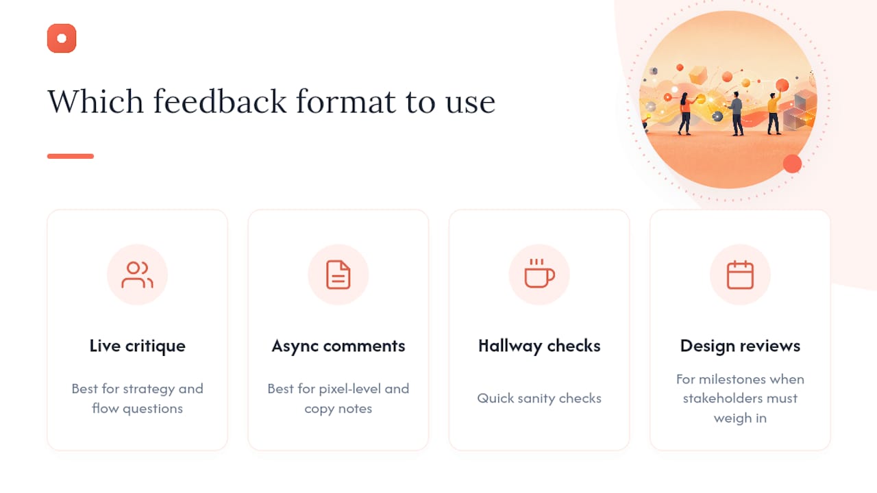
High-performing teams tend to run a hybrid model: pixel-level visual checks happen async, while flow or strategy changes move to a short, focused call. That split keeps comment threads from spiraling into twenty replies over something that a two-minute conversation would have settled immediately.
A practical rule of thumb: if a comment thread hits four or more back-and-forth replies without resolving, stop and schedule a fifteen-minute call. Typing out disagreement rarely converges faster than talking it through.
Pro Tip: Batch your feedback. Review a full flow or full page before commenting, then post one consolidated set of notes. Commenting screen-by-screen as you go interrupts the designer's focus and often produces contradictory notes by the end of the review.
What Questions Should a Design Critique Focus On?
Good facilitation comes down to asking fewer, sharper questions rather than covering everything. Successful critiques define goals upfront and limit the session to 3 to 5 high-impact questions instead of trying to review an entire project in one sitting.
Here's a plug-and-play question bank to pull from:
- "Does the visual hierarchy match what we want the user to do first?" A good answer names the specific element competing for attention, not just "yes" or "no."
- "What's the primary user goal on this screen, and does the design support it in one glance?"
- "What's the success metric we're designing toward here?" (conversion, task completion, time on page)
- "Where's the biggest technical risk in this design, and have we validated it?"
- "Does this meet our accessibility baseline, particularly contrast and tap-target size?"
Pick three to five of these per session based on where the project actually is. A first-draft review needs the hierarchy and user-goal questions. A pre-launch review needs the technical risk and accessibility questions. Trying to ask all five every time dilutes the conversation and burns time that should go toward depth on the questions that matter most right now.
How Should Designers Receive Feedback Well?
Receiving feedback is its own skill, and it's the half of the equation most critiques neglect. Experts consistently recommend that designers listen and clarify rather than defend, treating critique as a tool for refinement instead of a personal verdict.
Start by restating what you heard, in your own words, before responding: "So the concern is that the CTA gets lost against the background, not the color itself. Did I get that right?" This single habit prevents the single most common failure mode in critique: solving the wrong problem because you reacted to the words instead of the underlying issue.
Ask clarifying questions before you start revising:
- "Is this a blocking issue or a preference?"
- "What would success look like if this were fixed?"
- "Is there data behind this, or is it a gut reaction?"
- "Should I explore multiple directions or refine this one?"
After the session, record every note in one place, mark each as blocking or nice-to-have, and assign an owner, even if that owner is you. If you disagree with a piece of feedback, push back with evidence, not defensiveness: point to user data, a prior test result, or a stated constraint rather than simply repeating your original reasoning louder.
Which Tools Handle Feedback Best?
The right tool depends on what kind of note you're leaving. Figma comments work well for pixel-anchored notes directly inside the working file, ideal when the designer is going to open that file right after. Loom fits walkthrough narration, especially for flow-level or motion feedback that's hard to describe in text. Markup.io suits live website annotation when the design already exists on a real URL and you need to mark it up in context. Dribbble works for portfolio-level and community feedback, where the audience is other designers reacting to finished work rather than a client shipping a product.
A quick workflow for each: in Figma, pin the comment directly on the element and @mention the owner. In Loom, record a two-minute walkthrough and drop the link with a one-line summary of the main concern. In Markup.io, screenshot the live page, circle the problem area, and note the expected fix.
AI-assisted checks can catch obvious issues like contrast ratios or missing alt text as a first pass. They're not a substitute for the kind of judgment call that separates a good design feedback tool workflow from a checklist exercise.
What Does a Real Design Critique Sound Like?
Here's a short transcript from a live critique, annotated to show the method at work.
Presenter: "This is the updated onboarding flow, step two of four. We're trying to reduce the drop-off we saw at this stage last month."
Critic: "Looking at step two, the progress indicator disappears compared to step one. New users might lose track of how much is left, which could actually work against the drop-off problem you're solving for. Could we keep the progress bar visible through the whole flow?"
Facilitator: "Good catch. Let's mark that as blocking since it ties directly to the metric we're targeting. Anything on the copy in this step?"
Critic: "The copy is clear. One question: what's the success metric for this specific screen? If it's completion rate, I'd want to test the button copy too, but that might be nice-to-have for round two."
Three things happened here worth noticing. The critic named the exact element (progress indicator), tied it to the presenter's own stated goal (reducing drop-off), and ended with a question instead of a command. The facilitator then assigned priority immediately, rather than letting it sit ambiguous in the notes.
A useful post-session summary template turns all of this into action:
- Issue: Progress indicator missing on step two.
- Priority: Blocking.
- Owner: Presenter to propose a fix by Thursday.
- Status: Open.
How Pinhub Turns Vague Comments Into Resolved Fixes
A pixel-anchored workflow removes the ambiguity that kills most async feedback. The process runs like this: upload a screenshot or a Figma frame, pin a comment directly on the specific spot, tag the owner, let the thread auto-summarize into a checklist, and resolve it once fixed.
Consider the difference this makes for a note like "this looks off." Pinned to the exact element, that comment can become "the contrast on this gray text fails accessibility guidelines," fixed within the hour, and checked off, instead of triggering three back-and-forth messages trying to figure out which "this" someone meant.
A few specifics worth knowing:
- Guest reviewers can comment without creating an account, so clients and outside collaborators join the conversation without friction.
- Version history tracks every round of changes automatically.
- AI-generated summaries roll scattered comments into a single actionable list.
Pro Tip: When a client sends "it just doesn't feel right" over email, ask them to pin the comment directly on the design instead. Nine times out of ten, the act of pinning forces them to identify the exact element, which does most of the diagnostic work for you.
What I Wish More Reviewers Did
The mistake I see most often isn't rudeness. It's laziness dressed up as a quick note. "Make it pop" takes five seconds to type and costs the designer twenty minutes of guessing. The fix is almost always the same: name the element, state the impact, ask a question.
My go-to habit for speeding up reviews: before typing any comment, finish the sentence "...and this matters because..." If you can't finish it, you're not ready to leave the note yet.
Treat critique sessions like product work, not personality tests. The goal is a better product, not a chance to prove you noticed something first.
Run Faster Reviews With Pixel-Anchored Feedback
Every rewrite pattern in this guide gets easier when the feedback tool does some of the diagnostic work for you. Usepinhub lets you pin a comment to the exact pixel on a screenshot or Figma frame, so "this looks off" becomes a specific, resolvable note without three rounds of clarifying questions.
Guest reviewers, including clients who don't want another login to remember, can comment directly without creating an account. Threads roll into an AI-generated summary and a resolved checklist, so nothing sits buried in a scroll of comments. Product design teams, agencies managing multiple clients, and remote collaborators working across time zones tend to see the biggest time savings, since async reviews stop requiring a live meeting just to figure out what someone meant.
If you're tired of translating vague notes into action items by hand, try Pinhub on your next review and see how much faster a pinned comment resolves compared to a scrolling thread.
Sources
- How to give feedback to designers — Humbl Design
FAQ
How Do You Give Good Design Feedback?
Name the specific element, describe what you observe, explain who it affects and how, then end with a question or clear next step instead of a command.
What Are Some Examples of Good Design Feedback?
"The CTA on the pricing page is competing with the header for attention, which could pull focus from the click we need. Could we reduce the header's visual weight?" is a strong example because it names the element, states the impact, and asks for direction.
What Are Some Examples of Creative Design Feedback?
Creative feedback reframes a taste reaction into an outcome question, such as asking "what would make this headline the most prominent element on the page?" instead of saying an element needs to "pop."
What Makes a Positive Design Review Comment Effective?
A strong positive comment names the specific thing that worked and why, such as "the new navigation structure cut the steps to checkout, which should help the conversion goal directly," rather than a generic compliment.
Can Pinhub Help With Giving Design Feedback?
Yes. Usepinhub lets reviewers pin comments to an exact spot on a screenshot or Figma frame, which turns vague reactions into specific, resolvable notes and rolls them into an automatic checklist.