
AI design feedback is genuinely useful as a fast, evidence-driven first pass, but it is not a substitute for human judgment on strategic, brand, or creative decisions. Use it to catch objective issues before your crit, not to replace the crit itself.
The clearest wins are narrow and repeatable:
- Pre-crit QA: Run AI checks before a human review session to clear low-hanging issues so the conversation focuses on strategy, not spacing errors.
- Accessibility sanity checks: Quickly flag contrast ratios, font size concerns, and touch-target sizes before a formal WCAG audit.
- Consistency audits: Spot component drift across screens, mismatched spacing tokens, or inconsistent button styles.
- Dev-handoff checklists: Convert AI output into a structured list of measurable items your developers can verify during implementation.
Keep those use cases in mind as you read. Every section below is built around making AI feedback more reliable, not more magical.
Key Takeaways
AI design feedback works best as a first-pass check for measurable issues, not as a final creative arbiter, and it produces the most value when combined with pixel-anchored human review and a clear decision log.
| Point | Details |
|---|---|
| Use AI for measurable checks | Run AI before human review to catch contrast, spacing, and consistency issues. |
| Always require evidence | Ask the model to return specific token names, coordinates, or contrast ratios for every suggestion. |
| Verify before applying | Measure contrast with a dedicated tool and reproduce flagged issues in human review before making changes. |
| Follow a structured workflow | Tag, pin, iterate, and log every AI suggestion to maintain an auditable review trail. |
| Usepinhub connects AI and human review | Pixel-anchored comments, AI summary lists, and version control turn AI output into resolved, trackable checklists. |
Table of Contents
- What is AI design feedback and when does it actually help?
- Where AI feedback breaks down: common failure modes
- How to prompt AI for useful, specific feedback
- What criteria should you ask AI (and reviewers) to check?
- What do different AI feedback tools actually do?
- How to verify AI recommendations before you act on them
- Why AI design feedback needs a human layer to work
- Pinhub gives your team a better way to act on design feedback
- Useful sources and further reading
- FAQ
What is AI design feedback and when does it actually help?
AI design feedback refers to models, agents, or plugins that analyze images, design files, or Figma canvases and return structured critique or automated checks. The term covers a wide range of tools, from multimodal vision models you prompt with a screenshot to canvas-aware agents that read your actual layers, tokens, and component libraries.
The input mode matters more than most designers realize. An image or screenshot analyzer sees only pixels. It cannot know whether a gray button is disabled by design or a mistake, and it has no access to your spacing tokens or brand color system. A canvas-aware agent, by contrast, reads the file structure directly, which gives it access to component names, token values, and layer hierarchy. That context produces more specific feedback, though it also means the agent's quality depends heavily on how well your file is organized.
Where AI feedback adds the most value:
- Catching objective, measurable issues (contrast ratios, spacing inconsistencies, misaligned elements)
- Surfacing edge states you may have forgotten to design (empty states, error states, loading states)
- Generating a first-pass checklist to prepare designs for human review
- Running quick cross-screen consistency checks before a design review meeting
What it cannot reliably do: evaluate whether your design serves the business goal, whether the brand voice is right, or whether a creative direction is worth pursuing. Those calls belong to people.
Where AI feedback breaks down: common failure modes
Vision and multimodal models can surface compositional and hierarchical features from visual layouts, but their outputs vary significantly by prompt and model architecture. Knowing where they fail helps you catch bad recommendations before you act on them.

Hallucination and invented context. AI models sometimes describe states or components that do not exist in the design, or assume a user flow that was never shown. A model analyzing a single screen has no knowledge of the screens before or after it, so it may flag a "missing back button" on a screen where navigation lives in a persistent header outside the frame.
Shallow pattern-matching. Many models default to averaged, trend-driven suggestions. They may recommend increasing font size to 16px because that is a common accessibility guideline, without knowing your design system already uses a 15px body token that passes contrast at your target viewport. The suggestion sounds correct but ignores your actual context.
Brittle accessibility claims. Large multimodal models can produce plausible design reasoning but often conflate visible evidence with inference, so an AI claiming a color combination "fails WCAG AA" may be estimating from pixel appearance rather than measuring the actual hex values. Always verify contrast claims with a dedicated color tool.
Missed interaction details. Static image analysis cannot evaluate hover states, focus rings, animation timing, or keyboard navigation order. An AI reviewing a screenshot of a form will not know whether the tab order is logical.
Lack of product context. The model does not know your KPIs, your user research, or why a design decision was made. It will suggest changes that look correct in isolation but conflict with tested decisions.
Mitigation strategies:
- Provide your design system tokens or a component library link when available
- State the business goal and user persona in every prompt
- Ask the model to cite specific evidence (pixel coordinates, token names, contrast ratios) for each suggestion
- Request alternative approaches and ask the model to indicate its confidence level
Pro Tip: Require the model to produce evidence for every actionable suggestion. Ask it to return the specific screen coordinates, token name, or CSS-equivalent value that supports each recommendation. If it cannot, treat that suggestion as unverified.
How to prompt AI for useful, specific feedback
The quality of AI design feedback depends almost entirely on how you frame the request. Start every prompt with the exact question or decision you need answered, not a general "review this design."
What to include in every prompt:
- Target device and viewport (e.g., 1440px desktop, 375px mobile)
- Scope of the review (full screen, a single component, a specific flow)
- Measurable criteria (WCAG AA contrast threshold, 8px spacing grid, 44px minimum touch target)
- Design system tokens or library reference, if available
- The user persona and their primary goal on this screen
- What changes are allowed (e.g., "do not suggest layout changes, only typography and color")
Reusable prompt templates:
-
Hierarchy check: "Review this [screen name] at 1440px. Identify the top three elements a user's eye lands on first. Does that order match the intended priority: [list your priorities]? Return specific element names and their visual weight."
-
Accessibility audit: "Analyze this screen for WCAG 2.1 AA compliance. Flag any text elements where contrast may fall below 4.5:1 and any interactive elements below 44px. Return the element name, estimated contrast ratio, and the specific issue."
-
CTA prominence check: "Does the primary CTA on this screen stand out clearly at both 1440px and 375px? Compare its visual weight to the secondary actions. Return a confidence level and the specific visual properties that support your answer."
-
Consistency audit: "Compare these three screens for component consistency. Flag any buttons, input fields, or spacing values that appear inconsistent. Return the element, the screen it appears on, and the specific discrepancy."
-
Copy clarity check: "Review the microcopy on this form. Is each label and error message clear to a first-time user? Flag any ambiguous phrases and suggest a more direct alternative."
The difference between a minimal and a rich-context prompt is significant. "Review this design" returns generic advice. "Review the checkout screen at 375px for a first-time buyer who has already added items to their cart. The primary goal is completing payment. Flag anything that could cause hesitation or confusion, and return specific element names" returns feedback you can act on.
Pro Tip: Use the Ramz evidence-first workflow as a model: observe, measure with exact token values, derive the design's underlying logic, then produce concrete recommendations. Apply the same structure to your prompts.
What criteria should you ask AI (and reviewers) to check?
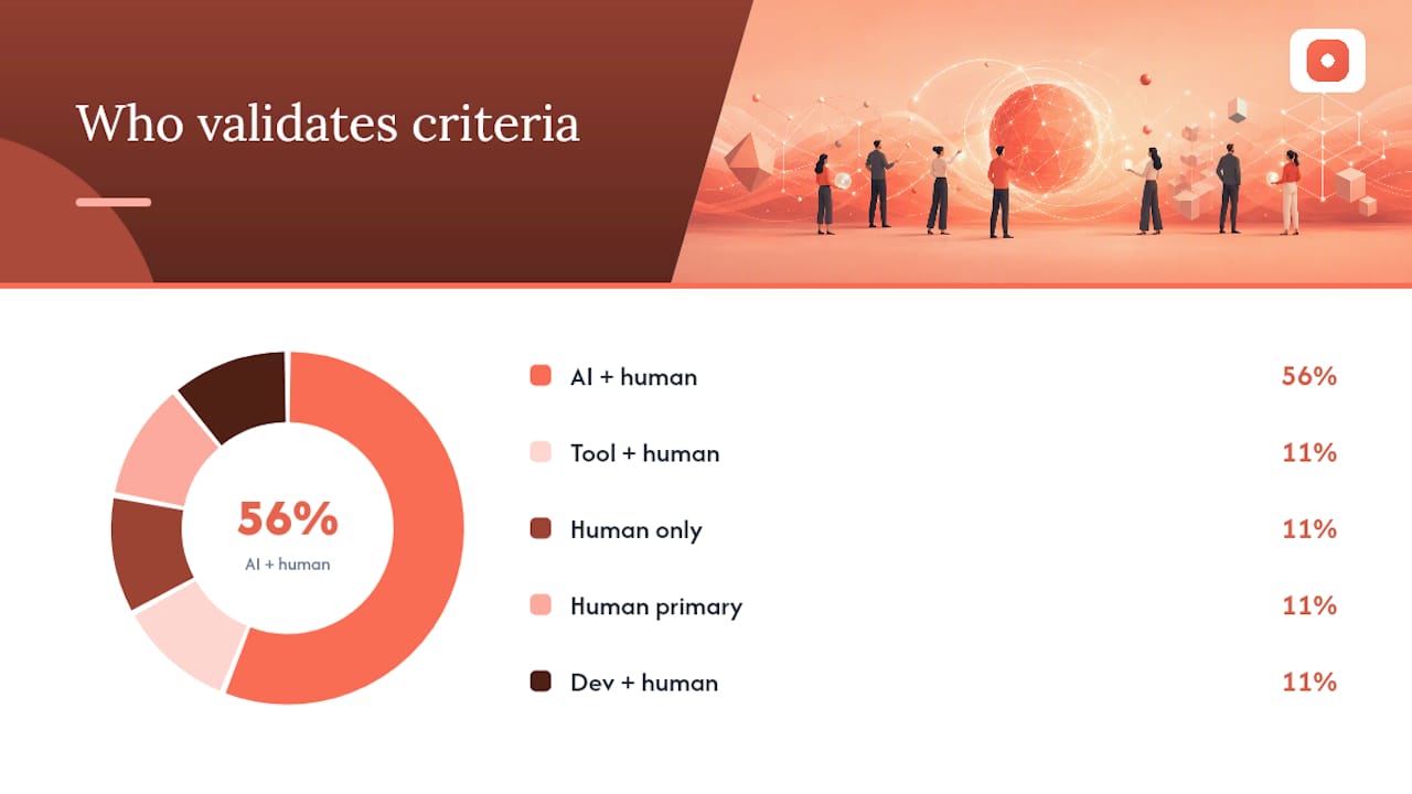
A consistent evaluation checklist keeps both AI and human reviewers focused on the same dimensions. Use this table as your standard review framework.
| Criterion | What to check | Measurement method | Who validates |
|---|---|---|---|
| Visual hierarchy | Primary, secondary, tertiary element order | Eye-tracking heuristic, size/contrast delta | AI + human |
| Spacing & alignment | Grid adherence, component margins | Token values, pixel measurements | AI + human |
| Typography & scale | Type scale, line height, readability | Token names, contrast ratio | AI + human |
| Color contrast | WCAG AA (4.5:1 text, 3:1 UI) | Color contrast analyzer tool | Tool + human |
| Component consistency | Button styles, input variants, icon set | Cross-screen comparison | AI + human |
| Interaction & states | Hover, focus, error, empty, loading states | Manual walkthrough | Human only |
| Copy clarity | Label precision, error message clarity | Readability check | Human primary |
| CTA prominence | Visual weight vs. secondary actions | Contrast and size delta | AI + human |
| Performance/weight | Image file sizes, animation complexity | File size check, frame rate | Dev + human |
WCAG contrast requirements are a useful example of what automated checks can and cannot do. A color contrast analyzer tool can measure the exact ratio between two hex values. An AI analyzing a screenshot can only estimate. Manual checks are still required for text over gradients, text on images, and any state that only appears on interaction. For guidance on evaluating designs against measurable criteria, the evaluation framework matters as much as the tools.
Convert each table row into a checklist item in your review thread. Assign each item to AI, a human reviewer, or both, and record the outcome before moving to the next iteration.
What do different AI feedback tools actually do?
A multi-pass analyzer architecture that separates layout, typography, motion, and uniqueness checks reduces mode confusion and produces more reliable, modular feedback. That principle maps directly to the tool categories available today.
| Tool type | Inputs needed | Typical outputs | Best for | Confidence level |
|---|---|---|---|---|
| Canvas-aware agent | Design file with layers and tokens | Component-level critique, token-specific flags | Teams with organized design systems | High when file is clean |
| Figma plugin analyzer | Open Figma file | Visual cohesion checks, CTA heuristics, mock user behavior | Quick in-file heuristic checks | Medium |
| Standalone image/screenshot analyzer | PNG or JPEG screenshot | Layout, hierarchy, contrast estimates | Fast first-pass on any design | Low to medium |
| Engineering-oriented analyzer | Design file or spec | Implementation specs, token extraction, handoff notes | Dev handoff verification | Medium to high |
Canvas-aware agents, like the feedback agent built into Figma's canvas, have the most context but are limited by the quality of your file organization. A file with unnamed layers and missing tokens will return vague feedback even from a capable agent. Plugin analyzers that focus on visual cohesion and CTA optimization are fast and useful for heuristic checks inside your existing workflow. Standalone image analyzers are the most accessible but lose all hidden states, layer names, and token values.
For teams comparing design feedback tools across categories, the right choice depends on whether you need fast heuristic checks or deep, auditable analysis tied to your design system.
- Canvas agents: best when your file is well-organized and you need token-specific feedback
- Plugin analyzers: best for quick visual-cohesion checks without leaving your design tool
- Image analyzers: best for reviewing exported screens or designs from tools without plugin support
- Engineering analyzers: best at the handoff stage when developers need implementation-ready specs
How to verify AI recommendations before you act on them
Acting on an AI suggestion without verification is how regressions happen. Every recommendation needs a quick check before it enters your design.
Verification checklist:
- Reproduce the flagged issue in a human review. Can a human reviewer see the same problem independently?
- Measure contrast with a dedicated color tool (e.g., Colour Contrast Analyser or the browser's built-in accessibility inspector). Do not rely on an AI's estimated ratio.
- Run a click-path sanity test on the updated design. Does the change improve the intended flow or introduce friction?
- Check the updated screen with an automated accessibility tool (e.g., axe DevTools or WAVE) for any regressions.
- Where feasible, use session recordings or A/B testing to confirm that a change improves user behavior, not just visual appearance.
What to record for each verified change:
- Before and after screenshots with the specific element labeled
- Token values before and after (e.g.,
color-text-primarychanged from#6B6B6Bto#4A4A4A) - Contrast ratio before and after, measured with a tool
- Accessibility score before and after, if applicable
For teams running user acceptance testing, AI suggestions that have passed verification make strong candidates for acceptance test cases because they are already tied to measurable criteria.
To track AI reliability over time, record three simple metrics: the false positive rate (AI suggestions that human review rejected), the acceptance rate (suggestions applied after verification), and the time saved per review cycle. These numbers help you calibrate how much weight to give AI feedback on future projects.
Why AI design feedback needs a human layer to work
The most common mistake teams make with AI design feedback is treating it as a verdict rather than a starting point. AI models are good at pattern recognition. They are not good at knowing why your team made a specific decision, what your users tested in the last round of research, or whether a creative risk is worth taking. Those are judgment calls, and judgment requires context that no model currently has access to.
There is also a subtler problem. Because AI feedback sounds authoritative, designers sometimes apply suggestions without checking them. A model that confidently flags a contrast issue may be estimating from pixel appearance rather than measuring actual values. A model that recommends increasing button size may not know that your design system already defines touch targets at the correct minimum. The suggestion sounds right. It may not be.
The responsible approach is to treat AI feedback the way you treat a first-pass peer review: useful for catching things you missed, not authoritative on things that require context. Require evidence. Verify measurements. Log decisions. And keep the human reviewer in the loop for anything that touches strategy, brand, or user experience.
Pinhub gives your team a better way to act on design feedback
Designers who want to put the workflow in this guide into practice need a place to pin AI suggestions, track iterations, and bring clients into the review without friction. Usepinhub is built for exactly that.
With Usepinhub, you can upload screenshots or Figma frames, pin comments to specific pixels, and use AI summary lists to convert a full review thread into a resolved checklist. Guest reviewers join without creating an account, so your clients and stakeholders can weigh in on the human-review step without any setup. Version control keeps every iteration on record, so when you re-run AI checks after applying changes, you always have a clear before-and-after comparison.
The free plan is a good place to start if you want to see how pixel-anchored feedback changes the quality of your review conversations. For teams ready to add Figma integration, version control, and AI summaries, the Pro and Team plans include everything described in this guide. Start your first review on Pinhub and see how much clearer your feedback process becomes when every comment is tied to a specific screen location.
Useful sources and further reading
The sources below informed this guide and are worth reading directly if you want to go deeper on any of the methods described.
- arXiv:2304.08485
- arXiv:2305.10355
- RAND Perspective on automation and human oversight
- musqulu/ramz-design-skill
- Va1bhav512/design-analysis-mcp-server
FAQ
What is AI design feedback used for?
AI design feedback is used to catch measurable issues like contrast failures, spacing inconsistencies, and component drift before a human review. It works best as a first-pass check, not a final creative decision.
How do you prompt AI for useful design feedback?
Include the target viewport, scope, measurable criteria (such as WCAG contrast thresholds), your design system tokens, and the user persona in every prompt. Require the model to return specific evidence for each suggestion.
What are the biggest limitations of AI design feedback?
AI models cannot evaluate business goals, brand voice, or interaction states. They also tend to estimate rather than measure, so contrast and spacing claims should always be verified with a dedicated tool.
How does Usepinhub work with AI design feedback?
Usepinhub lets you pin AI suggestions to specific screen pixels, convert review threads into AI-generated checklists, and track versions across iterations, giving AI output a structured place to live in your review workflow.
What is WCAG and why does it matter for AI design checks?
WCAG (Web Content Accessibility Guidelines) sets measurable contrast and size standards for accessible design. Automated tools can flag potential failures, but accurate measurement requires a dedicated color contrast tool and manual verification for complex cases.