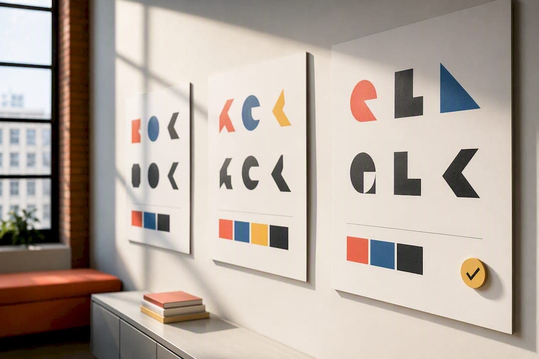
A logo feedback process succeeds when it turns opinions into observable, prioritized requests tied back to the original brief, not when it collects more comments. The first action is simple: before anyone reacts to a design, reopen the brief and agree on what "good" looks like, then require every comment to separate what someone sees from what they think it means and what they want changed. Cap each round to a handful of prioritized edits, and confirm the winner with a small-size and one-color test before you call it done.
TL;DR:
- Structured logo feedback focuses on prioritizing few, clear edits linked to the original brief rather than collecting endless comments based on personal taste.
- Reopening and clarifying the brief before review ensures everyone aligns on success criteria such as technical constraints and brand tone.
- Comments should be broken into observation, interpretation, and request, with each labeled by priority to guide effective revisions.
- Testing logo legibility at small sizes, in black and white, and through quick mockups helps resolve disagreements faster than opinion-based debates.
- Using pixel-anchored comments and limiting revisions to a set number accelerates approval rounds and avoids iteration paralysis.
Table of Contents
- Why a Structured Logo Feedback Process Beats Open-Ended Reviews
- How Do You Run a Logo Review Round Step by Step?
- What Templates Turn Vague Feedback Into Real Direction?
- Which Tests Actually Resolve Logo Disagreements?
- Who Approves the Logo, and How Do You Keep Rounds Finite?
- How Pixel-Anchored Comments and Guest Reviewers Speed Up Approvals
- Your Copyable Pre-Review Checklist
- Pinhub Perspective: Why We Build Pixel-Anchored Feedback
- Try Pinhub: Start Your Next Logo Review the Right Way
- Sources
- FAQ
Why a Structured Logo Feedback Process Beats Open-Ended Reviews
Open-ended reviews invite everyone to weigh in on personal taste, and taste has no finish line. A marketing director likes rounded corners, the CEO wants "more energy," and the designer ends up chasing five different visions across six rounds. That's design by committee, and it rarely produces a stronger mark. It just produces more billable hours and a logo that pleases no one completely.
A criteria-driven review changes the conversation. Instead of "I don't love it," reviewers respond to specific questions: Does it read at 16 pixels? Does it survive in one color? Does it match the brief's tone words? That framing pulls people out of aesthetic reflexes and into functional evaluation, which is exactly the shift Forbes Business Council's design guidance recommends when it warns against treating a logo like a framed art piece instead of a working identifier.
The payoff shows up in fewer rounds and clearer approvals. Structured processes typically resolve within a few rounds, according to Patrick Iverson's approval framework, compared to unstructured reviews that can drag on indefinitely.
What structure buys you:
- Comments tied to the brief instead of personal preference
- Fewer contradictory requests across stakeholders
- A designer who can act on feedback instead of guessing at it
- A defensible record of why the final mark was chosen
How Do You Run a Logo Review Round Step by Step?
A logo feedback process only works if every round follows the same sequence. Skipping steps is how projects drift, which is exactly what the logo design process checklist is built to prevent by mapping discovery through final files into checkpoints nobody can quietly skip.
-
Reopen the brief before anyone looks at the designs. Confirm the success criteria out loud: target audience, required tone words, competitive positioning, and technical constraints like favicon legibility or single-color reproduction. If reviewers can't recite these in one sentence, pause the review until they can.
-
Present two to three refined directions, not five weak ones. A revision menu of two or three distinct concepts forces meaningful comparison and avoids the analysis paralysis that comes from too many half-formed options, a pattern Forbes Communications Council flags as a common derailment point in creative reviews.
-
Collect comments in three parts: observation, interpretation, request. Reviewers state what they literally see ("the wordmark shrinks unevenly"), what they think it signals ("it looks unfinished at small sizes"), and what they want done ("test a heavier weight below 200 pixels wide"). This structure, drawn from practical critique frameworks like Ian Paget's logo critique guide, keeps comments grounded in fact rather than mood.
-
Require a priority label on every comment. Every note gets tagged blocking, important, or optional. Blocking issues stop approval outright. Important issues need addressing before final files. Optional notes are nice-to-haves the designer can skip without consequence.
-
Let the designer respond with focused prototypes, not a full redo. The response should show two or three targeted edits against the flagged issues, plus a short note on what changed and why. That documentation matters later when someone asks why an earlier idea got dropped.
Repeat this loop for each round, but never open a new round without closing the last one's action items first. A round that ends with "some feedback pending" is a round that never really ended.
What Templates Turn Vague Feedback Into Real Direction?
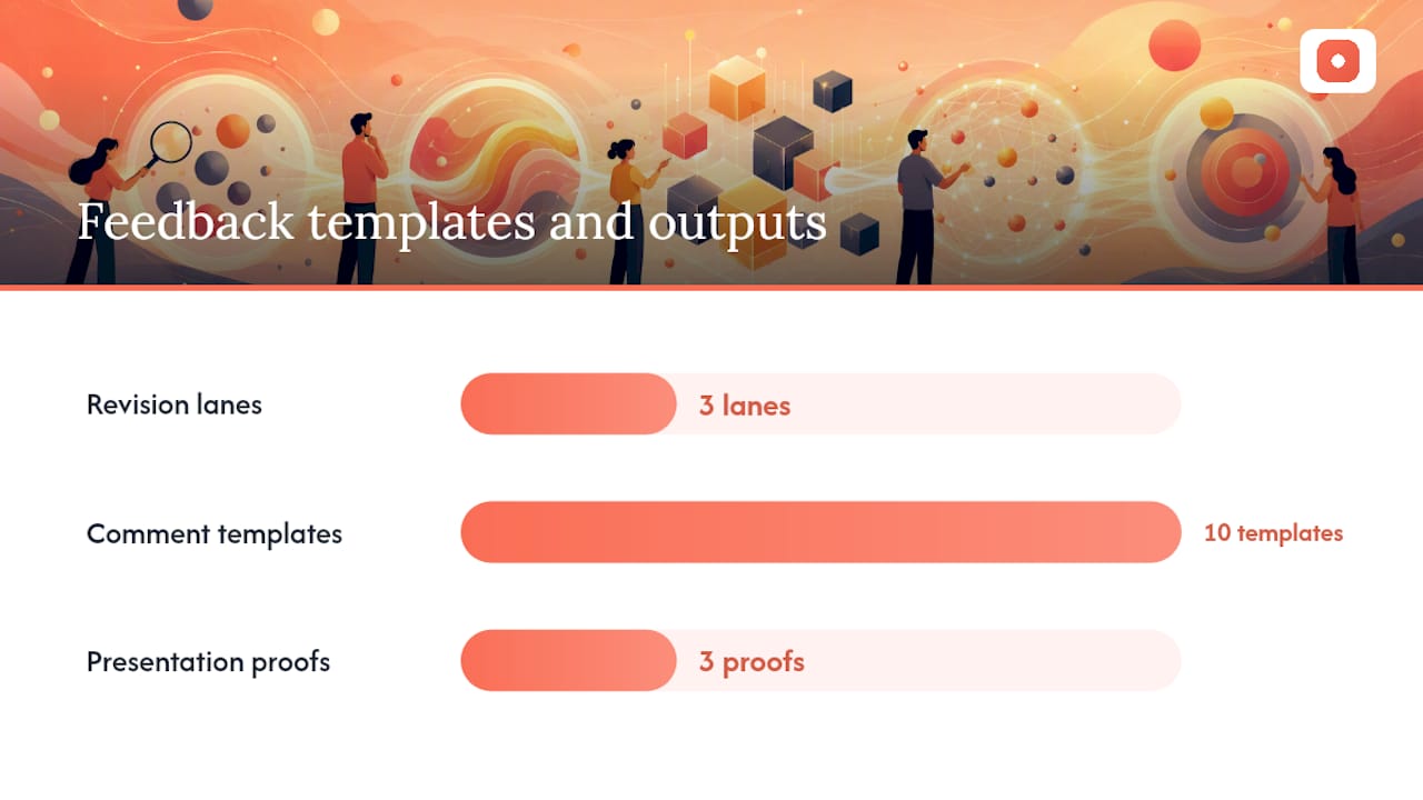
A revision menu works because it removes an infinite option space and replaces it with three defined paths: a safe refine (tighten spacing, adjust weight), a style shift (change the mark's overall feel while keeping the concept), and an alternative lockup (rearrange type and icon relationships). Reviewers choose a lane instead of inventing a new one every round, which is precisely the discipline behind structured revision prompts built for faster design iteration.
Ten comment templates that follow observation, interpretation, request:
- "The icon overlaps the wordmark at 100px [observation]. It reads as a rendering error, not a design choice [interpretation]. Add 4px of clearance minimum [request]."
- "The blue disappears against dark backgrounds [observation]. It will fail on our app icon [interpretation]. Test a lighter tint or add a white outline variant [request]."
- "The typeface feels corporate and flat [observation]. It undersells the brand's playful tone from the brief [interpretation]. Try a rounded or humanist alternative [request]."
- "The mark loses its shape at favicon size [observation]. Users won't recognize it in a browser tab [interpretation]. Simplify to two shapes max for the small-size version [request]."
Present each round with before/after comparisons, a mockup showing the logo at actual favicon size, and a one-color proof. Reviewers judge differently when they see real conditions instead of a clean 1200 pixel file on a white background.
Pro Tip: Ask reviewers to write their comment before they say whether they like the design. Forcing the observation first slows down the knee-jerk reaction and produces sharper feedback.
Which Tests Actually Resolve Logo Disagreements?
Testing settles arguments that opinion alone never will. A few lightweight checks catch most real problems:
- Thumbnail and favicon checks. Shrink the mark to 16 and 32 pixels. If it turns to mud, no amount of debate about color fixes that.
- Solid black, solid white, and reverse tests. A logo that only works in full color has a structural weakness, not a styling issue.
- Print-and-step-back tests. Printing a mockup and viewing it from across the room, a technique Forbes Business Council's evaluation guide recommends, exposes readability problems that a monitor hides.
- A/B preference tests. Ask a specific question, such as "Which version is easier to recognize at thumbnail size?" and score responses on a 1 to 7 rating scale for memorability and trust rather than a vague "which do you like better."
When a test produces a clear majority or a clean pass/fail on legibility, act on it immediately. When results split close to evenly, treat that as a signal to gather one more data point, not a reason to keep testing indefinitely. Endless testing is just another form of delay.
Who Approves the Logo, and How Do You Keep Rounds Finite?
Every logo feedback process needs one person, not a committee, who holds final sign-off. Name that person before the first review, not after the second round stalls on conflicting notes.
Set a cap of a few revision rounds from the start, matching the pattern Patrick Iverson's approval guide describes as typical for a well-run process, and communicate it upfront so stakeholders understand feedback has a deadline, not an open door.
When feedback contradicts itself, meaning one stakeholder wants bolder color and another wants it muted, resolve it by returning to the brief's stated audience and tone words rather than splitting the difference. If the brief doesn't settle it, a quick audience preference test usually will.
Governance essentials:
- One named approver, agreed on before review starts
- A fixed number of rounds, stated at kickoff
- A written resolution path for contradictory notes
- A record of what was approved and why, kept with the final files
Review timing matters too. Building in a short gap between rounds, rather than same-day turnarounds, gives reviewers time to look with fresh eyes instead of reacting on autopilot, a rhythm worth borrowing from broader thinking on timing in design work.
How Pixel-Anchored Comments and Guest Reviewers Speed Up Approvals
A message template that works in practice covers three things every time: what's strong about the direction, what's blocking approval, and what change is being requested. That's the observation, interpretation, request structure applied to a real note, and it holds up whether it's written in an email thread or dropped directly on a design file.
Annotated screenshots beat written descriptions because the comment sits exactly where the problem is instead of describing coordinates in prose. Tools built around pixel-anchored comments, version history, and automated summary lists cut down the rounds spent clarifying which element someone meant.
| What slows reviews down | What fixes it |
|---|---|
| Comments scattered across email and chat | Comments pinned to the exact spot on the design |
| Reviewers needing accounts to weigh in | Guest reviewer access with no signup |
| Losing track of what changed between versions | Built-in version history |
| Re-reading a long thread to find open items | Auto-generated summary lists |
For ready-to-copy comment language and workflow structure, design feedback templates and a broader branding feedback process guide are worth keeping on hand for your next review.
Your Copyable Pre-Review Checklist
Before you send feedback on any logo round, run through this list:
- Confirm you've reopened the brief and can state the success criteria in one sentence.
- Check that every comment separates observation, interpretation, and request.
- Label each comment blocking, important, or optional, so the designer knows what to fix first.
- Order comments by priority, not by the sequence you noticed them.
- Confirm the direction passes small-size and one-color tests before calling a revision final.
A revision is done when it clears every blocking item, the approver has signed off in writing, and the design has passed its small-size and one-color checks. At that point, request final files: vector formats, color and black-and-white variants, and a locked spacing guide.
Pinhub Perspective: Why We Build Pixel-Anchored Feedback
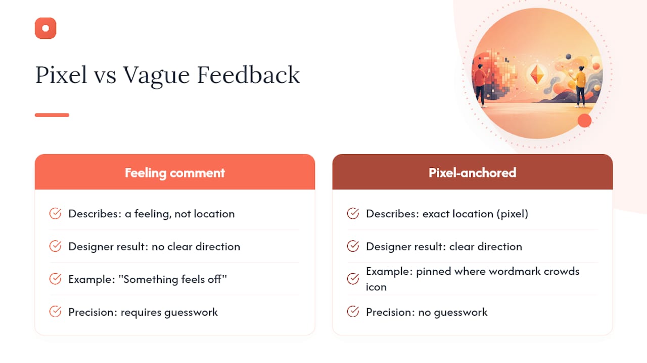
Most vague logo feedback isn't caused by bad taste. It's caused by comments that describe a feeling instead of a location. "Something feels off" doesn't tell a designer where to look. A comment pinned to the exact pixel where the wordmark crowds the icon does.
That's the problem Usepinhub was built to solve, and the guest reviewer flow removes the second-biggest friction point: requiring a client to create an account before they can point at a design and say what's wrong.
— Pinhub
Try Pinhub: Start Your Next Logo Review the Right Way
Usepinhub replaces scattered feedback threads with comments pinned directly to the exact spot on a design, so nobody has to guess which corner of the logo someone means.
Getting started takes three steps: create a workspace, invite a guest reviewer with no account required on their end, and upload the logo screenshot or Figma file. From there, pins anchor every comment to its exact location, threaded replies keep the observation, interpretation, and request structure intact, and an automated summary list shows the designer exactly what's blocking, important, or optional at a glance. Version history tracks every round so nobody loses track of what changed and why.
If your last logo review dragged through six rounds of "make it pop," try Usepinhub on your next round and see how much faster a pinned comment resolves than a paragraph of description.
Sources
- How to use A/B testing to improve your marketing
- How to Approve a Logo: What to Look At and What to Ignore | Patrick Iverson
- Logo design process checklist: From discovery to final files
FAQ
What Is the Golden Rule for Logo Feedback?
Judge the logo against the brief's success criteria and its functional use cases, like small-size legibility and one-color reproduction, not against personal taste.
Is $500 Too Much for a Logo Design?
It depends entirely on scope. A logo project typically covers a simple mark with limited revisions, while a full identity system with strategy, multiple concepts, and file packages costs considerably more.
What Are the Core Principles of Effective Logo Design?
Most frameworks agree on a similar set: simplicity, memorability, versatility across sizes and colors, appropriateness to the brand, and timelessness rather than trend-chasing.
What Elements Make a Logo Design Strong?
Strong logos typically balance shape, color, typography, scalability, one-color reproducibility, contrast, and a clear connection to the brand's positioning.
How Many Revision Rounds Should a Logo Review Include?
Most structured processes resolve within two to three rounds when the brief is clear and feedback stays prioritized and specific.