
The fastest results come from combining two feedback types: quick community or async reviews for gut-check clarity, and targeted customer surveys or session replays for real context. Pick one collection point today, drop a screenshot into it with a short brief on what you want reviewed, and you'll have usable landing page feedback within 48 hours.
TL;DR:
- Quick community reviews require precise questions to filter noise and deliver actionable insights within 48 hours.
- Pair behavioral tools like heatmaps with surveys to uncover the reasons behind user hesitation and friction points.
- Organize feedback by attaching screenshots, tagging categories, and assigning owners to prevent suggestions from getting lost.
- Prioritize feedback based on impact, confidence, and effort, focusing on high-scoring suggestions rather than loudest opinions.
- Use pixel-anchored comments, guest reviewers, and automated summaries to speed up and clarify the review process.
Table of Contents
- Where to Get Landing Page Feedback Fast
- How to Organize Landing Page Feedback Without Losing It
- Which Tools Actually Improve Landing Page Feedback Quality
- How Do You Prioritize Landing Page Feedback for Testing?
- What Results Have Teams Seen From Landing Page Feedback?
- Feedback Templates and a Pre-Launch Checklist
- What Pinhub Sees When Teams Review Landing Pages
- Why Most Teams Get Landing Page Feedback Backward
- Try Pinhub for Faster, Clearer Landing Page Reviews
- Sources
- FAQ
Where to Get Landing Page Feedback Fast
Speed and reliability trade off against each other, so match the channel to what you actually need to learn.
Free communities like Reddit and Indie Hackers give you fast, blunt reactions from people with no stake in your product. The catch: replies are noisy unless you ask specific questions. One founder who posted their landing page on Reddit for critique got scattered comments until they narrowed the ask to "does the headline tell you what this does in five seconds?"
Here's how the main channels stack up:
- Free communities (Reddit, Indie Hackers): fast, cheap, but require tight prompts to avoid vague replies
- Customer interviews: slower to schedule, but you get the actual language your buyers use to describe the problem
- In-product surveys: capture intent at the moment someone hesitates or converts
- Session replay and heatmaps: show what people do, not just what they say
- Async video walkthroughs: capture tone and hesitation that text comments miss
- Paid user panels: cost money but deliver structured, unbiased outside perspective on demand
How to Organize Landing Page Feedback Without Losing It
Scattered feedback across Slack, email, and sticky notes is the single biggest reason good suggestions never make it into a design. Build a simple workflow instead:
- Choose one source of truth. Every comment needs a screenshot or page URL attached, no exceptions.
- Capture context with each note. Record the segment, traffic source, device, and what the reviewer was actually asked to evaluate.
- Tag every item. A four-category scheme (bug, clarity, trust, offer) keeps feedback sortable and maps cleanly to the metric it affects.
- Assign an owner and a deadline, then track resolution with version control so nobody re-litigates a fix that already shipped.
Pro Tip: Tag feedback the moment it comes in, not during a later cleanup pass. Untagged comments pile up fast and someone always ends up guessing what "confusing" meant three weeks later.
Which Tools Actually Improve Landing Page Feedback Quality
Different tools answer different questions, and the strongest teams stop treating them as competing options.
Heatmaps and session replay tools show friction points, rage clicks, and drop-off moments, but they don't explain why someone hesitated. Pairing behavioral data with a short survey closes that gap. Contentsquare's collected case studies show teams repeatedly finding the "why" only after layering a survey on top of replay data, which is what turned vague hunches into fixes worth prioritizing.
Statistic Callout: One of the simplest structural changes to test is your navigation bar. A HubSpot-cited experiment found removing site navigation from a landing page improved conversion by as much as 28 percent, because it removed an easy exit path before the visitor saw the offer.
Other tools worth building into your stack:
- Surveys: place them post-conversion, on exit intent, or in-page after a scroll threshold, and ask one specific question at a time
- Async video reviews: prompt reviewers to narrate what they expected to happen next and where they paused
- Screenshot pinning with threaded comments: turns "the button is confusing" into a comment anchored to the exact pixel in question
- Pre-launch QA passes: check page speed, form submissions, and tracking events before any feedback round even starts
How Do You Prioritize Landing Page Feedback for Testing?
Not every comment deserves a test. Score each suggestion on impact, confidence, and effort, then work down the list instead of chasing whatever was mentioned loudest or most recently.
- Score each item. Rate impact (1 to 5), confidence in the data behind it (1 to 5), and effort to implement (1 to 5, lower effort scores higher).
- Turn the top scorers into hypotheses. State the change, the expected direction, and the metric that proves it worked.
- Set guardrails before launch. Define the sample size and test duration up front so a noisy traffic day doesn't fool you into a false positive.
- Read results against the original hypothesis, not against whatever looks good in the dashboard that week.
This mirrors the loop Leadpages recommends: message match, QA, tracking, testing, then protecting lead quality, in that order, so you're never testing a page that's broken in ways no test can fix.
What Results Have Teams Seen From Landing Page Feedback?
A founder who rebuilt a page after Reddit critique tightened a vague headline into an outcome-focused statement and saw clearer signups within days. Community threads on forums like RevGenius surface the same handful of complaints over and over: unclear headlines, buried proof points, and demos placed too far down the page.
Other teams combining surveys with session replay caught bugs and friction points that qualitative comments alone missed, then used that combination to justify tests that leadership might otherwise have deprioritized.
Feedback Templates and a Pre-Launch Checklist
Copy these directly into your next review request.
Feedback form (2 to 4 questions):
- In one sentence, what does this page offer? (open text)
- Would you take the next step (sign up, buy, book a call)? (yes/no/maybe)
- What's the single most confusing part of this page? (open text)
Reviewer prompt for community posts or async video: "Watch the page for 10 seconds, then tell me: what did you expect to happen when you got here, and where did you hesitate?"
| QA check item | What to verify |
|---|---|
| Page load speed | Loads in under 3 seconds on mobile |
| Form submission | Test entry reaches your CRM or inbox |
| Tracking events | Conversion pixel fires correctly |
| Mobile layout | CTA is visible without scrolling |
What Pinhub Sees When Teams Review Landing Pages
Pixel-anchored comments cut ambiguity fast. Instead of "the button is confusing," a pinned comment points to the exact spot, so there's no guessing what "confusing" means. Guest reviewer access removes the account-creation step that kills momentum in a feedback cycle, and automated summaries turn a scattered thread into a checklist. The recurring mistake we see: no assigned owner, so good feedback sits unresolved for weeks.
Why Most Teams Get Landing Page Feedback Backward
Most teams treat feedback collection as the hard part and prioritization as an afterthought. It's the opposite. Getting comments is easy; a Reddit post or a five-minute survey will produce more opinions than you can act on in a week. The actual bottleneck is deciding which comment is worth a build cycle and which is just one person's preference.
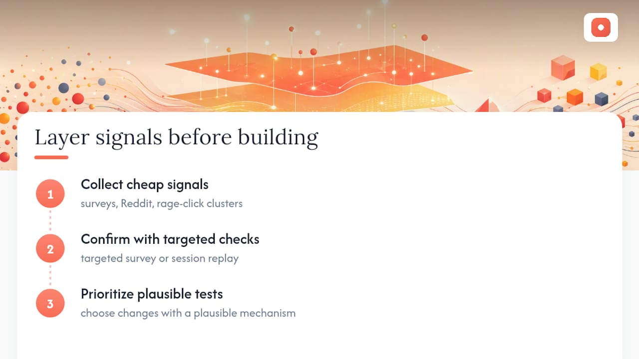
The conventional advice to "test everything" is bad advice for small teams. If you only have bandwidth for two or three experiments a month, spend them on changes with a plausible mechanism, not on whatever got the loudest reaction in a thread. A rage-click cluster on a form field backed by three separate survey comments about confusion is worth a test. A single reviewer's opinion about button color usually isn't.
What the evidence actually supports is layering: cheap, fast signals to find where to look, then a targeted survey or replay to confirm why it matters before you touch code. Skip the second step and you'll ship fixes for problems that were never really there.
— Pinhub
Try Pinhub for Faster, Clearer Landing Page Reviews
Pinhub gives you pixel-anchored comments, guest reviewer access with no account required, AI-generated summaries, and version control, all in one workspace built for exactly the workflow this article describes.
A marketing team running pre-launch QA can pin every issue directly on a screenshot and resolve each thread as a checklist item before the page goes live. A product design team iterating on a landing page redesign can invite a client as a guest reviewer, skip the account setup entirely, and get comments anchored to the exact element in question instead of a vague email chain. If you're tired of translating "the hero section feels off" into something your designer can actually act on, try Pinhub and run your next review round with comments that point to the exact pixel they describe.
Sources
- 4 inspiring examples of user feedback's impact on real businesses — Contentsquare
- I rebuilt my landing page based on Reddit feedback — Indie Hackers
- The Complete Guide to Landing Page Optimization — Leadpages
FAQ
What are some examples of customer feedback that improve landing pages?
Common examples include survey responses flagging a confusing headline, session replay showing users abandoning a form field, and community comments pointing out a missing proof point like testimonials or pricing clarity.
What makes a good landing page, according to feedback patterns?
A clear one-sentence value statement, a visible call to action, minimal navigation distractions, and fast mobile load times consistently show up as the traits reviewers praise across community critique threads.
What should a good feedback form for a website include?
Keep it to two or four questions: one forced choice about whether the page's purpose is clear, one about the next action they'd take, and one open text field for what confused them. Tools like Pinhub let you pair that survey data with pinned comments on the exact page area being discussed.
How do I turn landing page feedback into an actual test?
Tag the feedback item, score it for impact and effort, then write it as a hypothesis with a stated success metric before building the variation, following the message match, QA, tracking, and testing loop Leadpages outlines.