
Good Figma feedback etiquette comes down to five habits: pin comments to the exact element or state, tie each note back to the brief or user goal, label the comment type as a question, suggestion, or blocker, save open-ended discussion for live time while using comments for observations, and close every thread with a named owner and a clear outcome.
TL;DR:
- Comments should be pinned to specific elements or states, and clearly tie back to the project brief or user goal for clarity.
- Use labels such as Question, Suggestion, or Blocker to prioritize feedback; include evidence or context beyond personal preference to keep critiques productive.
- Share feedback asynchronously with deadlines and version control to prevent outdated comments and ensure efficient review cycles.
- Organize comments by screen and type before handoff, assign owners, and convert unresolved issues into actionable tickets with acceptance criteria.
- Avoid vague, taste-based feedback and prescriptive solutions; instead, focus on describing problems, their impact, and feasible next steps to foster trust and effective resolution.
Table of Contents
- Core etiquette rules for giving feedback in Figma
- How to write actionable Figma comments (templates and examples)
- When to use async comments vs live critique
- Organize feedback before handoff
- Manage threads, follow-through, and decision closure
- Common mistakes and red flags in Figma feedback
- Workflow improvements from dedicated review tools
- A short perspective on cultivating a healthy feedback culture
- A visual feedback platform that complements your Figma reviews
- FAQ
- Sources
Core etiquette rules for giving feedback in Figma
Every useful comment starts with location and intent. Pin your note to the specific frame or state, then restate the goal in one sentence so the designer knows what you're measuring the work against, not just what you noticed.

From there, structure matters more than tone. State the problem, explain its impact, and only then offer a suggestion, phrased as an option rather than an order. Research on design review comments found that politeness strategies increase feedback acceptance, especially when feedback is framed as a problem to solve rather than a directive to follow.
A few habits keep comments useful and welcome:
- Pin to the exact element or state, never a general area of the screen.
- Label the comment as a Question, Suggestion, or Blocker so priority is clear at a glance.
- Include evidence or user context instead of personal preference alone.
- Keep language about the work, not the person who made it.
Avoiding taste-only language ("I don't love this") in favor of specific, evidence-backed notes is one of the clearest ways to keep critique productive rather than defensive.
How to write actionable Figma comments (templates and examples)
A comment works when someone else can act on it without asking a follow-up question. A short structure, borrowed from standard design feedback guidance, handles most situations:
- Goal: What is this screen or flow supposed to accomplish?
- What's working: One honest note on what already serves that goal.
- Specific issue: What breaks or confuses, pinned to the exact spot.
- Why it matters: The user or business impact, not just your opinion.
- Suggested next step: An option, not a mandate.
For a question: "Pinned to the checkout button: is this disabled state intentional, or is it pulling the wrong token?" For a suggestion: "The form label sits too close to the field above it, which makes scanning harder on first read. Worth adding 8px of space?" For a blocker: "This error state has no exit path. Flagging as a blocker since it affects the core flow before we can hand this off."
When referencing responsive states, name the breakpoint directly ("at the tablet frame" or "in the collapsed nav") rather than describing it vaguely. Before posting, check three things: tone (would this read well without your voice behind it), clarity (could a stranger act on it), and ownership (does the reader know who's expected to respond). Our design feedback template walks through this structure with filled-in examples if you want a reusable starting point.
When to use async comments vs live critique
Comments and meetings serve different jobs, and mixing them up is where most review fatigue comes from. Async comments are built for independent observation: each reviewer looks at the work without being anchored to someone else's take, and the thread becomes a record you can point back to later. Live critique earns its time slot when there's genuine tension to resolve, like conflicting priorities or tradeoffs that need a real conversation.
A practical hybrid recipe, drawn from remote design critique practices, looks like this:
- Share a short brief covering the artifact, audience, stage, and the specific question you want answered.
- Give reviewers quiet time to leave independent async comments first.
- Cluster overlapping or conflicting comments before the meeting.
- Reserve a short, timeboxed live session only for the unresolved decisions.
Set a deadline for async comments and link to the exact version under review, since feedback on an outdated frame just creates noise later.
Pro Tip: Name the file version in your async brief so no one critiques a screen that already shipped.
Organize feedback before handoff
A messy comment thread is a liability at handoff time. Before anything goes to development, feedback needs a shape: grouped by screen, separated by type, and assigned to someone accountable for closing it.
A clean handoff checklist usually includes:
- Group comments by screen or flow, not by reviewer or date.
- Separate genuine bugs from personal preferences, and name an owner for each.
- Name frames and versions clearly so nobody references "the new one" ambiguously.
- Check that realistic content, not lorem ipsum, is in place before final review.
- Document any technical or brand constraints that shaped a decision.
Once threads resolve, convert them into a consolidated list or tickets with acceptance checks attached, so engineering has a single source of truth instead of a scroll of comment history.
Manage threads, follow-through, and decision closure
Every open comment should land in one of four buckets: Change now, Investigate, Keep as-is, or Outside scope. Each bucket needs an owner and a next check-in, so nothing stays ambiguous for long.
- Sort every comment into one of the four decision buckets before closing the review.
- Resolve threads only after the action happens, not before.
- Publish a short decision readback so stakeholders see what changed and why.
- Set a bound on the review window and avoid commenting on a version that already shipped.
This kind of closure is what separates a review that builds trust from one that just generates noise.
Common mistakes and red flags in Figma feedback
A few patterns show up again and again in unproductive reviews, and they're worth naming so you can catch them early.
- Vague, taste-only comments ("this feels off") with no context attached.
- Drip-feeding feedback across multiple rounds instead of consolidating it upfront.
- Prescriptive edits that hand over a solution instead of describing the problem, which removes the designer's ability to solve it well.
Each of these erodes trust faster than it saves time, even when the intent behind them is good.
Workflow improvements from dedicated review tools
Figma comments work well for in-file discussion, but ambiguity creeps in once feedback needs to travel beyond the design team, especially with clients or guest stakeholders who don't have Figma seats.
Pixel-anchored feedback tools solve a specific version of this problem: a comment pinned to an exact point on a screenshot removes the guesswork that comes with "the button on the right" style notes. Guest reviewers who can comment without creating an account remove another layer of friction, particularly for client rounds.
- Pixel-anchored comments reduce ambiguity compared to general-area notes.
- Guest access without account creation speeds up client and stakeholder rounds.
- AI-generated summaries and version history make handoff faster once threads close.
A short perspective on cultivating a healthy feedback culture
The healthiest feedback cultures we've seen rotate who facilitates reviews, require a short brief before any session starts, and always publish what changed afterward. None of that is complicated, but skipping it is usually why feedback loops stall.
Favor evidence over opinion, and close threads quickly. A review process only keeps people's trust when they can see their input actually led somewhere.
— Pinhub
A visual feedback platform that complements your Figma reviews
Figma handles in-file critique well, but once feedback needs to reach clients, marketing stakeholders, or anyone outside your design tool, a dedicated layer helps. We built Pinhub around pixel-anchored comments on screenshots or exported designs, so a note always points to the exact spot it describes, no account required for guest reviewers.
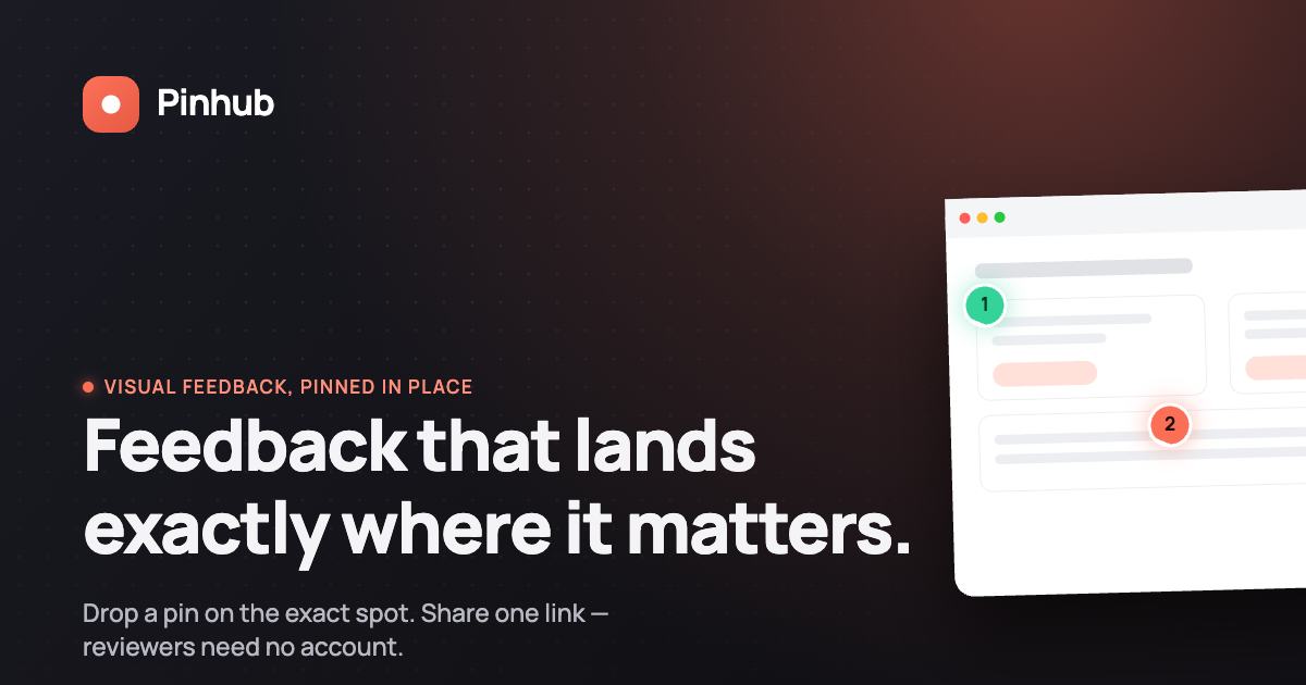
Teams juggling multiple review rounds often use AI-generated summaries and version history to turn scattered threads into a single handoff list. If your Figma workflow starts breaking down once non-designers join the conversation, it's worth seeing how Pinhub's plans fit alongside what you're already doing, starting with our free tier for low-volume use.
FAQ
Why are designers leaving Figma?
Some designers cite rising subscription costs, interface complexity as the platform adds features, and a preference for lighter or more specialized tools for specific tasks. Others stay for Figma's collaboration strengths but pair it with separate tools for client-facing feedback rounds.
Can viewers leave comments on Figma?
Viewers with at least view access can leave comments on a Figma file depending on the permission level set by the file owner. Commenting access typically needs to be explicitly granted or included in the sharing settings.
What are the downsides of using Figma?
Common complaints include performance slowdowns on large or complex files, a learning curve for advanced features, and friction when non-Figma stakeholders, like clients, need to leave feedback without creating an account. Pairing Figma with a guest-friendly review tool, such as Pinhub, is one way teams address that last gap.
Is Figma basically Canva?
No. Figma is built for interface and product design with features like components, auto layout, and developer handoff, while Canva focuses on quick graphic design for marketing and social content. The two tools serve different stages and audiences in a design workflow.
Sources
- Politeness strategies increase feedback acceptance (ACM)
- Remote design critiques: a practical sync and async guide (The Crit)
- How to provide design feedback effectively (Koi Studios)